Over Christmas my brother-in-law teased me about how nice and humble I seem in my blog compared to how nasty and arrogant I am in real life. He has a point: I'm not all that nice or humble. But I do have a few guidelines for how I conduct myself on the Internet, and was just acutely reminded why those guidelines are a good idea.
Although I don't spend a lot of time online, I do participate in a couple of forums and newsgroups that talk comics. In one recent discussion I poked some sarcastic fun at a particular syndicated feature and very quickly received an e-mail from the cartoonist who does that feature thanking me for the recognition, complimenting me on my own work that he'd been following since I went online, and congratulating me on my success.
What a gracious response! My original comment could've been taken as an insult, although it wasn't really meant as one and the cartoonist didn't see it as one--or perhaps chose not to. Instead, he won a fan for life. But the little tingle of "Oh crap!" that ran up my spine when I found his name in my In Box reminded me why I try to live by some pretty high standards:
Don't write anything about someone that I wouldn't say to their face. The anonymity of the Web is intoxicating. But you never know who's reading, and Web archives last forever. I try not to write anything I'd ever have to apologize for or be embarrassed by.
A corollary: Don't write anything uncomplimentary about the creative efforts of others. The fact is, I have an innate respect for almost anyone who creates anything, and a lot more respect for anyone able to make a living at it. The worst I'll say about something publicly is that it doesn't work for me; I'm not its audience. That makes it my problem, not yours. I'm quick to admit I might be wrong. Now, that doesn't mean I don't have my own opinions about terrible work and talentless hacks. I do, and if you and I are friends or colleagues splitting a pizza I might share those thoughts with you. But not here.
I learned two things from making Mom's Cancer: 1) It is much, much harder to create something--anything--than to sit back smugly tearing down the work of others, and 2) One cruel criticism stays with you longer than 100 kind compliments. I fairly commonly come across aspiring cartoonists online looking for critiques of their work. If I see something I like or have something genuinely constructive to contribute, I speak up. If not... well, maybe I just didn't happen to see it. Good luck to 'em.
No politics or religion. In particular, no evolution or conspiracy theories. I sometimes regret this guideline and am tempted to break it. Such topics encompass a big, interesting part of life and I wouldn't mind sharing my thoughts on them. In fact years ago I used to, but adopted the guideline when I realized I had never once changed anyone's mind about anything. All that my online arguing accomplished was to keep me awake nights drafting clever retorts in my head that were invariably undone by my opponents' blind inability to accept the inescapably self-evident beauty of my impeccably reasoned conclusions. This guideline has nothing to do with timidity or manners; it's pure self-preservation. Otherwise you'd all drive me nuts.
Go easy on family. With the obvious glaring exception of Mom's Cancer itself, I try to keep my personal life private. That's partly an editorial decision based on the type of blogger I want to be. I do mention my family once in a while, but this ain't Erma Bombeck or Anna Quindlen. Let's just assume we all glimpse the majesty of the universe in a baby's smile and move on. I also want my wife, children, sisters and friends to feel free to live their lives without worrying about Brian broadcasting it to the world. Frankly, after doing that once already, I think I owe them. Forever.
These guidelines create a little wall between us--me the writer and you the reader--that I sometimes regret but is just about a thickness and height I can live with. Some bloggers say whatever they want and let the chips fall where they may, and I see the value in that, sometimes admire it, and recognize it as one reason blogs exist. Just not this one.
Since I don't plan to post again before the start of 2007, maybe you could find a New Year's resolution in here somewhere worth adopting. Couldn't hurt.
Sunday, December 31, 2006
Friday, December 29, 2006
Helfen und Hoffen
I had a very fine Christmas and hope you did too. I'm back home and easing into work (most of my clients took the week off so it's light), and won't bore you with a list of gifts I received except to say they included a couple of good books and good toys, plus too much good food.
Just before Christmas I did receive a swell package from my German publisher Knesebeck: an envelope packed with German-language articles and reviews of Mom's Cancer (aka Mutter Hat Krebs) dating back to March. There were more than two dozen clips, some from prominent publications such as Zeit Wissen, Bunte, Bild am Sonntag, Suddeutsche Zeitung, and Stuttgarter Zeitung. A cover note from my contact at Knesebeck thanked me and added, "Your book was very well received in Germany," and from what I can understand picking through the reviews armed only with long-forgotten high school German and the Babelfish online translator, I think it was.
I've said before that it's a little unsettling to think of my words and pictures existing out in the world on their own, not knowing what mischief they're up to, only getting an occasional e-mail or postcard to let me know they're alive--moreso when those notes are written in a foreign tongue. I sent two kids to college last fall and, although I take my children's fates much more seriously than my cartoons', it's a similar feeling.
Sometimes I can tell a review has appeared when I see a jump in Web visitors from a particular region or referring URL and follow that trail back to its source. I confess I even Google my title once in a while just to see if anything new turns up. But by and large I have no way of knowing what anyone is saying about my book or if they're saying anything at all. Until I opened the envelope from Knesebeck I was aware of only two or three of these German reviews. Which made it a fine Christmas gift indeed.
I haven't heard anything lately about French or Italian editions that I understand are in the works. I'm assured that everything's fine, it just takes time. When I originally put Mom's Cancer on the Web I of course knew it might be read around the world, and the e-mails I received from Australia, Israel, Brazil, Europe and elsewhere were thrilling. But somehow seeing my work translated into another language, and reading articles and reviews about my work in that language, makes it more real. Mom hoped her story would inform, comfort, and help other people; although Mom's Cancer isn't a high-profile best-seller, and I remain a bit frustrated that so many people who might get something out of it will never see it, this packet of German reviews reminds me how well we've succeeded--really, far beyond any reasonable expectations we could have had.
Which isn't to say we've exceeded any unreasonable expectations. Like Han Solo said when told his reward for saving Princess Leia would be more wealth than he could imagine, "I don't know. I can imagine quite a bit."
Just before Christmas I did receive a swell package from my German publisher Knesebeck: an envelope packed with German-language articles and reviews of Mom's Cancer (aka Mutter Hat Krebs) dating back to March. There were more than two dozen clips, some from prominent publications such as Zeit Wissen, Bunte, Bild am Sonntag, Suddeutsche Zeitung, and Stuttgarter Zeitung. A cover note from my contact at Knesebeck thanked me and added, "Your book was very well received in Germany," and from what I can understand picking through the reviews armed only with long-forgotten high school German and the Babelfish online translator, I think it was.

I've said before that it's a little unsettling to think of my words and pictures existing out in the world on their own, not knowing what mischief they're up to, only getting an occasional e-mail or postcard to let me know they're alive--moreso when those notes are written in a foreign tongue. I sent two kids to college last fall and, although I take my children's fates much more seriously than my cartoons', it's a similar feeling.
Sometimes I can tell a review has appeared when I see a jump in Web visitors from a particular region or referring URL and follow that trail back to its source. I confess I even Google my title once in a while just to see if anything new turns up. But by and large I have no way of knowing what anyone is saying about my book or if they're saying anything at all. Until I opened the envelope from Knesebeck I was aware of only two or three of these German reviews. Which made it a fine Christmas gift indeed.
I haven't heard anything lately about French or Italian editions that I understand are in the works. I'm assured that everything's fine, it just takes time. When I originally put Mom's Cancer on the Web I of course knew it might be read around the world, and the e-mails I received from Australia, Israel, Brazil, Europe and elsewhere were thrilling. But somehow seeing my work translated into another language, and reading articles and reviews about my work in that language, makes it more real. Mom hoped her story would inform, comfort, and help other people; although Mom's Cancer isn't a high-profile best-seller, and I remain a bit frustrated that so many people who might get something out of it will never see it, this packet of German reviews reminds me how well we've succeeded--really, far beyond any reasonable expectations we could have had.
Which isn't to say we've exceeded any unreasonable expectations. Like Han Solo said when told his reward for saving Princess Leia would be more wealth than he could imagine, "I don't know. I can imagine quite a bit."
Sunday, December 24, 2006
An'a One. A Two. A OneTwoThreeFour!
Deck us all with Boston Charlie,
Walla Walla, Wash., an' Kalamazoo!
Nora's freezin' on the trolley,
Swaller dollar cauliflower alley-garoo!
Don't we know archaic barrel,
Lullaby Lilla boy, Louisville Lou?
Trolley Molly don't love Harold,
Boola boola Pensacoola hullabaloo!
Bark us all bow-wows of folly,
Polly wolly cracker n' too-da-loo!
Hunky Dory's pop is lolly
gaggin' on the wagon,
Willy, folly go through!
Donkey Bonny brays a carol,
Antelope Cantaloup, 'lope with you!
Chollie's collie barks at Barrow,
Harum scarum five alarum bung-a-loo!
--Walt Kelly
Friday, December 22, 2006
My Elf Self
 Kid Sis pointed me to one of the strangest, stupidest Web utilities I've ever seen. Fortunately, I'm a fan of strange and stupid.
Click here or on the picture above to view a very (very very) special holiday greeting made by me just for you. Because I care.
Wednesday, December 20, 2006
Dr. Sagan
A few of the science-themed bloggers I read are taking part today in the Carl Sagan Memorial Blog-a-Thon, marking the tenth anniversary of the astronomer's death. Dr. Sagan meant something to me, so I thought I'd contribute as well.
I first came across Carl Sagan in the early 1970s, before his television series Cosmos, around the time of the Pioneer probes to Jupiter and Saturn and in preparation for the Viking probes to Mars. These were also the years when the search for extraterrestrial intelligence (SETI) first began to be taken semi-seriously as a scientific pursuit; along with Frank Drake, Sagan was at the forefront of that effort.
Those were my early and mid-teen years, an impressionable time when a lot of young people figure out what their passions are and how they'd like to direct their lives, and Dr. Sagan was a big part of that process for me. Also around that time, my parents had a copy of the Whole Earth Catalog that, as I recall, featured a poem by Dr. Sagan on its back cover:
There is a place with four suns in the sky:
red, white, blue and yellow.
Two of them are so close together they touch,
and star-stuff flows between them.
I know of a world with a million moons.
I know of a sun the size of Earth
and made of diamond...
To a kid who grew up mesmerized by Chesley Bonestell's amazing art when it was the only glimpse available at what might lie beyond the Moon, that piece was pretty evocative and moving. Even inspirational. I was ready to go see that stuff. Since then, thanks to the robotic probes that Dr. Sagan and his peers, colleagues, and successors built, I have seen some of it, with promises of more to come.
Dr. Sagan's longest-lived legacy will be the plaques he designed and placed on two Pioneer probes, and the similar plaques plus record albums on two Voyager probes, that are now plying their way through the trackless nothing beyond our solar system. Millions of years after the Pyramids have eroded to dust, the sights and sounds of Earth that Dr. Sagan pressed into those plaques and gold-plated records (along with the attached custom phonograph stylus and pictographic instructions for putting the record player together!) will still be drifting among the stars.
 Plaques attached to the Pioneer 10 and 11 probes illustrated the hyperfine transition of nuetral hydrogen (upper left) to serve as a yardstick for the other images, which include a map of our Sun's position relative to several pulsars, a drawing of which planet in our solar system the probe came from, and drawings of a man and woman relative in size to the spacecraft itself.
I've had the opportunity to talk to a couple of people who worked with Dr. Sagan on a professional level, and they paint a more complex picture of the man. Frankly, they didn't like him. One made an arch comment about a book written by "Carl and one of his several wives" (he had three). Maybe Sagan was a pompous jerk, and maybe they were jealous of his fame disproportionate to what they considered his scientific accomplishments. I found it interesting that I heard almost identical comments from people who'd encountered paleontologist Stephen Jay Gould, another great popularizer of science. I wish Sagan had resisted later urges to dabble in sociology and politics, where I think he was out of his depth. And there's the well-known story about Sagan suing Apple Corp. to stop them from using his name as the internal company code name for a new computer system; Apple promptly changed the project's code name to "Butt-Head Astronomer," and he sued them for that as well.
Regardless, becoming aware of his blemished reputation in at least some quarters tarnished him only slightly in my eyes, and I think his critics missed a very important point: how the public views, understands, supports, and applies science can in the long run be just as important as the science itself. In that, Sagan's contributions were unique and immense. Working that seam where science and society intersect is still something I hope to dedicate my own time and effort to.
Finally, near the end of his life when I was all grown up and thought I'd wrung just about all the inspiration from Dr. Sagan that I could, he wrote a book titled The Demon-Haunted World: Science as a Candle in the Dark, that is just about perfect. This is one of my desert-island books, the one that most perfectly captures my own thoughts about how a person ought to think about and approach the universe. It is a stirring defense of the beauty and utility of science, reason, and skepticism. I think it's a great work. If not for those plaques already beyond the orbit of Pluto, it would be a perfectly suitable monument to the man.
I have a foreboding of an America in my children's or grandchildren's time--when the United States is a service and information economy; when nearly all the key manufacturing industries have slipped away to other countries; when awesome technological powers are in the hands of a very few, and no one representing the public interest can even grasp the issues; when the people have lost the ability to set their own agendas or knowledgeably question those in authority; when, clutching our crystals and nervously consulting our horoscopes, our critical faculties in decline, unable to distinguish between what feels good and what's true, we slide, almost without noticing, back into superstition and darkness.
Thursday, December 14, 2006
Superman
| Mark Evanier, whose excellent blog (www.newsfromme.com) is often my first daily Internet stop, posted this 10-minute Google video today and I enjoyed it so much I thought I'd borrow it myself. In 1941, just three years after Superman's comic book debut, Max and Dave Fleischer began producing a series of animated shorts starring the Last Son of Krypton. I love these cartoons, which I believe are now in the public domain, and this is the first one they made. According to Evanier, at the time this was the most expensive non-Disney cartoon ever produced. It's gorgeous. The art is art-deco lush and expressive throughout, and I think the sequence at the end with Superman punching out (!) a death ray is truly one of the best bits of animation art ever done. Also interesting is how much of the Superman mythos and family of characters was already in place. Each of the Fleischer cartoons distilled them to their essence: Lois and Clark are professional rivals and spunky Lois gets into trouble that meek Clark finds a reason to avoid so Superman can save her. It's a lovely little cartoon formula that, like Road Runner vs. Coyote or Charlie Brown vs. Lucy's Football, has worked in countless permutations for many decades. At the same time, you can see they were still working out the bugs. This Baby Kal-El wasn't found and raised by the Kents but grew up in an orphanage. The opening title states that Superman could only leap great distances, but the cartoon clearly shows him free-flying. All of his auxiliary powers (X-ray vision, heat vision, super-breath, whatever) would come later, along with a gradual ratcheting up of his strength to absurd levels--an error that subsequent creators tried to correct once in a while and then committed all over again. Anyway, this cartoon backs up a strong opinion of mine that the 1940s and '50s was a Golden Age of comic and cartoon art that has not been and probably never will be surpassed. There are a lot of reasons why. One is that the people producing it were adults creating to entertain adults. Their work was never condescending. Another is that they were professionals who'd paid their dues mastering (and in many cases inventing) their craft. Very few cartoonists or animators working today would be fit to clean the old guys' inky brushes. They also brought a wealth of life experience to the job that I think enriched their work. (I often think of the latter point in relation to the original Star Trek, which I believe had a verisimilitude that subsequent spin-offs lacked because Gene Roddenberry, Gene Coon, and the others involved had long, interesting pre-TV careers--including military service--that gave their adventures and characters a realistic edge despite the groovy far-out setting. In contrast, Star Trek writers and producers in the 1980s and '90s were relatively recent college grads whose life experience consisted of writing screenplays--and watching old Star Trek. Not that the newer Treks were bad, but I think they could have benefitted by hiring a fifty-year-old writer who'd maybe served aboard an aircraft carrier.) At any rate, I'm rambling and I think this cartoon speaks for itself. If you haven't seen the Fleischer Supermans before and have 10 minutes to spare, I think it's time well spent. | |
Tuesday, December 12, 2006
Young Cartoonists in Love
One of the best parts of getting a cartoon/comic/graphic novel book published has been getting to know a few people who are really good enough to make a living at it. Some have become friends, in that "hey it's good to run into you once a year and meanwhile I'll read your blog" type of friendship. Completely coincidentally, two of those friends (who I'm sure don't know each other) got married in the past few days, and the mind hungry for blog topics grasps at any connections it can.
Otis Frampton, creator of Oddly Normal and several series of collector art cards, has been trying to marry Leigh Lawhon during a wedding/honeymoon trip to Tokyo, where I believe Otis either lived once or may have been stationed when he was in the service (?). I say "trying" because, according to Leigh's blog of their trip, their plans to wed in a quiet civil ceremony have been complicated by the need to translate documents into Japanese and run back and forth between Tokyo City Hall and the U.S. Embassy. With luck, the deed has been accomplished. It sounds like the kind of petty frustration that'll make a charming story 20 years from now.
In New York, cartoonists Raina Telgemeier and Dave Roman married on December 2. Raina is drawing the graphic novelizations of The Babysitters Club (I wrote about acquiring an original page of that artwork from Raina in July) and I admit I'm more familiar with her work than Dave's, but they're both very good cartoonists who write and draw with a lot of heart. They really seem perfect for each other. Raina has posted some photos of their wedding that show her absolutely gorgeous and Dave, for the first time in my experience, clean-shaven. My eyes ga-oogahed like a wolf's in a Tex Avery cartoon on both accounts.
You know it's true love when you tell someone you draw funny pictures for a living and they still want to marry you anyway. My best wishes to both talented couples.
Thursday, December 07, 2006
Workin' in the Coal Mines...
Goin' down, down, down....
I realize that sitting at a keyboard in my home office writing stuff for a living is cushier than most jobs most people have to do--I've done plenty worse and I'm grateful every day--but it still has its demands. This is a busy time of year for me, when several clients' projects all come due at once. Others who haven't already lined up people like me to work for them call in desperation, and if they're friends or the project sounds interesting I try to say Yes. I've got many irons in the fire.
Which I hope serves as an explanation and apology for not blogging as much as I'd like. I love you guys, really.
Last weekend my wife went through a bin of stuff we brought home from Mom's after she passed away and haven't really looked at since. She found this sketch I did of Kid Sis's and my feet as we sat side-by-side on a couch. I was 21 and Kid Sis was...much younger...and Mom framed it and displayed it for a while before relegating it to a closet.

(Click it to see a big version)
I have a dim memory of doing the drawing. It's in pencil on cheap newsprint (I jacked up the contrast to make the details more visible on this jpg). The date on the back tells me I was visiting home the summer after my junior year of college. Kid Sis and I liked to spend time drawing together, and she still has some of those awful, awful pieces I scribbled to amuse her. Really, Kid Sis, let the Ewok drawing go, all right? It's embarrassing.
I like the Rubik's cube. I like how Kid Sis's shoes are laced differently from each other. I actually have very fond memories of the shoes I'm wearing in the drawing: possibly the best-fitting shoes I ever owned, they felt like they were molded to my feet. I wore them past disintegration.
I also like how I could count on Mom to save things that evoke memories like these years and years later. I probably would've tossed it the day I drew it.
Fine, Kid Sis, you can keep the Ewok drawing.
Friday, December 01, 2006
Cybil Award Nomination
Interrupting my recent gassy ruminations on physics and metaphysics, I just learned that Mom's Cancer is one of 35 books nominated for a Cybil Award in the graphic novel category.
If you (like me) ask, "What's a Cybil Award?" the organization's website explains. Quoting from the press release marking their formation in October:
Like all revolutions, this one started small, with a single post on a blog devoted to children's literature. The Newbery Medals seemed too elitist and the Quills, well, not enough so. Was there a middle ground, an annual award that would recognize both a book's merits and popularity? The answer: invent one! Within hours, this meme had circulated among some of the biggest bloggers in the burgeoning kidlitosphere, the cozy corner of the Web where children's books are given the same regard as their grown-up counterparts. Within days, the new awards had a name and a website: The Cybils, a loose acronym for Children's and YA Bloggers' Literary Awards....
Panelists will trim the list of nominees to five books in each of eight categories by January 1, after which judges will choose the winners.
This is very nice recognition. Again, as I mentioned when discussing my book's nomination for an American Library Association 2007 Best Books for Young Adults award, I'm happily nonplussed to discover I wrote a "young adult" book. I did not know that, but it's fine by me.
Thursday, November 30, 2006
Put Up or Shut Up
I think its kind of presumptuous for you to assume you know what Kinkade sees and experiences. Maybe in a certain place he saw exactly the rainbow he painted! Unless you followed him around his whole life I don't think you can know.
Anonymous Reply to Previous Post
That’s a fair enough objection, I think. At the risk of getting too textbooky, I’ll explain myself and then add a few thoughts about exactly how obligated to truth I believe an artist can or should be. It’s not my job to tell anyone what art to like or not like (hi, Nurse Sis!). But I can defend my rationale.
First, a little rainbow physics. Your standard rainbow appears when sunlight behind you hits raindrops in front of you. Each individual spherical raindrop becomes a prism that refracts white sunlight into its component colors and reflects it back to your eye. It’s important to remember that a rainbow isn’t a “real thing out there,” but an optical phenomenon that the observer is a part of. Everybody sees a slightly different one.
(This suggests an interesting analog to the old koan, “If a tree falls in a forest and there’s no one there to hear it, does it make a sound?” I never understood why that was considered a profound puzzle: the answer is obviously Yes. However, if sunlight hits a raindrop and there’s no one there to see it, does it make a rainbow? Maybe not.)
A rainbow’s arc is always a portion of a circle, and the angle sunlight makes going in and out of each raindrop is always the same: 42 degrees. This has some interesting corollaries: the angle described by the center of the rainbow’s arc, the observer, and the rainbow is likewise always 42 degrees.
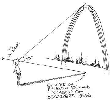
Furthermore, all rainbows are the same size—you just see more or less of them depending on how high the sun is in the sky. When the sun’s low, you see more of the circle; when it’s high, you see less. That’s what impressed me about the rainbow my wife photographed: with the sun about as low as it could be, the rainbow was about as big as it could get.
The Crime of Kinkade
I tried to find the objectionable Thomas Kinkade painting online but couldn’t. I only saw it once a few years ago, but as I best recall (and I apologize if I recall incorrectly) the critical elements looked like this:

You can make rainbows many different ways, but the one indispensable element is light. A bright light source has to be either directly behind the observer opposite the rainbow, or at the exact center of the rainbow behind it (for example, you can sometimes see a night rainbow circling the Moon formed by ice crystals in the sky).
Where’s the light source in this painting? The sun isn’t directly behind the observer nor directly behind the rainbow. It’s off to one side. There’s no enormous spotlight shining onto or out of the waterfall. The only way this rainbow works is if it’s on a planet with two suns, like Luke Skywalker’s home of Tatooine, and one of those suns is shining behind us. But even then, the rainbow is so far up the mountain that the second sun behind us would have to be impossibly below the horizon. If Kinkade added a Jawa or Sand Creature to this painting I’d be more satisfied, because this rainbow couldn't happen on Earth.
There’s a more subtle problem with the rainbow as well. As mentioned, the angle between a rainbow’s center, an observer, and the rainbow’s arc is always 42 degrees. That means that an entire rainbow, side to side, takes up 84 degrees of the observer’s world view. Think of it like this: if you slowly turned in a 360-degree circle and saw rainbow after rainbow lined up side by side along the horizon like McDonald's Golden Arches, there’d be just over four of them before you circled back to where you started.
The problem with Kinkade’s rainbow, then, is not just that it’s in the wrong place but that it's far too small. You could have fit several rainbows side by side in the painting I remember without going all the way around. Kinkade was clearly thinking of a rainbow as a physical “real thing out there” that should follow the rules of perspective and look smaller when it’s farther away. But that’s not how rainbows work.
Is There in Truth No Beauty?
So what?
A lot of artists draw and paint a lot of things that aren’t necessarily technically accurate. Have I never heard of artistic license? Never made a mistake myself? Am I trying to suck the fun out of everything?
That kind of depends on what you think art is about. I’m not a soulless drudge. I’d never criticize a child for drawing the sun beside a rainbow or getting the colors mixed up. And abstract artists can do whatever they want. Still....
When I was in college, a friend who wanted to sell his racing bicycle asked me to do a drawing of it that he could post with a flyer (this was in the Dark Ages, kids, when we couldn’t just upload a digital photo and print it in full color. Although we did have photocopiers, which saved me the trouble of chiseling the bike’s image in marble).
So with my friend’s bike as a model I drew it as best I could. When I proudly unveiled my creation to him, he scoffed, “That looks like my grandmother’s Schwinn!” Then he took me by the hand and patiently explained to me all the features that made a racing bike different from grandma’s Schwinn. I was struck by how wrong I’d gotten it. The proportions, the angles of the posts, the wheels... Even though it was sitting right in front of me, I hadn’t drawn his bike at all. I had drawn a completely different bike that existed in my head.
I think a fundamental responsibility of artists is to view the world as accurately and convey it as honestly as they can. To really see what they’re looking at and then communicate it. That's very hard to do! A big part of that responsibility is knowing what you don’t know and being willing to find out. I didn’t know anything about racing bikes but didn’t know I didn’t know. I learned.
If I set out to draw a horse, I’d surround myself with horse references. If I tried to draw a World War II tank, I’d google up as many tank pictures as I could find. I’d probably still botch the job: there are things about horses only a horse person knows and I’m sure there’s a tank guy out there who’d get mad because I put a 1944 model in a story set in 1943. And doctors and nurses laugh at medical shows (you ought to hear Nurse Sis gripe about “E.R.”), cops laugh at cop shows, lawyers laugh at law shows, and cartoonists laugh at cartooning shows (“Caroline in the City” anyone?). You could get paranoid and paralyzed pretty quickly, afraid to move a muscle. Nobody knows everything! What’re you supposed to do?
Cartoonist Mort Walker wrote about how when he started “Beetle Bailey” he took great pains to be sure the rifles, tanks, and other equipment were drawn accurately. He soon realized that didn’t work. In his comic strip world, his generalized abstractions of rifles and tanks worked better than truer representations. The symbols were more effective than the objects they symbolized. That’s probably true for a lot of cartooning and non-representational art but a problem for an artist like Kinkade, who is clearly portraying places that, though idealized, are meant to look like they could exist.
Another story: One of my favorite panels in Mom’s Cancer is the one of my mother strapped down in Frankenstein’s lab.
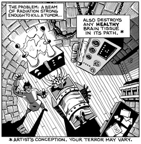
The metaphor conveys her perspective of the terrifying experience, but my original intent was to draw a realistic picture of her lying on the actual machine used to treat her. I scoured the Internet looking for a picture of the machine, all through the hospital’s and manufacturer’s websites, and couldn’t find one. That wasn’t a detail I wanted to risk getting wrong so I evaded it as creatively as I could. It worked great, better than my original idea, but it was essentially a cheat to cover my ignorance of stereotactic radiosurgery (sorry, I must have missed that day of class). There are a lot of ways to solve the problem.
I make mistakes and take shortcuts (I'm painfully aware of mine, no need to point them out), everyone does. All I’m looking for is a good-faith effort. An artist who makes his living as a “painter of horses” should know horses. A “painter of tanks” should know tanks. And a “painter of light”....
Tuesday, November 28, 2006
I've Been One Poor Correspondent
Apologies again for not posting more frequently. The Thanksgiving holiday combined with the rush of several end-of-the-year work projects consumes a lot of time. A few odds and ends today:
I just got off the phone with a reporter for the Berlin newspaper Der Tagesspiegel who is doing a story on Mom's Cancer from the healthcare book perspective. I thought it was a very nice interview, with a few thoughtful questions I hadn't been asked before, and the reporter was very knowledgable about comics and graphic novels. In fact, he said he hopes to place a second article about Mom's Cancer with a magazine that would address the graphic novel angle. No idea when either article will appear, but he promised to send me copies.
I just got off the phone with a reporter for the Berlin newspaper Der Tagesspiegel who is doing a story on Mom's Cancer from the healthcare book perspective. I thought it was a very nice interview, with a few thoughtful questions I hadn't been asked before, and the reporter was very knowledgable about comics and graphic novels. In fact, he said he hopes to place a second article about Mom's Cancer with a magazine that would address the graphic novel angle. No idea when either article will appear, but he promised to send me copies.
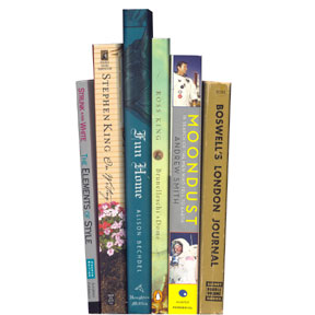
 What the cool kids are reading in Germany.
I've been looking over a couple of cover designs for the French edition of Mom's Cancer. I'll post them here when I can, but have been asked to keep them under wraps for now. Foreign publishing is an interesting topic in general. Overseas publishers who acquire the rights to print Mom's Cancer in their countries often have their own ideas about looks or formats that will sell best locally. For example, the French cover might look very different. As long as the content of the story remains intact, I'm pretty easy-going about how it's presented.
A lot of authors retain foreign rights but I was frankly happy to let my publisher have them; negotiating contracts in other languages with unfamiliar legal systems sounds like the Tenth Circle of Hell to me. As a consequence, I really have very little to do with my book's fate in non-English-speaking nations, although Editor Charlie and Abrams are extremely considerate and solicitous about keeping me involved and happy (thanks, Jutta!).
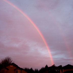
I'll sign off with this photo of a rainbow, which my wife took a couple of days ago. You can just see a wisp of secondary rainbow to the right, with a hint of Alexander's dark band between them. Everyone knows that the sequence of colors in the primary and secondary rainbows are the opposite of each other, right? (Optics was my favorite physics course.)

What I find interesting about this photo is that my wife took it early in the morning, just after sunrise. Since a rainbow forms in the sky opposite the sun--in fact, the shadow of the observer's head always points to the exact center of a rainbow's arc--this is just about as big and high in the sky as a rainbow can be, almost a complete half-circle. (And yes, pedants, I'm aware of circumstances that create full-circle and more exotic rainbows. You know what I mean.)
Where was I? Sleeping, of course.
(We now enter the free-association portion of today's post). It was a rainbow that destroyed any esteem I might have once held for "Painter of Light" Thomas Kinkade. Don't get me wrong, I was never a fan of his syrupy sentimentality, but I could understand the appeal of his work and considered him technically accomplished. That was, until the day I saw one of his typically majestic mountain vistas with a beautiful rainbow suspended in a spot where no rainbow could possibly exist. I think one of the primary functions of art is to tell the truth as the artist sees it; even if I disagree with their vision or dispute their skill, I should be able to count on their integrity. By painting a rainbow that neither he nor anyone who ever walked our planet had ever seen, Kinkade revealed himself to me as a big fat liar. When you call yourself the "Painter of Light," you have a responsibility to get the light right.
Some people become less judgmental with age. I'm trying to become more.
Tuesday, November 21, 2006
Nice People
I rent a P.O. box for business purposes that I check once or twice a week. The post office is a one-room cinder-block building in a tiny town nearby, and is usually staffed by two workers who keep a candy bowl on the counter.
A few months ago while I waited in line to mail a package, one of the clerks caught me rooting around in the bowl for my favorite, those little green sour apple Jolly Ranchers. We chatted about candy for a few seconds, I mailed my package and left.
Several days later I returned to check my mail, opened my box, and found sitting atop the junk adverts three green sour apple Jolly Ranchers. That particular clerk wasn't working that day so I couldn't thank her for making my week. Next time I went in: another couple of Jolly Ranchers. She was working that day, so I went to the counter to thank her for, again, making my week. She explained that she was attuned to the candy preferences of several regulars and, when she refilled the counter candy bowl, did her best to accommodate them. I just returned from the post office a few minutes ago and she did it again.
What a tiny, attentive, wonderful thing to do. How easy it is to brighten someone's day. Monuments, museums, technology and conquest are well and good but, as far as I'm concerned, getting candy in my mailbox is what Civilization is all about.
Three-Point Perspective
Another way I spend my time instead of working:
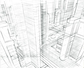
Original is non-photo blue pencil, about 14 x 17 inches. Maybe I'll think of something useful to do with it... Hmm....

Original is non-photo blue pencil, about 14 x 17 inches. Maybe I'll think of something useful to do with it... Hmm....
Friday, November 17, 2006
Miriam Engelberg Memorial
I'm planning to attend a public memorial service for Miriam Engelberg in San Francisco this Sunday, November 19 at 1 p.m. Details and directions are available on her website at www.miriamengelberg.com.
UPDATE: It was nice.
UPDATE: It was nice.
Thursday, November 16, 2006
Kerning
In yesterday's post about digital type, I bemoaned the inability of my custom hand-lettered font to do kerning. That's because I'm a big dummy--but a big dummy who can be taught. Ten minutes ago I figured out that I can do kerning with the Type Tool in Photoshop, and I got so excited I had to share.
Kerning means making individual letter shapes fit together in ways that are pleasing to the eye. A good example are the letters "A" and "V," whose sides have complimentary slopes. In the top example below, the letters are printed next to each other without kerning, while in the bottom example I used kerning to slightly overlap them (see how the top left of the "V" hangs over the bottom right of the "A") and reduce the empty space between.
Kerning means making individual letter shapes fit together in ways that are pleasing to the eye. A good example are the letters "A" and "V," whose sides have complimentary slopes. In the top example below, the letters are printed next to each other without kerning, while in the bottom example I used kerning to slightly overlap them (see how the top left of the "V" hangs over the bottom right of the "A") and reduce the empty space between.
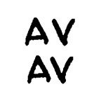
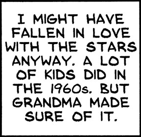
In yesterday's example caption, the words "STARS" AND "LOT" caught my eye, both due to the letter "T." T is a good candidate for kerning since it's got all that empty space at the bottom that many slanted letters could slide into. Here are the two words, without and with kerning around the T's:
 I think the bottom example is easier on the eye. Notice that kerning doesn't mean squishing all the letters together (that's "tracking"), but overlapping the space only between certain letters. If it's absent, words can subconsciously look funny even if you can't figure out why; if you do it right, no one ever notices.
I'm so happy I can kern. And it's still prodigiously faster than lettering by hand.
By the way, this is how I spend my time instead of working.
Wednesday, November 15, 2006
Man of Letters
I did something cool recently that I think turned out pretty well and could save me a lot of time and effort in the future. So why do I feel a bit ambivalent about it?
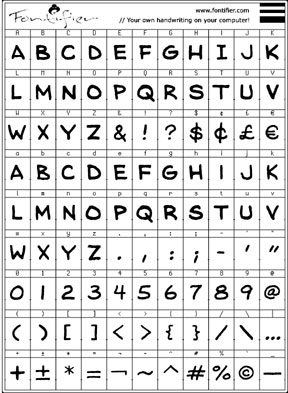
Fontifier is an online service that for $9 will turn your handwriting (or, really, any characters or squiggles you want) into a True Type font that can be used in Word, Photoshop, and most any other application you'd use on a computer. You download a form, print or paste your upper- and lower-case letters into the appropriate squares, upload the form, pay your $9, and seconds later download your custom font. There are a few things to watch out for, but it's pretty easy. Other people provide the same service and I'm not necessarily endorsing Fontifier, it's just the one I happened to try.
I composed my font digitally, cutting and pasting individual letters from my original Mom's Cancer scans into the Fontifier form using Photoshop. I customized the font to meet my unique needs. Since cartoon lettering is almost always upper-case, I used capital letters for both upper- and lower-case characters, so I have two capital A's, B's, C's, and so forth in case I want to mix things up (handy if you don't want all your letters to look too uniform in a phrase like "No one noshed on one noodle at noon"). I redefined other keys to print characters I thought I'd use more. My form looked like this:
I'll digress to explain that lettering seems to be the part of making comics that cartoonists hate most. It's time-consuming, tedious, and exacting. It's also a real craft in its own right; in the old days, professional letterers made good livings hand-printing words for comic books and strips. Very few cartoonists did their own lettering (Charles Schulz being a notable exception) and it added time and expense to their production.
In contrast to many, I never hated lettering. I always looked at it as a final editing opportunity: a word doesn't count until I put it on the page. Occasionally I could make the letters themselves an interesting graphic element. The act of lettering could also be engrossing. Once you get into a rhythm, time flies enjoyably. Still, there's no denying that it takes a lot of time and leaves little room for error.
So I thought I'd try to digitize.
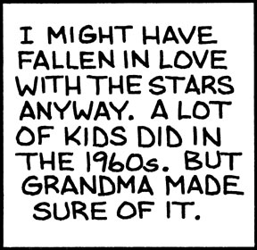
The first caption box below is my hand lettering as it appears on Page 77 of Mom's Cancer. The box immediately below it is the same caption typed using my custom font.
Fontifier is an online service that for $9 will turn your handwriting (or, really, any characters or squiggles you want) into a True Type font that can be used in Word, Photoshop, and most any other application you'd use on a computer. You download a form, print or paste your upper- and lower-case letters into the appropriate squares, upload the form, pay your $9, and seconds later download your custom font. There are a few things to watch out for, but it's pretty easy. Other people provide the same service and I'm not necessarily endorsing Fontifier, it's just the one I happened to try.
I composed my font digitally, cutting and pasting individual letters from my original Mom's Cancer scans into the Fontifier form using Photoshop. I customized the font to meet my unique needs. Since cartoon lettering is almost always upper-case, I used capital letters for both upper- and lower-case characters, so I have two capital A's, B's, C's, and so forth in case I want to mix things up (handy if you don't want all your letters to look too uniform in a phrase like "No one noshed on one noodle at noon"). I redefined other keys to print characters I thought I'd use more. My form looked like this:

I'll digress to explain that lettering seems to be the part of making comics that cartoonists hate most. It's time-consuming, tedious, and exacting. It's also a real craft in its own right; in the old days, professional letterers made good livings hand-printing words for comic books and strips. Very few cartoonists did their own lettering (Charles Schulz being a notable exception) and it added time and expense to their production.
In contrast to many, I never hated lettering. I always looked at it as a final editing opportunity: a word doesn't count until I put it on the page. Occasionally I could make the letters themselves an interesting graphic element. The act of lettering could also be engrossing. Once you get into a rhythm, time flies enjoyably. Still, there's no denying that it takes a lot of time and leaves little room for error.
So I thought I'd try to digitize.
The first caption box below is my hand lettering as it appears on Page 77 of Mom's Cancer. The box immediately below it is the same caption typed using my custom font.

The top box has an undeniable rough-hewn hand-crafted quality... some might even say a naive charm. It says something about me, and that something is: "I am not a professional letterer." I think the bottom box is better. Characters are uniform (duh), lines are straight and evenly spaced, everything's centered. Any lost personality is more than offset by improved quality. And it is still my handwriting.
It also took about one-fiftieth the time.
I want to point out one fine detail about the art of lettering that a lot of people miss. I made two versions of the letter "I," one with serifs (the little horizontal lines at top and bottom) and one without. The serif "I" should be used when it stands alone, as at the start of the first sentence. The sans-serif "I" should be used everywhere else. It's just a spacing/style thing that the old pros knew and a lot of punk kids don't.
So whence my ambivalence? In general, I value hand-crafted artwork and stand like an ink-stained dinosaur against the irresistible forces of computerization and digitization. More and more artists and cartoonists are working entirely on the computer and, although some are very skilled, I think it's a terrible trend. I think the computer imposes a uniformity of style and technique that artists aren't even aware of. Unless you're really good, everything drawn on a Wacom tablet and colored in Photoshop looks the same to me. "When your only tool is a hammer, every problem looks like a nail."
I think we're in danger of losing entire media of artistic expression--charcoal, ink wash, pastel, watercolor--simply because they're not easy to duplicate or manipulate on a computer. I've seen discussions in which cartoonists describe elaborate multi-layer Photoshop processes aimed at producing the same effect they could achieve in 10 seconds with a brush and drop of paint. I want to scream at the them, "Just DRAW the darn thing!"
In my opinion, computerization homogenizes while removing flavor. And, entirely personally, it drains most of the fun, as well. I enjoy putting ink and paint onto paper in a way I've never once enjoyed clicking a computer mouse.
Anyway, it's already an old argument among cartoonists and I'm pretty sure I've taken my stand on the losing side. But if someone told me I had to stop using paper and ink in favor of the computer, I think I'd probably rather quit altogether. It just wouldn't be something I'd want to do anymore.
Is digital lettering my first step down the slippery slope? I doubt it, but I admit I'm worried. I also think my friend Patricia Storms, who has stood on the side of the dinosaurs with me, might be disappointed in me. Fontifier isn't a terribly sophisticated font generator (my kingdom for kerning), and for future professional work I might try something more advanced (and expensive). But I think once you've lettered digitally, there's no going back.
Tuesday, November 14, 2006
Thursday, November 09, 2006
Top O' My Book Heap
I'm working hard on a bunch of stuff, some of it fun, but leaving little time for blogging. But I didn't want to leave my six regular readers hanging.
Books I've read lately:
"Fun Home," Alison Bechdel. Finally got around to it, and it's certainly a tour de force graphic novel by any standard. I'm not sure how I feel about it; I need to reflect on it a bit and may have a fuller review later. Let's say that although I'm tremendously impressed on many levels, my reaction was not the unequivocal rave it's gotten from everyone else.
"Moondust," Andrew Smith. I picked up this paperback at an airport bookstore and enjoyed it very much. Smith, who is about my age, interviewed the surviving nine Apollo astronauts who landed on the Moon (three are deceased) in an attempt to figure out what it all meant. The author injected himself into the story more than I thought necessary and I don't entirely agree with his conclusion, but as a fellow Apollo buff born at the beginning of the Space Age I found it fascinating.
"Boswell's London Journal," James Boswell. I find myself rereading Boswell's first-hand account of life in 18th century London every few years. To be honest, I don't read it straight through cover to cover, but enjoy dipping in and out for several pages at a time. It's cliche to say a work "brings history to life," but this is the only book I can remember that meets that standard.

"Brunelleschi's Dome," Ross King. Frankly kind of a slog to get through, but an ultimately rewarding look at the construction of Florence's Il Duomo cathedral at the height of the Renaissance. Begrudgingly recommended.
"On Writing," Stephen King. A lot of writers say this is one of the best books about being a writer they've ever read. I agree with them.
"The Elements of Style," Strunk and White. One of my daughters' good friends was the editor of their high school newspaper who hopes to pursue writing at university and in the service of various progressive causes she champions (ah, youth). I bought her a copy of this classic style guide because no writer should be without it. Then, realizing I didn't actually own a copy myself, I bought a second one for me and read it in one sitting. E.B. White is one of my favorite writers anyway, and this book--while too dry a reference work for the casual reader--is packed with gems of wisdom it's good to be reminded of from time to time... of which it is good to be reminded... that which of be reminded... never mind.
Books I've read lately:
"Fun Home," Alison Bechdel. Finally got around to it, and it's certainly a tour de force graphic novel by any standard. I'm not sure how I feel about it; I need to reflect on it a bit and may have a fuller review later. Let's say that although I'm tremendously impressed on many levels, my reaction was not the unequivocal rave it's gotten from everyone else.
"Moondust," Andrew Smith. I picked up this paperback at an airport bookstore and enjoyed it very much. Smith, who is about my age, interviewed the surviving nine Apollo astronauts who landed on the Moon (three are deceased) in an attempt to figure out what it all meant. The author injected himself into the story more than I thought necessary and I don't entirely agree with his conclusion, but as a fellow Apollo buff born at the beginning of the Space Age I found it fascinating.
"Boswell's London Journal," James Boswell. I find myself rereading Boswell's first-hand account of life in 18th century London every few years. To be honest, I don't read it straight through cover to cover, but enjoy dipping in and out for several pages at a time. It's cliche to say a work "brings history to life," but this is the only book I can remember that meets that standard.
"Brunelleschi's Dome," Ross King. Frankly kind of a slog to get through, but an ultimately rewarding look at the construction of Florence's Il Duomo cathedral at the height of the Renaissance. Begrudgingly recommended.
"On Writing," Stephen King. A lot of writers say this is one of the best books about being a writer they've ever read. I agree with them.
"The Elements of Style," Strunk and White. One of my daughters' good friends was the editor of their high school newspaper who hopes to pursue writing at university and in the service of various progressive causes she champions (ah, youth). I bought her a copy of this classic style guide because no writer should be without it. Then, realizing I didn't actually own a copy myself, I bought a second one for me and read it in one sitting. E.B. White is one of my favorite writers anyway, and this book--while too dry a reference work for the casual reader--is packed with gems of wisdom it's good to be reminded of from time to time... of which it is good to be reminded... that which of be reminded... never mind.
Monday, November 06, 2006
E-mail Woes, You Bet'cha
I just learned this morning that, for at least the second time in the past few months, e-mails sent to me at brian[AT]momscancer.com aren't reaching me (substitute "@" for "[AT]"...I'm trying to fool the spammers' evil robots). Of course the scary thing is that these are the two situations I'm aware of; for all I know, the darn thing has only worked 15 minutes a day for the past year.
Part of the problem is surely my cut-rate site host, but part may be the intricate daisy-chain of forwarding instructions that send mail from that address to another address where I actually read it. From now on I'm skipping the middle man. If you want to reach me, I'm at:
I've never had a reliability problem with Comcast and trust that'll work. I've changed all the contact information on this blog and my www.momcancer.com website accordingly. Of course I'll keep the old address active, but use it at your own risk.
I hate not knowing what I might've missed. If you sent me an e-mail I should have responded to but didn't, I wasn't intentionally rude. I answer everything I get, generally within a day or two. If I get it. Feel free to try me again.
You Ain't From Around Here, Is'ya?
I found this fun quiz on Raina Telgemeier's blog. Answer some questions about how you pronounce various words and it'll tell you what kind of accent you have. Here's mine:
Although I enjoyed the quiz, it got me wrong. I'm pretty sure my accent is "The West," a neutral newscasters' accent that the quiz calls "the lowest common denominator of American speech," and if I answer just a few questions differently I can tweak my result to come out that way. I suspect part of what the quiz picked up on is that, as a writer, I try to be careful and precise about what I say and how I say it. I exert a little effort to differentiate "stock" from "stalk" and "pin" from "pen."
On the other hand, although I've lived in the accentless West for more than 30 years, I did spend my speech-forming childhood in South Dakota. When I'm lazy I say "crick" for "creek" and I know what a davenport is. So I have to wonder if the quiz was clever and subtle enough to uncover my buried Midwestern roots. Or if it just got lucky.
Along those lines, check out the "Pop vs. Soda" website, where researchers have documented where in the U.S. people refer to a carbonated soft drink as "pop," "soda," "coke," or something else. I grew up a "pop" kid in South Dakota, as the map shows, and clearly remember feeling like a yokel when I first used the word in California.
I love regional accents and dialects. The fear that they'll go extinct as we all consume the same mass media doesn't seem to be coming to pass, as I understand it. What babies hear in their homes still seems to overwhelm whatever homogenization encroaches from outside. I hope that's true and remains so for a long time.
UPDATE: I just retook the accent quiz fresh (i.e., forgot what I answered the first time) and got "The West." Guess I'm a borderline case.
Part of the problem is surely my cut-rate site host, but part may be the intricate daisy-chain of forwarding instructions that send mail from that address to another address where I actually read it. From now on I'm skipping the middle man. If you want to reach me, I'm at:
brianfies[AT]comcast.net
I've never had a reliability problem with Comcast and trust that'll work. I've changed all the contact information on this blog and my www.momcancer.com website accordingly. Of course I'll keep the old address active, but use it at your own risk.
I hate not knowing what I might've missed. If you sent me an e-mail I should have responded to but didn't, I wasn't intentionally rude. I answer everything I get, generally within a day or two. If I get it. Feel free to try me again.
You Ain't From Around Here, Is'ya?
I found this fun quiz on Raina Telgemeier's blog. Answer some questions about how you pronounce various words and it'll tell you what kind of accent you have. Here's mine:
| What American accent do you have? Your Result: North Central "North Central" is what professional linguists call the Minnesota accent. If you saw "Fargo" you probably didn't think the characters sounded very out of the ordinary. Outsiders probably mistake you for a Canadian a lot. | |
| The Midland | |
| The West | |
| Boston | |
| The Inland North | |
| Philadelphia | |
| The South | |
| The Northeast | |
| What American accent do you have? Take More Quizzes | |
Although I enjoyed the quiz, it got me wrong. I'm pretty sure my accent is "The West," a neutral newscasters' accent that the quiz calls "the lowest common denominator of American speech," and if I answer just a few questions differently I can tweak my result to come out that way. I suspect part of what the quiz picked up on is that, as a writer, I try to be careful and precise about what I say and how I say it. I exert a little effort to differentiate "stock" from "stalk" and "pin" from "pen."
On the other hand, although I've lived in the accentless West for more than 30 years, I did spend my speech-forming childhood in South Dakota. When I'm lazy I say "crick" for "creek" and I know what a davenport is. So I have to wonder if the quiz was clever and subtle enough to uncover my buried Midwestern roots. Or if it just got lucky.
Along those lines, check out the "Pop vs. Soda" website, where researchers have documented where in the U.S. people refer to a carbonated soft drink as "pop," "soda," "coke," or something else. I grew up a "pop" kid in South Dakota, as the map shows, and clearly remember feeling like a yokel when I first used the word in California.
I love regional accents and dialects. The fear that they'll go extinct as we all consume the same mass media doesn't seem to be coming to pass, as I understand it. What babies hear in their homes still seems to overwhelm whatever homogenization encroaches from outside. I hope that's true and remains so for a long time.
UPDATE: I just retook the accent quiz fresh (i.e., forgot what I answered the first time) and got "The West." Guess I'm a borderline case.
Friday, November 03, 2006
ALA BBYA! (BYOB.)
A nice, unexpected honor arrived with yesterday's announcement of the American Library Association's 2007 nominees for Best Books for Young Adults (BBYA). Out of uncounted thousands of books eligible for the honor, the ALA nominated Mom's Cancer and 231 other titles, a list that (I gather) a blue-ribbon committee will trim by more than half in January. Those that make the cut will be official 2007 BBYAs, with a Top Ten list highlighting the best of the best. This is a potentially big deal, as librarians throughout the country look to the ALA's guidance when deciding how to spend their meager book-buying funds.
As I say, the nomination was unexpected, partly because I had no idea my work was being considered but mostly because I never thought of Mom's Cancer as a young adult book. I can certainly see how that could work, though, and in fact young adult literature includes some of the best writing and most challenging concepts around. I have a ton of respect for the field; I just didn't realize I was in it. I also think there are many readers whose first instinct when seeing comics in a book is to think "kids' stuff." I noticed that Jessica Abel's La Perdida, R. Kikuo Johnson's Night Fisher, and The 9/11 Report: A Graphic Adaptation also made the first cut, and I don't think of them as particularly young adult titles, either. Maybe I need to expand my concept of "young adult."
The other curiosity is that Mom's Cancer got listed as fiction. Trust me, it's as non-fictional as I could make it. I wonder if the ALA was thrown off by some of my metaphorical choices, like the superheroes. I'm reminded of a story about Art Spiegelman's Maus, when the New York Times was trying to decide if it should be listed as fiction or non-fiction. As I recall the tale (no doubt inaccurately), an exasperated editor finally said, "Go knock on Spiegelman's door. If a giant mouse answers, it's non-fiction."
If anyone knocks on my door, I'll be sure to have my yellow superhero tights on.

Thursday, November 02, 2006
What Did You Find in Your Shower?

These are two original Charles Schulz sketches I found in the shower around 1976-77. Explaining how I got them requires me to write a sentence I am extremely reluctant to type: When I was a teenager, my family belonged to the same raquet club as Mr. Schulz.
I expect that admission to conjure a completely inaccurate image of my family, our finances, and our position in the social strata. We didn't talk like Thurston Howell III while dashing off to the polo pitch in our tennis whites (nor did Mr. Schulz, come to think of it). We were just a solidly middle-class family who found a nice place to play tennis and swim. Why Mr. Schulz spent time there was beyond me, although I suspect it was simply for the friendship and competition. As I recall, he regularly appeared atop the tournament leader boards. He certainly didn't need the facilities, what with having his own indoor and outdoor tennis courts back at his studio.
In any case, I was playing tennis one day with my best friend, hacking away. We weren't rowdy or disruptive but we weren't very good, either, and our balls kept dribbling into the adjoining court whose players gamely returned them to us. When our neighbors left, my friend said, "That was Charles Schulz!" I'd played beside the man--and no doubt annoyed him--for an hour and never noticed.
When we finished I went into the clubhouse locker room and found these slips of paper lying on the floor, crumpled and completely soaked with water that'd run over from the shower. They were literally circling the drain. Obviously Mr. Schulz had drawn them for a friend or fan who promptly lost them. I took them home, gently uncrumpled them, pressed them flat between paper towels until they were completely dry, and used a soft kneaded eraser to pick up as much dirt as I could without touching the pencil. They couldn't have been more lovingly restored if they'd been sent to the Louvre.
And so they've sat in a scrapbook for thirty years until today, when I decided to matte them properly and add them to my slowly growing collection of original cartoon art. My Winsor McCay, Irwin Hasen, Raina Telgemeier, Ted Slampyak, and Otis Frampton are now joined by my two Charles Schulzes... which, no disrespect to those other talents (some of whom I consider friends), classes up the joint considerably.
Wednesday, November 01, 2006
Dia de los Muertos, Part Two
As I suspected, all attempts to photograph the rest of my Halloween yard decorations in operation failed. You'll just have to take my word that everything worked perfectly, a fine time was had by all, and trick-or-treaters seemed more numerous than in most years.
My favorite was a boy who came with his father and admitted he'd been too scared to approach the door on past Halloweens but had finally mustered the courage now. The stout-hearted lad was very happy and proud of himself, while I was simultaneously horrified and gratified. I never meant my wee ghosties to be scary in the slightest but, at the same time, it was kinda cool to hear that. Ringing my doorbell was a rite of passage for him. I'll take that.
Y'all'll just have to come over next year. Everyone's invited.
Tuesday, October 31, 2006
Dia de los Muertos, Part One
"If you're an adult and you're planning to wear a costume at Halloween... Don't. I will find you. I will hurt you."
With all due respect to Mr. Black, Halloween is one of my Top Two holidays. I'm not above wearing a costume, though it's a fine line: you don't want to be that guy who works just a little too hard getting into character. For example, I think it's fine to have an emergency Starfleet tunic hanging in the closet, but you've gotta wear it with a pair of ordinary black pants and shoes. If you're over the age of 20 and you've also got zippered calf boots and specially tailored pants with flared cuffs and no pockets (everyone knows Starfleet pants don't have pockets), that's too much.
Over the years I've built up a nice assortment of props we scatter around the front yard every Halloween. I try to build something new each year, though they don't all work and some get retired in favor of better ones. Since I have finite space in my yard to display them and in my garage to store them, I've gotten better at making props that are light and break down easily.
I already revealed this year's addition, though I've made a few changes since posting that video, such as swapping the belt drive for a more steady and reliable chain drive using junked bicycle parts. Works great, and looks great in the dark.
The ghosts below are incredibly unimpressive in daylight but look very nice at night, gently wafting in the corner. I light them dimly so you might not even notice them at first, but you catch them out of the corner of your eye. Simple and effective.
Below is my pride and joy, the Ghost Catcher, displayed in my garage window. Unfortunately, it's too dark to see the details. The video opens with a wide shot of a mad (or at least mildly peeved) scientist's lab on the left and the Ghost Catcher on the right. It then zooms into the window of the high-voltage (1.21 gigawatts) machine I use to trap trespassing ghosts. Looks like I got three already.
Half the people who try to guess how this works think it's holograms. Nope. The technique is much lower tech--in fact, magicians have used it for more than a century--and (spoiler alert!) it's the same one used in the ballroom of Disney's various Haunted Mansions.
These are the only two props I set up early. I've got a couple of other good ones I'll try to photograph tonight, but it's difficult--both because of the darkness and the visitors. You may've noticed they're all ghosts, without a vampire, mummy, or werewolf in sight. That's deliberate. In the small space available, I'm trying to tell one story. This is the house where the mischievous green ghosts arise, some of whom are temporarily detained by the ghostbusting scientist who lives there. No need to throw in the kitchen sink.
And yeah, I've got a Ghostbusters jumpsuit. No nuclear-powered plasma-shooting proton pack, though; that would be too much.
--Lewis Black
With all due respect to Mr. Black, Halloween is one of my Top Two holidays. I'm not above wearing a costume, though it's a fine line: you don't want to be that guy who works just a little too hard getting into character. For example, I think it's fine to have an emergency Starfleet tunic hanging in the closet, but you've gotta wear it with a pair of ordinary black pants and shoes. If you're over the age of 20 and you've also got zippered calf boots and specially tailored pants with flared cuffs and no pockets (everyone knows Starfleet pants don't have pockets), that's too much.
Over the years I've built up a nice assortment of props we scatter around the front yard every Halloween. I try to build something new each year, though they don't all work and some get retired in favor of better ones. Since I have finite space in my yard to display them and in my garage to store them, I've gotten better at making props that are light and break down easily.
I already revealed this year's addition, though I've made a few changes since posting that video, such as swapping the belt drive for a more steady and reliable chain drive using junked bicycle parts. Works great, and looks great in the dark.
The ghosts below are incredibly unimpressive in daylight but look very nice at night, gently wafting in the corner. I light them dimly so you might not even notice them at first, but you catch them out of the corner of your eye. Simple and effective.
Below is my pride and joy, the Ghost Catcher, displayed in my garage window. Unfortunately, it's too dark to see the details. The video opens with a wide shot of a mad (or at least mildly peeved) scientist's lab on the left and the Ghost Catcher on the right. It then zooms into the window of the high-voltage (1.21 gigawatts) machine I use to trap trespassing ghosts. Looks like I got three already.
Half the people who try to guess how this works think it's holograms. Nope. The technique is much lower tech--in fact, magicians have used it for more than a century--and (spoiler alert!) it's the same one used in the ballroom of Disney's various Haunted Mansions.
These are the only two props I set up early. I've got a couple of other good ones I'll try to photograph tonight, but it's difficult--both because of the darkness and the visitors. You may've noticed they're all ghosts, without a vampire, mummy, or werewolf in sight. That's deliberate. In the small space available, I'm trying to tell one story. This is the house where the mischievous green ghosts arise, some of whom are temporarily detained by the ghostbusting scientist who lives there. No need to throw in the kitchen sink.
And yeah, I've got a Ghostbusters jumpsuit. No nuclear-powered plasma-shooting proton pack, though; that would be too much.
Friday, October 27, 2006
CR Magazine
Several months ago I was contacted by people starting up a new magazine called CR, aimed at cancer patients, family members, and the professionals who help them. The CR Editorial Board says their mission is to "strengthen collaborations and communications among cancer survivors, patient advocates, physicians and scientists, with the goal of accelerating the prevention and cure of cancer." As I understand it, the idea is to distribute the magazine mostly through clinics, cancer libraries, and doctors' waiting rooms, where the people who need it can find it.
An excerpt from Mom's Cancer, accompanied by a little author's note I wrote, appeared in the fall issue just now out. I think it's great, and not only for the full-page, full-color treatment they graciously gave my work:
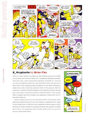
An excerpt from Mom's Cancer, accompanied by a little author's note I wrote, appeared in the fall issue just now out. I think it's great, and not only for the full-page, full-color treatment they graciously gave my work:

Click the image to see a big version (610 kB)
CR is 64 pages packed with solid news about cancer research and treatment, along with good practical advice and first-person accounts of dealing with cancer or helping someone who is. I know just enough about the magazine business to be very impressed with the quality of its writing and design, along with little things like their choice of paper and use of color. I hope it's a huge success for them.
See www.CRmagazine.org for more information about the magazine and the American Association for Cancer Research (AACR) that publishes it. It's good people doing good work.
Thursday, October 26, 2006
More on Tilt-Shift Faking
My Photoshopped tilt-shift miniature fakes drew a lot of visitors, a couple of whom wanted to see the original photos and compare them. Here are a few:
For the Disneyland Hotel picture, I cropped the original to focus on the pool area and eliminate the background, then applied the gradient blurring as described in the tutorial I linked to earlier. In this case, I didn't mask any features to keep them in focus, although it probably would've looked good if I'd masked that one palm tree that juts into the beige roof. Notice how the tree is sharp at the bottom and blurry at the top; it would've been better all sharp (since the top of the tree is theoretically in the same focal plane as the bottom). But that's nit-picking.
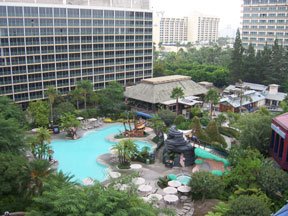
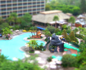
For the Disneyland Hotel picture, I cropped the original to focus on the pool area and eliminate the background, then applied the gradient blurring as described in the tutorial I linked to earlier. In this case, I didn't mask any features to keep them in focus, although it probably would've looked good if I'd masked that one palm tree that juts into the beige roof. Notice how the tree is sharp at the bottom and blurry at the top; it would've been better all sharp (since the top of the tree is theoretically in the same focal plane as the bottom). But that's nit-picking.


For the ampitheater, I kept the entire stone wall in focus while gradient blurring the rest of the top and bottom of the picture. Then I cut out the arched windows to let the now-blurry background show through. I could've done more with the red-rimmed stage at lower right; in the tilt-shift image, it's hard to tell what and where it's supposed to be.

As I also mentioned in the first post, one trick that helps the illusion is increasing the image's saturation to brighten colors and make the surfaces look more plastic and shiny. That worked really well in the next pair:


Not too boring, I hope. I'm sure I'll play with this more later. What I find really intriguing is thinking about how we perceive what we see, the cues we use to judge relationships and distance, and how those cues can be manipulated to fool us. It's pretty subtle and almost always completely unconscious. The eye-brain connection is an amazing thing.
Wednesday, October 25, 2006
Charles Addams Bio Review
Cartoonist Edward Sorel has written a nice review of a new biography of Charles ("Addams Family") Addams for the New York Observer. I knew little of Addams other than his work, and the glimpses Sorel offers of Addams's life, his own regard for Addams, and the way things worked during the glory days of The New Yorker magazine made interesting reading, I thought.
If nothing else, it makes one long for the days a cartoonist had a shot at ladies like Jacqueline Kennedy, Greta Garbo and Joan Fontaine.
If nothing else, it makes one long for the days a cartoonist had a shot at ladies like Jacqueline Kennedy, Greta Garbo and Joan Fontaine.
Tuesday, October 24, 2006
Revenge of the Infernal Machine
Back on October 15, I posted a short video of a contraption I built and challenged you to guess what it was. Opinions included something "for Halloween," "a medieval torture device," "automatic dog skritcher," "newfangled sock dryer," "Gertie's toothbrush," and "editor motivator."
Jim, who wrote that "It's for Halloween. Exactly what, I do not know..." was half right, although I don't know how much credit he deserves since "Halloween" was one of the tags I put on the video. (You wouldn't cheat, would you Jim?) I think the two clips below, showing the next step in the process, will clarify everything.
If you take the contraption, paint it black, add styrofoam balls and tulle, and paint them fluorescent green, you get this:
Then you paint on black eyes, wait until dark, turn on a black light, and get this hard-to-photograph apparition:
You'll have to trust me that it looks better in person, and will look WAY better behind a bush and under a tree in my front yard on Halloween, where vaporous spirits have been known to erupt from the ground one night each year.
I trust no one thinks me less manly because I know what tulle is.
Sunday, October 22, 2006
I Got a Rock
My wife and I went to the Charles M. Schulz museum on Saturday for an afternoon of special events. First was a showing of "It's the Great Pumpkin Charlie Brown" in the museum's swell little theater. As we sat down, we both realized it'd been years since we'd actually watched the show, and the experience of seeing it projected large with a hundred or so other people was unexpectedly entertaining. There's something very cool about watching it with a crowd that laughs and says "Aww" at all the right parts. There were also a lot of very cute children--some costumed for the occasion--and, for some reason, a full TV camera crew skulking about taping everything. We never quite figured that out.
After the screening and a quick snack at The Warm Puppy Cafe at
Mr. Schulz's ice rink next door, we made our way to the event I was most interested in: a panel discussion by four professional cartoonists on their work and the impact of "Peanuts" on their lives. The guests were Keith Knight ("The K Chronicles"), Darrin Bell ("Candorville" and "Rudy Park"), Michael Jantze ("The Norm"), and Paige Braddock ("Jane's World"). I didn't take notes for a detailed report, but I did walk away with two or three new thoughts about the art and craft of cartooning that made it a good day for me.

Keith Knight, Darrin Bell, Paige Braddock, Michael JantzeAfter the screening and a quick snack at The Warm Puppy Cafe at
Mr. Schulz's ice rink next door, we made our way to the event I was most interested in: a panel discussion by four professional cartoonists on their work and the impact of "Peanuts" on their lives. The guests were Keith Knight ("The K Chronicles"), Darrin Bell ("Candorville" and "Rudy Park"), Michael Jantze ("The Norm"), and Paige Braddock ("Jane's World"). I didn't take notes for a detailed report, but I did walk away with two or three new thoughts about the art and craft of cartooning that made it a good day for me.

I was excited to meet Darrin face-to-face. In addition to his paying job(s), Darrin operates Toontalk, one of the few places where professionals and amateurs can meet on the Web to talk about cartooning. So I wanted to thank him for doing that, he had some nice things to say about Mom's Cancer, and we had a good three-minute conversation before he had to go sign books.
I'd briefly met Keith before, at the Alternative Press Expo (APE) in San Francisco, after exchanging a couple of e-mails with him. I reintroduced myself and met Keith's wife Kerstin, who was terrific. Kerstin had a potentially cancerous health scare a while ago (I'm not divulging anything personal; Keith wrote about it in his comic), which is why I got in touch with him in the first place. Kerstin's tumor was large and serious but benign, she looks great, and while the cartoonists were put to work my wife and I enjoyed several minutes talking with her.
All in all, a couple of hours well spent.
Saturday, October 21, 2006
Fantastic Voyage
Very deliberately returning to the utterly trivial....
I've been playing around lately with a Photoshop process called the "tilt-shift miniature fake" technique. It's definitely fun and I think the results look pretty cool.
I recall seeing photos a while ago by a photographer named Olivo Barbieri, who shot aerial pictures of famous places using a complex and expensive tilt-shift lens, which allowed him to leave certain parts of the image in focus and others out. One interesting side effect of the process is that it mimicks the narrow depth of field one gets when taking pictures of miniatures. In other words, it makes the real things look like models.
Just a few days ago I came across a tutorial for faking the same effect using Photoshop. I won't go into details--the tutorial covers it pretty well, although I tweaked it some--but here are some of my better results. Remember, these all began as actual photos of full-size objects. Some are more successful than others.

A parking lot by a rail line near Venice, Italy. To the extent this "works" (and this isn't one of my best ones), it's helped by the high point of view that matches the angle at which a person would look at a miniature model. I kept the yellow light pole in focus by masking it from the blurring effect; I think that really helps sell the illusion.
Cacti in Tucson, Arizona. The one on the left is probably 20 to 25 feet tall. Again, I masked the two tallest cacti to keep them sharply focused while gradient-blurring the background and foreground.
Generators at the base of Hoover Dam. One trick that helps sell the miniaturization illusion is cranking up the picture's saturation so everything looks overly bright and plastic. I love the garish yellow, orange and red that resulted in the far background.

My second favorite picture. This is the swimming pool at the Disneyland Hotel. I think this picture has a lot going for it. First, the high angle. Second, the lack of people that would give your eye something to lock onto and provide scale. Third, Disney landscaping is made to look cartoony and fake in the first place; the little pirate ship at center was intended to look like a toy, which greatly reinforces the illusion that it is one.

My favorite result so far. This is a small (but not that small!) ampitheater at the Acropolis in Athens. This one involved a lot of masking to keep the stone wall sharply focused all the way to the top of the frame. Then I had to cut out the little windows to let the blurry background show through.
I'm sure this is a technique I'll continue to play with. If you'd like to see more, there's a whole Flickr group dedicated to other people's fake miniature pictures (again, some better than others). Have fun!
Thursday, October 19, 2006
More Miriam
Melissa Block, who interviewed Miriam Engelberg and me for NPR's "All Things Considered," broadcast a very nice remembrance of Miriam yesterday. The three-minute segment, which you can hear here, captures Miriam's voice and some of her personality, I think. It's good.
I've corresponded with both Melissa and USA Today reporter Liz Szabo since Miriam died, and it is evident they both considered Miriam more than "just another assignment" and were very moved by her passing. That's good, too.
I've corresponded with both Melissa and USA Today reporter Liz Szabo since Miriam died, and it is evident they both considered Miriam more than "just another assignment" and were very moved by her passing. That's good, too.
Wednesday, October 18, 2006
Dammit
I'm extremely sad to interrupt my trivial musings about drawing on walls, watching old cartoons, and losing meaningless competitions to report that Miriam Engelberg has died. Miriam wrote a graphic novel titled Cancer Made Me A Shallower Person that came out shortly after mine, and for several weeks we shared press coverage in USA Today, National Public Radio, and elsewhere.
Miriam and I traded a few e-mails before meeting briefly at one of her book signings, and we had more time to talk when we were both interviewed on NPR's "All Things Considered" in June. In August, I blogged that the breast cancer she never quite beat had metastasized aggressively and she had decided to stop treatment.
I thought Miriam was a first-rate humorist who precisely captured essential (in the sense of "the essence of") insights into her cancer experience. When I read some of her cartoons, I was amazed by both their raw honesty and the guts it took to write and draw them. As two people who both decided to tell cancer stories with words and pictures, I think we shared something unique. And I just liked her as a warm and funny person very, very much.
 ©2006 Miriam Engelberg
Miriam kindly added me to her mailing list and I received the e-mail below from her friend and Web helper Gina a few minutes ago. The fact is that although I sent a note to Miriam after she entered hospice care, I didn't hear from her again after our NPR date. Even in June she felt the symptoms of brain tumors coming on, worried about what the seemingly inevitable would do to her husband and son, and felt as fragile as a bird when I hugged her goodbye. Still, in the absence of news it was easy to imagine the best, making this e-mail a shock if not a surprise. I barely knew Miriam and she must have had a thousand closer friends than me; I can hardly imagine what they're all feeling now because I feel as desolate as I have in quite a while.
*****
This is the email I've dreaded sending out since I took over Miriam's online mail and I find myself trembling as I'm writing this.
Miriam Engelberg died at home earlier today. She had her family and close friends with her and was not in a coma. As far as I can tell, she didn't suffer and was spared the intense pain many go through with cancer. I like to think the love, humor and good karma she shared with everyone protected her from the worst aspects of dying.
During the past several weeks, Miriam had been sleeping more and more and was getting increasingly confused and was having a harder time hearing and seeing. But she was still able to eat (donuts and fried chicken were recent favorites) and, for fleeting moments, could still provide glimpses of the spirit we all loved. But she was certainly fading.
No funeral service has been set and, as you can imagine, Jim, her son Aaron, sister Elise and best friend Gail are all in major shock and everyone's just trying to give them the support and space to help themget through this. Miriam's parents only returned to Kentucky a few days ago after spending over a month here. If there is a public service, I will try to let you all know the details.
It's so painful to imagine a world without Miriam and the magic she brought to everyone around her. She was a very unassuming person about just how special a woman she was but everyone she touched knew it andtreasured her. We've all been so lucky just to have had her in our lives.
be well,
Gina
Tuesday, October 17, 2006
The Overlook Lounge
The Overlook Lounge, 225 E. 44th St., NYC
(I "borrowed" this photo from my friend Mike Lynch's
blog because it's much better than the one I took.
Retroactive thanks, Mike!)
(I "borrowed" this photo from my friend Mike Lynch's
blog because it's much better than the one I took.
Retroactive thanks, Mike!)
The Manhattan establishment now called the Overlook Lounge has been a bar or tavern for more than 50 years. In 1976, members of the National Cartoonists Society had their annual meeting in New York, met there for dinner and drinks and, reportedly, paid their tab by drawing on the wall. Their art has survived several changes in ownership and the tradition has been revived, spearheaded by cartoonist Mike Lynch. Though much of the new work was done in a single day in November 2005, Mike has continued wrangling cartoonists to fill in empty spots one at a time. When there's not a spot of white left--soon, I think--the entire surface will be sealed. Last week was my turn.

Mike arriving for our lunch date
Here are some photos of the original mural (shown in order from left to right as looking at the wall), with drawings by Mort Walker, Milton Caniff, Gil Kane, Sergio Aragones, Dik Browne, Jerry Robinson, and a couple dozen more.


Here are some photos of the new drawings. Unlike the original wall, which is one long piece, the new cartoons are on three walls that wrap around a banquette table in a niche, just opposite the originals. These pictures also go left to right:


Only Mike Lynch himself could name all the cartooning talent contained on these walls. The newer drawings include work by Dan Piraro, Jules Feiffer, Rick Stromoski, Guy Gilchrist, Ted Slampyak, Don Orehek, Mell Lazarus, Anne Gibbons, Stephanie Piro, Frank Springer, many more.
I enjoyed noticing that both the old and new walls have a Hagar the Horrible--the original drawn by Hagar creator Dik Browne, the new one by Dik's son Chris, who took over drawing the strip when his dad died. At least two cartoonists, Mort Walker and Irwin Hasen, drew on both the old and new walls (there were probably others, but it's a lot to take in).
After fortifying ourselves with beefy Overlook bacon-cheeseburgers and a pint of fine local draught, it was my turn to step up to the wall. I don't mind confessing I was intimidated. I chose my spot--the blank patch in the upper right corner of the last picture above--pulled out a conte crayon and Sharpie, stepped up onto the cushioned seat, and went to work.

I used the conte crayon to faintly sketch out the oval head shapes and features, then pretty much went straight to work with the marker. Sharpie is not an ideal medium and a vertical wall eight feet above the floor is not an ideal surface. I was also a little unnerved by the idea that every jot I laid down could stay there for another 50 years. If I'd had an "erase" function, it would've been better. But I did the best I could under the circumstances and am not incredibly embarrassed by the result:

I like the idea that I made a little piece of history and contributed something that maybe a scholar of the cartooning arts will work to puzzle out someday ("Who the heck was this guy?"), and I wouldn't have done it if Mike hadn't insisted. Thanks, Mr. Lynch.
Monday, October 16, 2006
Gertie the Dinosaur (again)
Mark Evanier, whose "News From ME" blog is one of my daily reads, posted this 12-minute silent-era film a couple of days ago. It's Winsor McCay's "Gertie the Dinosaur" circa 1914, and this movie is an interesting artifact. McCay originally showed the short cartoon within this movie as part of a live vaudeville show, during which he stood on stage and "commanded" the dinosaur on screen to do tricks. However, McCay couldn't be everywhere at once, and this film was made to recreate that stage experience for theater audiences around the world.
[NOTE: I originally embedded the Gertie movie here, but something about its HTML coding played havoc with my Blogger template in some browsers. I tried to work around the problem but couldn't solve it, so the best I can do is point you to it at the Google Video site here. It's worth the effort.]
Title cards take the place of words McCay would've said in person. At one point, Gertie catches a pumpkin; on stage, McCay would've tossed it to her himself (although I always heard it was an apple). At another point, an animated McCay comes on screen to take a ride on Gertie; on stage, McCay would've walked behind the screen so it appeared he became part of the movie. The framing story of a group of cartoonists finding a museum and wagering on McCay's ability to "make a dinosaurus live" is interesting only for glimpses of McCay at work and cartoonist George McManus. Also for the fact that 1914 is probably the last time a cartoonist dressed up to go to work.
Though not the first animated cartoon, Gertie is an animation pioneer, appearing years before Mickey Mouse's "Steamboat Willie." She was evidently a popular sensation, the first real animated character in an extended story, and years ahead of her time. Compared to her rubber-limbed, stick-figure contemporaries, Gertie had volume, mass, personality and life. I particularly love how she breathes and flicks her tail. Watch Gertie's tail as she drinks the lake dry: that's superior animation in any era.
I've written before of my enormous admiration and respect for McCay's work, particularly his classic "Little Nemo in Slumberland" newspaper strip, and the fact that the first (and only) self-indulgent thing I bought with my advance for Mom's Cancer was one of the hand-drawn animation cels that comprised the film above. My cel appears at about the 8:41 mark, as Gertie licks her lips after eating a tree trunk. In fact I think it appears twice, as McCay--no dummy--has Gertie lick her lips twice and re-uses the same drawings for each motion. Here's mine:

This drawing is ink on rice paper, about 6 x 8 inches (15 x 20 cm). Animation was at a very early stage; artists hadn't yet figured out the trick of drawing the characters on transparent plastic so they didn't have to redraw the entire background for each frame. For Gertie, McCay and an assistant redrew every mountain, rock, and ripple in the water thousands of times (the movie says 10,000 cels, but I believe that number is disputed. As I indicated, McCay very sensibly used many drawings more than once, as when Gertie sways in time to the music.) Some 300 to 400 of the cels have survived the nearly 100 years since they were drawn. I'm very happy and grateful to be the temporary steward of one of them.
Secret Origin of the Cartoonist
A couple of people have asked for a higher-resolution version of
the cartoon I posted a few days ago depicting "The Secret Origin of the Cartoonist," which I drew for a young man through the Make A Wish Foundation. Very happy to oblige! Thanks for asking.
the cartoon I posted a few days ago depicting "The Secret Origin of the Cartoonist," which I drew for a young man through the Make A Wish Foundation. Very happy to oblige! Thanks for asking.
Sunday, October 15, 2006
The Infernal Machine
I built this contraption Saturday afternoon:
Any guesses what it's for? (My girls are ineligible.)
Hint: the next step is to paint it black.
Any guesses what it's for? (My girls are ineligible.)
Hint: the next step is to paint it black.
Thursday, October 12, 2006
The Quill Awards: Why I Don't Feel Entirely Like a Big Fat Loser
NEW YORK, NY October 10, 2006 – Reed Business Information (RBI) and the NBC Universal Television Stations have announced the winners of the second annual Quill Awards, named this evening during a star-studded ceremony at the American Museum of Natural History in New York City, hosted by NBC News’ Lester Holt, with special performances by Fantasia, Lewis Black, and the Tony Award-winning cast of Broadway’s “Avenue Q.” Celebrity presenters included Anderson Cooper, Liz Smith, Donald Trump, Stanley Tucci, Harry Connick, Jr., Dominick Dunne, Sue Monk Kidd, James Patterson, Judy Blume, Janet Evanovich, Mary Matalin, Suzanne Somers, Rhea Perlman, S. Epatha Merkerson, Judd Hirsch, Ann Brashares, Marianne Williamson, Dana Delany, and Daniel Handler (aka Lemony Snicket), among others.
--From the Official Press Release
I could post 20 pages about the 12 hours between 11 a.m. and 11 p.m. Tuesday. But I don't have time to write it and you sure wouldn't want to read it. Here are some bullet points, most drafted while sitting in airports on the way home.
The Overlook Lounge: Years ago, in a pub that sits in the shadow of the Chrysler Building, a group of cartoonists filled a wall with drawings in lieu of paying their tab. The wall has been respected and preserved through changes in ownership, and the tradition revived with contemporary cartoonists today. So one of the first things I did after deplaning from my red-eye flight to JFK early Tuesday was meet my cartoonist friend Mike Lynch at the Overlook to draw on their wall. I took some pictures and will devote a whole post to this humbling honor in the next day or two. If you'd like a sneak preview, Mike's already written about it on his blog.
The City: With a few visits under my belt, I'm pretty comfortable navigating Manhattan and using the subway. This trip, my expertise grew to encompass the subtle distinction between "local" and "express." Also, the fact that "Rockaway Ave." and "Far Rockaway" are two different places.
I hadn't seen Grand Central Station since my first visit to New York more than 10 years ago, and I kind of stumbled on it by accident this time ("What the heck is this big building in my way--Oh!"). It is simply the sort of magnificent public space that has always distinguished the world's great cities from the wannabes. I wandered and ogled.
 Iconic.
The weather was perfect and it's easy to understand how New York City can sometimes seem like the center of the whole universe.
Harry N. Abrams: No one at my publisher's offices could believe I'd never been there before when I darkened their door Tuesday afternoon. I'd met many Abrams people, but never on their home turf. It was one of the highlights of the day and, by itself, made the trip worthwhile. They expressed so much genuine warmth and appreciation for Mom's Cancer that I was a little overwhelmed (thank you, Sylvia). Somebody welcomed me home and that's kind of how it felt. Very nice.

Above: Editor Charlie Kochman and
me at the Abrams offices, 4 p.m.
Below, same guys at 7 p.m.
We cleaned up all right.
me at the Abrams offices, 4 p.m.
Below, same guys at 7 p.m.
We cleaned up all right.
The Venue: The Quill Awards ceremony was held at the American Museum of Natural History, which, like Grand Central Station, embodies the ambitious architecture and purpose that help define greatness. From the dinosaur fossils in the entry hall to the diorama displays throughout, it is an iconic institution. Following a reception under the dinosaurs, we were directed to the Milstein Hall of Ocean Life, a large room whose focal point is a full-scale model of a blue whale suspended from the ceiling. Whoa. Comics journalist Heidi MacDonald noted that it would have been the perfect place and time for a supervillain to smash through the roof to threaten the pampered, overdressed elite of Gotham City, and she was right.
Above, attendees in Milstein Hall
under the whale (with TV cameras
and teleprompters beneath its snout).
Below, Heidi MacDonald and Charlie.under the whale (with TV cameras
and teleprompters beneath its snout).
The People: The press release above lists some of the people who were there to present awards. I got a close look at a few of them. I shared an elevator ride with Rhea Perlman, with whom I made eye contact and traded a "How 'bout this?" smile. I saw a lot of Judd Hirsch--during the reception, we just always seemed to end up standing near each other. Anderson Cooper. Harry Connick Jr. Joan Didion. Many familiar faces I couldn't put a name to.
My favorite sighting of the night was crossing paths with Donald Trump, his wife Melania, and the man I know only as "The Old Guy Who Works for Trump on The Apprentice." I was going down an otherwise-empty staircase as they were coming up. Charlie later pointed out what a great service I could've done for humanity with just one small shove. I could'a made it look like an accident, too.
Location, Location, Location: The first omen that it might not be our night came when we were seated in the balcony. We reassured ourselves that was only because Abrams is a small publishing house that had RSVPed late. The view was nice. Had we won, it would've been a short, easy trot down a few steps to the stage. But, in fact, I observed over the evening that none of the winners emerged from the balcony. Thus, should you ever find yourself in a similar situation, I think you can rely on this rule of thumb: If there is a flight of stairs between you and your potential award, you ain't getting one.
 My view of the stage, with
Lewis Black performing.
The Food: Surprisingly great. A salad of greens and cheesy-stuff, a perfectly grilled filet mignon, potatoes, green beans, creme brulee, all the wine you could drink. Organized service. Well done.
 Deprived of a trophy to bring home, I stole part of my
table's centerpiece (left) instead. Charlie liberated the
book-reading chimpanzee from another table for me.
I added the inscription to the base with Sharpie marker.
Below is a photo of my prize as it appeared in situ.
.
Chip Kidd: One of the leading art directors and graphic designers in the world, famous for the book covers he's designed, presenter of the Quill Award for Best Graphic Novel, and a friend of Charlie's. I had opportunities to talk with Chip before and during the Quill Awards and--without betraying confidences that would reveal Chip's true thoughts about the allegedly humorous remarks scripted for him, most of the winners, and almost every aspect of the entire event--I will report that no one I've met uses the word "ghastly" with as much verve as he does. After the awards, Chip invited Charlie and me to his apartment, where we were joined by Charlie's girlfriend Rachel (whom I think the world of) and poet, literary critic, opera librettist, and Yale Review editor J.D. McClatchy. And the five of us sat on Chip's 17th-story balcony overlooking Manhattan sipping rum and saying spiteful things about other people until we all felt much better about everything.
Sour Grapes: Of the Quill results themselves, almost anything else I could say would sound like sour grapes. Had I won, I would obviously think they were the most perceptive, prestigious, and fairly decided awards around. Therefore, without expressing any opinion at all, I'll just offer three data points from which you may draw your own conclusions:
1. Approximately 200,000 English-language books were published last year.
2. From among that number, the Quill Award nominating committee chose 95 books (in 19 categories) whose authors included Frank McCourt, Doris Kearns Goodwin, E.L. Doctorow, Maya Angelou, Joan Didion, and the Dalai Lama.
3. From among that number, the voting public decided that the winner of the top Quill Award for Book of the Year was this:
.
 Book of the Year. Can it
repeat at the Pulitzers?
My Bottom Line: I wanted to win. I'm disappointed I didn't. I think in this case the platitude that "it's an honor just to be nominated" is more true than usual.
As I told Charlie and Chip "Name Drop" Kidd, my hopes for the Quill Award were less about the prize itself than what it could've done to bring new readers to Mom's Cancer. I don't mean to sound like a big sap, but I really just want people who could maybe get something from it to find it. To that end, I met one or two people who might help us accomplish that anyway.
My trip could've gone better, but all I really missed out on was bringing home a bauble. Compared to everything wonderful that happened, it's not a huge loss.
Subscribe to:
Posts (Atom)

