Along with retail booths, exhibits, panels, sneak peeks and other attractions, Comic-Con International offers every attendee a Souvenir Book. It's a nice, perfect-bound, 128-page publication separate from the Program Guide that profiles the Con's special guests and provides artists and writers a chance to reflect on appropriate subjects. Themes for 2006 included Dick Tracy's 75th anniversary, Captain America's 65th anniversary, Gumby's 50th anniversary ... and Star Trek's 40th anniversary.
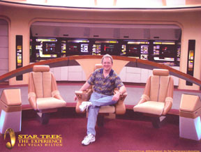
I may not have mentioned it, but it may be no surprise that I'm a Trekkie. (Some Trekkies insist on being called "Trekkers" because they find "Trekkie" demeaning. I think those Trekkies take themselves too seriously.) Star Trek was important to me. As an adult, I realize it's not tremendously deep or any kind of profound blueprint for life or society; nevertheless, it hit me at the right time in my life and made a difference. So when I read that Comic-Con planned to commemorate its 40th anniversary, I wrote and submitted an essay that they were kind enough to include in the Souvenir Book.
In point of fact, I doubt many of the 100,000-plus Con attendees read it. No one mentioned it to me in the three days I was there. It's kind of long and not the best thing I ever wrote. However, it's from the heart and I wanted to post it here. By the way, the first sentence is now inaccurate; I had a birthday since I wrote this several months ago.
The Ages of Man: An Appreciation of “Star Trek”
I am 45 years old: old enough to claim Star Trek: The Original Series (TOS) cred. I was there when Earth’s molten crust cooled, simple molecules linked to form complex proteins, and my family bought its first color television in time for me to feel the electric primary colors of “Star Trek” burn from ember-orange vacuum tubes through my retinas into my brain.
After 40 years, the thematic depth of the McCoy-Spock-Kirk trio has been well plumbed and hardly bears repeating. McCoy is emotion, Spock is reason, and Kirk is the balance between emotion and reason that draws on both to inform decisive action. Id, ego, superego. However, as I age, I’ve been surprised to find I gain new appreciation for these three characters as my understanding of them evolves. Their velour-bloused TOS incarnations haven’t changed since 1969. But I have.
When I was a child and teen, Spock was It: the apotheosis of alienated intelligence. His tools were logic, quiet confidence, and bone-dry wit. He defeated his enemies with brainpower. His weapons were
numbers and
words. Yet beneath that cool facade roiled overpowering emotions and superhuman strength barely contained. On the rare occasions Spock lost control, the results were unpredictable and frightening.
Adolescence never had a better metaphor.
Spock was important to me. He valued things I valued—reason, science, knowledge—and wasn’t embarrassed by it. I had a temper as a child; watching Spock struggle to maintain his self-control helped me tame it. He taught me grace under pressure. When a junior high bully twice my size picked me up and threatened to drench me under an overflowing rainspout, I replied with cold Nimoyan indifference, “I would actually prefer it if you didn’t,” and he released me with a laugh and enough respect to never bother me again. Being cool worked.
Spock was about restraint, temperance, placid courage, and the triumph of the intellect. He guided me through many rough passages as I matured, and got me safely to the other side.
Where I was met by James T. Kirk.
It’s always been easy to mock the flamboyant Kirk, yet I believe—in all sincerity and without a trace of condescending sarcasm—that Captain Kirk is one of the great characters of twentieth-century American fiction. Kirk
was twentieth-century America, or at least the best of how twentieth-century America saw itself: bold, confident, powerful, ambitious, thoughtful, resourceful, loyal, compassionate. Had a twinkle in his eye. Did all right with the ladies. Always found a way to win. Shatner made him that.
For the past couple of decades, Kirk has gotten a bad rap as a trigger-happy gunslinger. Slander! Not this man who agonized over decisions that sent crewmen to their deaths. Who knew Shakespeare and quoted Masefield. Who once had a Gorn by the throat (felled by a cannon Kirk fashioned from dirt and twigs, and I’d like to see you try it) and showed the impressively advanced trait of mercy.
Spock may have been superhumanly smart and strong but, like an adolescent, he wasn’t comfortable in his own skin. Kirk knew who he was, what he was doing, and why he was doing it. He was a man.
Of course, part of being a man is that you quit looking to fictional role models to show you how to be one. Unlike Spock in my youth, I can’t pinpoint aspects of my adult life consciously patterned after Kirk, unless you count his purposeful stride as he leaves the Enterprise’s chapel headed for the bridge at the end of “Balance of Terror.” Sometimes I walk like that. I like to think I’ve internalized some of his courage and cleverness, but until I actually have to face down a rock-melting Horta or drive a computer mad with illogic, how would I know? Nevertheless, if anyone had asked me between the ages of 20 and 40 to name the best character in the “Star Trek” canon, I would have said Kirk.
Perhaps I still would. But when I watch TOS lately I find myself powerfully drawn to Leonard McCoy and the understated performance of DeForest Kelley. I never cared for Bones when I was younger. He was a few years older than Kirk and a few watts dimmer than Spock. Distrustful of technology and contemptuous of trivial rules. Cranky. Jaded. Jowly. Maybe a little weary.
Maybe I’m beginning to relate.
McCoy trusted the ship to Kirk and Spock while he calmly commanded Sickbay, comfortable in his mastery, as much a man of science in his element as Spock was in his. If you needed someone to brew a telekinesis serum or reinstall a brain, there was no one better in the galaxy. He faced down a scalpel-wielding Khan and, in my favorite McCoy moment, knocked out Kirk and Spock to take their places in an alien torture chamber. McCoy had paid his dues and didn’t have anything to prove to anyone. Despite his occasional bluster, he was probably the most laid-back person on the ship.
Until recently, I might not have recognized the quiet heroism of a genuine mature adult who could be counted on to keep his cool and do the right thing. By now I’ve seen enough of the opposite in the real world to treasure those qualities wherever I find them.
Smart and Stylish
TOS was a sophisticated program for sophisticated viewers, and even before I finish typing this sentence I imagine scoffers pointing to its sometimes laughable effects and props, day-glo sets and costumes, outdated sexism, and overwrought melodramas with ham-handed morals as proof of my lunacy.
Touche.
On the other hand, audiences in the 1960s didn’t need to have everything spelled out for them. They understood the art of allegory in ways that seem to escape modern viewers. TOS charmers like “A Piece of the Action” or “Bread and Circuses” would be impossible in later decades because more modern audiences, blinded by literalism, know for a fact that when we eventually travel the galaxy we will not find strange new worlds populated by Chicago gangsters or twentieth-century Romans.
Guess what: we won’t find pointy-eared Vulcans or blue-hued Andorians, either. Guess what again: people knew that in the sixties, too.
Nor would modern audiences accept such highly stylized episodes as “The Empath” or “Spectre of the Gun” that deliberately screamed out, “This is a make-believe story filmed on a soundstage for your entertainment!” Today we applaud ourselves for seeing the mirrors and wires that sustain the illusion, not realizing that perhaps the greater skill lies in ignoring them. We’re not holding up our end of the artist-audience bargain.
(A similar erosion of sophistication killed the movie musical, I think. Audiences of the nineteen-thirties, forties and fifties knew as well as we do that overjoyed or heartbroken people don’t actually break into song and dance. They were just able to wrap their minds around it. We apparently cannot, and more’s the pity for us.)
TOS was a smart, stylish program of its time. The fact that many viewers and fans moved on to newer, flashier, darker, or grittier Trek incarnations that abandoned metaphor and humor, and felt compelled to actually explain why everyone in the galaxy spoke English and looked like an L.A. starlet, reflects worse on them than on the original “Star Trek.” If you’d rather watch an hour explaining how Klingons got bumpy foreheads than exploring why a half-black half-white man hates a half-white half-black man, I won’t argue. Everyone’s entitled to their taste and opinion. We can both call ourselves “Star Trek” fans, even if it turns out we don’t have all that much to talk about.
But you may be surprised to discover which Treks grow on you—and with you—in the long run.
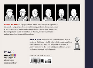
Brian Fies is a writer and cartoonist whose webcomic, Mom’s Cancer, won the 2005 Eisner Award for Best Digital Comic and is now available in print as a graphic novel published by Abrams Image.
 Blue Green Floral by Lynne White


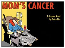
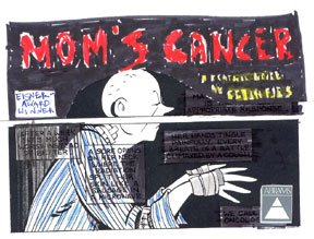 I wasn't immediately sold. I understood why he liked it, but I wanted to build the cover around my drawing of Mom sitting in the chemo chair. That was the very first picture I sketched when I conceived the idea of telling our family's story as a comic and it meant a lot to me. If I recall correctly, members of the cover committee found it too bleak and busy. I reluctantly moved on.
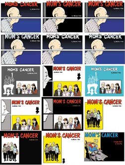
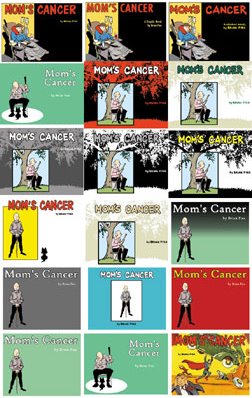
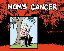
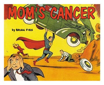 Anyway, after weeks of sketching, drawing, coloring and e-mailing, we at last arrived at the cover we did. I was happy, my editor was happy, the committee was happy. Most of all, my most important and potentially harshest critic, Mom, was happy. And Charlie called it pretty much from the start. Also note that on his mock-up, Charlie inserted a little caption box reading "Eisner Award Winner" when at the time I had not yet won it. Right again. This was not my last opportunity to learn to trust his judgment.


