My very first post on this blog was about winning the Eisner Award for Best Digital Comic at the 2005 Comic-Con International in San Diego. So it seems somehow symmetrical and right that my very last post follows my report on the same event almost exactly three years later.
Today I'm closing up shop here and opening a new establishment right around the virtual corner at
It'll be the same old stuff from the same old guy, which raises the question: Why bother? Why force my six regular readers to change their bookmarks and links? Who do I think I am?
Well, I'll explain...
First: my site stats show me that a lot of people arrive here while searching for help and information about cancer. Mom died October 1, 2005, and the fact is that I left Cancer World that day and haven't tried too hard to keep up. I'm not an expert on anything except my family's experience. I know Mom's Cancer still helps readers facing the same dizzying, baffling, frustrating challenges we did--I hear all the time from readers who continue to discover it anew--but my blog hasn't had much to offer those folks in a long time and I feel bad about that.
Second, and the reason I made a last-minute trip to this year's Comic-Con after I hadn't planned to go at all: I'm writing a new book. It's a graphic novel titled Whatever Happened to the World of Tomorrow? that I'm working on with my friend and Mom's Cancer editor Charlie Kochman to be published by Harry N. Abrams next spring. Charlie wanted me in San Diego to unveil it, along with other books being released under a new Abrams imprint named Abrams ComicArts, with Charlie as its newly promoted Executive Editor (Publishers Weekly ran a nice item about it here). There's some neat symmetry there as well: my first book was Charlie's first acquisition shortly after he arrived at Abrams; my next book will be his first original graphic novel under his new imprint.
Fact is, I've been working on this thing and keeping quiet about it for more than a year--maybe close to two--although I did let a few hints drop from time to time to time. Both Abrams and I had our reasons for playing our cards close to our vests, but 3 p.m. Saturday in San Diego we tipped our hand. Now that I can talk about my new book--just try to shut me up!--it makes no sense to do it on a blog named for my previous one. It makes even less sense to start a second blog for the new book and try to maintain two! So I decided to carry on with a new blog named after me, less out of ego than lack of imagination. Unless I change my name, I won't face this dilemma again.
This doesn't mean I'm moving past Mom's Cancer, or turning my back on it, or anything like that. I would have none of this without that book and my mother's great gift of allowing me to write it. As I said, I know new readers are still finding it all the time. In fact, Abrams has some new plans for Mom's Cancer I'm excited about. I'll continue to blog about it and Cancer World when I have reason to.
Same guy, same stuff--plus some new stuff.
I hope you'll follow me over to the new place to learn more about The World of Tomorrow but, if not, thanks for being here. I appreciate it.
...
Showing posts with label Publishing. Show all posts
Showing posts with label Publishing. Show all posts
Tuesday, July 29, 2008
Wednesday, May 21, 2008
Orphan Works
I wish I posted more often and regularly, but I've been awfully busy and blogging takes time, what with the thinking and writing and all. My site stats say a bunch of you check in regularly and I appreciate it.
"Orphan Works" is a topic that's really riled up my cartooning and illustrating acquaintances. Senate Bill S2913 is the Shawn Bentley Orphan Works Act of 2008 and HR5889 is its counterpart in the House. If the legislation passes, it will dramatically change copyright law in the U.S., and not for the benefit of creative types. I'm trying to educate myself and haven't actually yet read the text of the bill, so my comments are tentative and based on what others tell me.
As I understand it, Orphan Works are creative products--books, articles, essays, photos, artwork, cartoons--that somebody wants to reproduce but can't find the original copyright holder to pay or ask permission. As the law stands now, you'd be a criminal fool to say "what the heck" and use it anyway; someone owns the rights to the work even if you don't know who. If the Orphan Works bill passes, it would make it legal to do a diligent search for the work's original owners and, if you can't find them, not only go ahead and use it but register it for protection under your own copyright. What exactly constitutes a "diligent search" isn't defined.
Here's part of the problem: before 1978, if you created something and wanted to copyright it, you had to pay a small fee and register it with the U.S. Copyright Office. But in 1978 the law changed so that creators obtain copyright to their work the moment they create it without doing anything at all. You don't have to register or pay a fee; if you made it, you automatically own the legal rights to it and get to decide what happens to it. (If you want, you can still register with the U.S. Copyright Office, which does leave a useful paper trail. But you don't have to.) From the creator's point of view, that's great. It really cuts down on the hassle and expense. The drawback is that it doesn't create an official record for someone else to follow.
So let's say you wrote or drew something a few years ago. Maybe the publisher went out of business, maybe your signature or byline isn't legible, maybe your work is clearly marked “©1989 Bob Smith” but there are a million Bob Smiths in America so good luck finding the right one. Maybe you've got an old family photo posted on the Web. Or maybe you created one of those memes that just floats around the Internet. Next thing you know, someone else could take your work, register it as theirs, and crank out t-shirts, posters, books, movies and breakfast cereals based on your stuff. They could even prevent you from using it. And there's nothing you could do about it.
You can understand where the outrage comes from. Some artists call it legalized theft. Some imagine giant corporations laying claim to all the work they can find and bulldozing any creators who come out of the woodwork to object. Some fear the establishment of a registration clearinghouse--essentially a return to the pre-1978 situation--that could put them out of business (imagine being a magazine cartoonist creating 50 gags a week and having to register them all at $20 a pop).
I can actually see both sides of the issue. As a writer, I'm a very vigorous defender of copyright and I'd be outraged if someone took my words, art or characters and used them without my permission (if there's any exploiting to be done, it'll be by me!). I created 'em, I say what happens to 'em. I really despise the whole modern song-sharing software-pirating mash-up-media "information should be free" ethic. It's disrespectful. As I've written before: especially in a society that produces so few material goods anymore, the most valuable products we have are ideas; if you think my ideas are good enough to steal, you ought to think they're worth asking permission or paying for.
On the other hand... I'm working on a project now that incorporates bits of old artwork. One was copyrighted by General Motors in the 1940s, so I wrote GM (they've got a whole department for the purpose) and paid them a fair fee to license its use. Another was produced by a now-deceased artist in the 1950s, so I tracked down his estate and got their permission to use it. But there are other pieces done for publications long defunct by obscure artists long dead who as far as I can tell left no heirs. They're terrific work I'd really like to use but I can't and won't. That's a shame, and it also seems contrary to the original spirit of copyright, which was to give creators a reasonable time to profit from their work before freeing it for use by everyone (that's called "public domain," which is why anyone who wants to can write a Dracula or Sherlock Holmes story). Instead, the work is locked away and nobody benefits.
Still, it seems clear to me that the current Orphan Works bill is an abomination that ought to be stopped. It's an overkill solution to an insignificant problem. I'd urge you to write your legislators blah blah blah, and I have, but I don't really expect you to. I just thought you'd like to know what they're up to and why your favorite cartoonists may seem grouchy lately.

My copyright registration for Mom's Cancer.
So don't even think about trying any funny business.
.
Tuesday, September 04, 2007
MoCCA: Infinite Canvas
I see that New York's Museum of Comics and Cartoon Art (MoCCA) is promoting the exhibition Infinite Canvas: The Art of Webcomics, to which I've contributed four original pages from Mom's Cancer. The show will be up September 14 through January 14, 2008, with an opening reception on September 13. Unfortunately I won't be there, but I know some people who might make it and report back to me.
"The exhibit explores three aspects of online comics," reads MoCCA's blurb. "The unique format and design of webcomics, their appeal to niche audiences, and the transitions between web and print comics." Curator Jennifer Babcock further explains, "webcomics are free of the space constraints and editorial censorship to which printed comics are often subjected...." I agree with that sentiment completely. I also think that freedom to break all the rules doesn't necessarily carry an obligation to do so.
Let me back up to explain that the exhibition's title, "Infinite Canvas," comes (to the best of my knowledge) from Scott McCloud's notion that the Internet provides just that: an infinite canvas. Online, there's no need to restrict a comic to three or four panels, stick to traditional comic book page layouts, or draw in black and white. No need for most of the artistic constraints imposed on comics by 19th-century printing press technology. No need to avoid words that might emotionally scar five-year-old Suzy or give Grandma the vapors. We're finally free. Free!
So why do so few cartoonists take advantage of the limitless space, time and language available to them? Why do so many webcomics look exactly like their print counterparts? Why did mine?
I can't speak for anyone else--although I have some notions--but I put considerable thought into how I wanted Mom's Cancer to interact with the electronic medium that transmitted it. First, I designed the pages to be proportional to a least-common-denominator computer monitor. I wanted anyone on any computer to be able to read each page without scrolling or clicking. That in turn mandated the size I needed to draw to produce art that would be clear and legible at on-screen resolution. My decision was a deliberate break from the infinite canvas idea, which can obviously demand significant reader interaction (and allow the cartoonist to play with story flow as scrolling reveals and conceals information). Those were features I willingly gave up so that my readers could apprehend each individual page as a unit of story--a thought, an idea, a chunk of time. I did that on purpose.
Also, I always had hopes that Mom's Cancer might see print. I didn't know how, I couldn't imagine who would publish such a book, but I wanted to keep my options open. I drew in black and white, colored in the cyan-magenta-yellow palette needed for press, and saved high-resolution versions of everything (not high enough, I later learned, but that's another sad story). I think that same hope motivates more web cartoonists than would admit it, and partly explains why so few break out of the shackles of print: they want it. Print still matters.
For similar reasons, I wrote and drew Mom's Cancer to be as all-ages as possible. It's an adult story, but I wanted it accessible to readers from young children to great-grandparents. There's not a dirty word in it (I actually thought long and hard about the "My God" on Page 99 but couldn't conceive of anything better). I fought my first impulse to draw it dark and gothic with scritchy-scratchy cross-hatching, partly because I wanted it to look as friendly and familiar as a 1950s' comic strip. I wanted people who'd never read a comic or graphic novel to get comfortable and ease into the story, where I hoped to hit 'em between the eyes. The web gave me complete freedom--including the freedom to approach the audience however I wanted.
Still, I share McCloud's frustration (as I perceive it) that almost no one has grabbed webcomics by the horns and exploited the new medium's potential to create something never seen before. Literature done in a new visual language that couldn't have existed until today. Why do so many webcomics consist of tiny, repetitive, static panels of talking heads when they could be ... ANYTHING? I would very much like to see that someday--maybe even try to do it. But that's not what Mom's Cancer was intended to be. I've always seen it less as a webcomic than as a comic that happened to be on the web, and never pretended it was anything else.
.
Monday, August 13, 2007
Ends and Odds

I neglected to mention that I recently received copies of the Italian edition of Mom's Cancer--titled, oddly enough, Mom's Cancer. The last time I mentioned the Italian edition, I said I was surprised they didn't translate the title. Editor Lorenzo from my Italian publisher Double Shot-Bottero Edizioni was kind enough to reply that they "talked very much between us if we had to translate the title or not. At the end, we decided for the original title, because the word CANCRO still (frightens) people, and because the book was famous with its original title." That's a nice explanation.
Now that I have it in my hands, I'm happy to report that Lorenzo and his partners did a terrific job. I'm very happy with the look, feel, and quality of their work. Again, my thanks to them; I appreciate the risk they took and hope it's a success for them.
.
I think I've decided, with regret, to miss the Baltimore Comic-Con next month. It's not an easy decision. I'm honored, humbled, amazed to have my work nominated for three Harvey Awards, and believe that if someone pays you that kind of respect you should reciprocate by showing up. It seems like the least you could do. But the fact is I live on the other side of the country, the date conflicts with other commitments, and the cost of what would be a cross-continent hit-and-run round trip is pretty high. Editor Charlie is planning to attend and can represent me if I improbably win. I just don't want to leave any impression I take the nominations for granted, because I don't.
.
Wednesday should be interesting. A curator from the Norman Rockwell Museum in Massachusetts is coming to my home with a cameraman to film an interview that will, as I understand it, accompany the "LitGraphic" exhibition I'm participating in later this year. A couple of weeks ago I sent the museum nine of my favorite original pages from Mom's Cancer, which they'll display with the work of several other writer-cartoonist types. Although "sent" isn't quite the right word; the Rockwell people constructed a specially padded portfolio just the right size for my pages and dispatched an 18-wheel truck to pick it up. (To be fair, the truck was also picking up a lot of other art for other museum customers on its way cross country. But I'm greatly pleased to imagine they sent it just for my nine sheets of paper.) In short, the Norman Rockwell Museum is obviously a first-class professional organization used to working with a much better class of exhibitor than me. But I could get used to it.
.
Thursday, May 24, 2007
The Italian Job
Deadlines. You know the drill.
Editor Charlie forwarded me the cover art for the Italian edition of Mom's Cancer, which is being published next month by Double Shot-Bottero Edizioni. Looks a lot like the English edition, which is fine with me--although I also don't mind when a foreign publisher changes things up to fit their perception of the audience, as the French did. I find that very interesting. I'm surprised the Italian editors didn't translate the title.

I guess some writers demand painstaking control over how their work is presented overseas. I certainly understand that need but don't necessarily share it. My publisher Abrams has my foreign rights (which, as I've explained before, I voluntarily and happily assigned to them) and our understanding is that the pictures and words of Mom's Cancer remain as unaltered as translation allows. As long as I get that, I'm pretty flexible about format, cover art, soft or hard cover, etc. Of course I want it to look its best, but I figure the foreign publisher's job is knowing what appeals to their market. Since selling books is in our mutual interest, I don't mind investing some faith in them.
I got a very nice note from the Italian editor about a week ago, telling me that they debuted my book at a big national book fair and got a lot of positive response. They seem enthusiastic about it, which feels great. As always, I'm a bit befuddled and bedazzled that people I don't know halfway round the world are reading my story in a language I don't speak. Don't know if I'll ever get over that. Hope not.
.
Editor Charlie forwarded me the cover art for the Italian edition of Mom's Cancer, which is being published next month by Double Shot-Bottero Edizioni. Looks a lot like the English edition, which is fine with me--although I also don't mind when a foreign publisher changes things up to fit their perception of the audience, as the French did. I find that very interesting. I'm surprised the Italian editors didn't translate the title.
I guess some writers demand painstaking control over how their work is presented overseas. I certainly understand that need but don't necessarily share it. My publisher Abrams has my foreign rights (which, as I've explained before, I voluntarily and happily assigned to them) and our understanding is that the pictures and words of Mom's Cancer remain as unaltered as translation allows. As long as I get that, I'm pretty flexible about format, cover art, soft or hard cover, etc. Of course I want it to look its best, but I figure the foreign publisher's job is knowing what appeals to their market. Since selling books is in our mutual interest, I don't mind investing some faith in them.
I got a very nice note from the Italian editor about a week ago, telling me that they debuted my book at a big national book fair and got a lot of positive response. They seem enthusiastic about it, which feels great. As always, I'm a bit befuddled and bedazzled that people I don't know halfway round the world are reading my story in a language I don't speak. Don't know if I'll ever get over that. Hope not.
.
Saturday, May 12, 2007
San Diego e Italia
Yesterday I firmed up plans to attend the International Comic-Con in San Diego this July--meaning I finally found a place to stay, which is a genuine challenge when 100,000-plus descend on a city. As I mentioned earlier, the people who decide such things were nice enough to nominate Mom's Cancer for two Eisner Awards, and it seems polite to show up even though I don't expect to win (not being humble, just analytically realistic). It's a fun event regardless. I'll get to sign some books at my publisher's booth, see a few friends, and no doubt make one or two new ones. My wife and I also enjoy the city itself and we'll make a nice, not-all-comics-all-the-time vacation of it.
I also found out yesterday that the Italian edition of Mom's Cancer will be published in June. And that's literally all I know about that. I'm looking forward to seeing what they did with it.

I also found out yesterday that the Italian edition of Mom's Cancer will be published in June. And that's literally all I know about that. I'm looking forward to seeing what they did with it.
Thursday, May 10, 2007
Medical Humanities
My stats tell me there's a bunch of y'all who check my blog regularly and are more loyal than I deserve. Thanks.
One of Mom's ambitions for Mom's Cancer was that it might help physicians, nurses, and other medical professionals better understand the experience from the patient's side. We saw some signs that was happening almost from the start. One of the first, best e-mails I got when Mom's Cancer was still an online webcomic was from a nursing instructor in Australia who asked permission to include pages of my comic in her course materials. I've heard of it showing up in oncology clinics and smoking cessation programs. And probably the highlight of my entire book experience was a talk I gave to a group of hospice and healthcare professionals in Tucson last July, some of whom said my story would change the way they approached their jobs.
When Mom's Cancer first came out, my publisher Abrams got a list of oncologists and sent free review copies to a whole bunch of them. I thought that was a great idea and appreciated the expense and effort very much, but it's very hard to tell if something like that pays off. If Abrams got any response they didn't mention it to me. Just one doctor who really likes it and recommends it to patients and colleagues could make the whole push worthwhile, but you'll never know. It feels like throwing pebbles into the ocean.
A while ago I was helping my daughters buy college textbooks (by "helping" I mean "handing my charge card to the cashier") and saw Art Spiegelman's Maus and Marjane Satrapi's Persepolis stacked up for a literature class. Since everything's about me, I started wondering why Mom's Cancer couldn't be a textbook somewhere. But where? And with an epiphany that should have occurred to me months before--that in fact other people had explicitly told me but I hadn't quite registered--I realized that medical schools teach courses in "Medical Humanities" whose entire purpose is training new doctors to understand their patients' perspectives. Duh. Once I set my mind to it, it wasn't hard to put together a list of professors teaching Medical Humanities at medical schools across the country. Although I was perfectly willing to buy the books and pay the postage myself, when editor Charlie heard my plan ("You want how many books?") he took care of it even though I doubt it was in his budget. For which I'm grateful.
I've since heard back from a couple of profs who thanked me for the book and said they think it'd make a nice addition to their curricula. We'll see if they follow through--or more likely, we'll never know if they follow through. Pebbles in the ocean. The idea of flocks of new docs coming out of medical school having read my book is tremendously exciting. That's what it's all about. Mom had it figured out from the start.
.
Wednesday, May 02, 2007
Wimpy Kid: I Told You So

My friend Jeff Kinney's book, Diary of a Wimpy Kid, just made the New York Times Bestseller List for Children's Chapter Books, entering at number seven. Wow. I'm struggling to come up with a simile for how cool and amazing it is for a first-time author to crack the bestseller list right out the gate: like a minor-league pitcher getting called up to the majors to throw a no-hitter in the deciding game of the World's Series? Cooler than that.

Comic-Con 2006: Jeff Kinney on the left, me on the right, and our mutual editor Charlie Kochman butting in uninvited. I just noticed I'm wearing that same shirt today. I need a new shirt.I met Jeff at Comic-Con International in 2006, when our mutual editor Charlie brought us together so Jeff could tap the deep pools of experience and wisdom I'd accumulated during my whole year in the business (that's sarcasm). We had a good talk, I liked him a lot, and we've kept in contact since. I also reviewed Wimpy Kid when it was published earlier this year, and I'm feeling a little smug that I saw this success coming a mile away. You never know what the book-buying public will go for but I had a good feeling about this one--which, by the way, is the first of a three-book Wimpy Kid series and, I strongly suspect (hint hint), much more to come.
Anyway, congratulations to Jeff, a great guy who I know truly appreciates his good fortune. My young Padawan learner has become a powerful Jedi knight with more midichlorians than I'm apparently packing. If it were anybody else, I'd be jealous; in Jeff's case, I'm just very happy for him.
.
Tuesday, March 06, 2007
Originals Shmoriginals
This post might be a bit too "inside baseball" for some, but I know a few people who'll appreciate it. If you're not one of them, thanks for your indulgence.
The nice folks at the Norman Rockwell Museum e-mailed me a wish list of the original art from Mom's Cancer they'd like to include in their "LitGraphic" exhibition, which opens this November. I was sorry to inform them that, of the eight pages they requested, four of them suffered from a minor problem called "not actually existing."
I am a proud cartooning dinosaur, drawing with brush, pen, ink, and a strong aesthetic that if paper was good enough for McCay, Kelly and Schulz then, by Zeus, it's good enough for me. But something I noticed in the many months it took me to draw (and live through) Mom's Cancer was how my relationship with digital art--specifically Photoshop--grew and evolved in that time. For example, on Page 10 of my book, I drew a picture of Mom metaphorically drowning in a sea of medical jargon.
 As I say, I'm not entirely happy about this state of things. Original cartoon art is very, very cool and I've always gotten both pleasure and education from studying it. I'm afraid we'll have volumes of great original hand-crafted art from the 19th and 20th centuries that will last forever and then nothing from the 21st century onward, as more and more of it is done digitally on media that won't survive a couple of decades (anybody got a 5.25-inch floppy drive?). That's a great loss.
I think the best I can do is value hand-crafted physical artwork and continue to do as much of it as I practically can, within the bounds of modern reproduction requirements and sanity. Although I've become much more proficient with, and even dependent on, Photoshop, I'd much rather spend hours hunched over a drawing board than a computer monitor. Originals matter.
.
By the way, I gave the Rockwell Museum a good list of alternative pages that do exist. We'll see what they like.
.
The nice folks at the Norman Rockwell Museum e-mailed me a wish list of the original art from Mom's Cancer they'd like to include in their "LitGraphic" exhibition, which opens this November. I was sorry to inform them that, of the eight pages they requested, four of them suffered from a minor problem called "not actually existing."
I am a proud cartooning dinosaur, drawing with brush, pen, ink, and a strong aesthetic that if paper was good enough for McCay, Kelly and Schulz then, by Zeus, it's good enough for me. But something I noticed in the many months it took me to draw (and live through) Mom's Cancer was how my relationship with digital art--specifically Photoshop--grew and evolved in that time. For example, on Page 10 of my book, I drew a picture of Mom metaphorically drowning in a sea of medical jargon.

Now, I actually did that: the jargon was printed onto a sheet of paper that I carefully trimmed to size, glued to my two-ply bristol board, and painstakingly cut around the shapes of Mom, the waves, the bubbles, and the caption. That's what the original looks like.
.
But that's insane! The way to do that panel right (which is to say, the way I would've done it six months later or today) is to create Mom, the jargon, the captions, and the bubbles as separate elements and then layer them atop each other in Photoshop. It'd take one-twentieth the time and look much better. The only downside is that there'd be no original ... just scattered bits and pieces, half of them ephemeral electrons on a hard drive.
I'd regret that. But I'd still do it. Sometimes it's nearly unavoidable. For example....
One of the originals the Rockwell people asked for was the two-panel image of Mom on Page 47 that we also adapted for the cover. Now, Mom's Cancer began life as a Webcomic. Here's how that original looked:
A year later, Abrams agreed to publish Mom's Cancer and Editor Charlie picked this image as the one he wanted for the cover. Two problems: I needed to get rid of the captions--which meant I had to draw what was hidden "behind" them--and I frankly thought I could draw it better. Best to start from scratch. So I drew this:
Obviously the captions are gone. The large space to Mom's right that I inked black in the first version is now blank, to be filled with color as we choose. And there are also no stripes on Mom's shirt. I wasn't sure we'd want the stripes for the cover and I was thinking about trying some fancy color separation stuff so, using a light box to trace over the drawing above, I drew those on a separate sheet of paper:
Then, combining the new drawing of Mom with the separate stripes and captions cut-and-pasted from the Web original gave me the published Page 47:
 Combining the same elements differently, cropping, and adding color gave me a book cover. The only thing this process didn't give me was, again, an original that looks like either Page 47 or the cover.
There's a tiny subsequent irony. When we were getting ready for my book's debut, Abrams wanted to make buttons using Mom's profile. The problem was that in my new art, I'd still drawn her with a panel gutter bisecting her head. So for the button graphic I had to digitally erase the panel borders and fill in the missing details. If I'd been smart, I would've drawn it without the panels in the first place. Yet another non-existent original.
As I say, I'm not entirely happy about this state of things. Original cartoon art is very, very cool and I've always gotten both pleasure and education from studying it. I'm afraid we'll have volumes of great original hand-crafted art from the 19th and 20th centuries that will last forever and then nothing from the 21st century onward, as more and more of it is done digitally on media that won't survive a couple of decades (anybody got a 5.25-inch floppy drive?). That's a great loss.I think the best I can do is value hand-crafted physical artwork and continue to do as much of it as I practically can, within the bounds of modern reproduction requirements and sanity. Although I've become much more proficient with, and even dependent on, Photoshop, I'd much rather spend hours hunched over a drawing board than a computer monitor. Originals matter.
.
By the way, I gave the Rockwell Museum a good list of alternative pages that do exist. We'll see what they like.
.
Tuesday, February 27, 2007
More from France
This morning I received a very nice e-mail from my French publisher, Editions Ca et La. In addition to saying some kind things about my book that I'll keep to myself, the note pointed me to some good reviews that Le Cancer de Maman has been getting in France that I wanted to pass on. Because I'm a braggart.
The first appeared in "20 Minutes," which my publisher describes as a national free daily newspaper:
The first appeared in "20 Minutes," which my publisher describes as a national free daily newspaper:

A poor and inadvertently humorous translation provided by AltaVista's BabelFish: "The fight against the nicotinism invests to the data base, even if it is in an indirect way, in the Cancer of Mom (éd. Ca & Là), of the American Brian Fies. Published at the origin on the Web site of the author, this log book has reported the tests crossed by its family, when one diagnoses with his mother, smoky for forty-five years, a lung cancer métastasé, with a brain tumour.
"Direct and poignant, the account unrolls without pathos the daily newspaper of the disease, with its batch of hopes and discouragements. Just like it pins the mistakes of the medical profession, whose certain inconsistencies add to the ambient anxiety. The author however defends himself to overpower whoever, affirming in his foreword to have only wanted 'to bear witness to those which needed some'. It is all the force of this upsetting album, rewarded for prestigious Eisner Award into 2005 before gaining, in the United States, a popular and commercial success deserved."
Le Cancer de Maman was also favorably mentioned on the February 17 radio program "Oui FM" (podcast here), and was reviewed on a television health magazine program "Le Magazine de la Sante," near the end of this video. Finally, there was a very positive review posted on ActuaBD, a French website devoted to comic books.
In the comments of my post of February 22, my friend Ronnie considerately translated an online review she found of Le Cancer de Maman and Miriam Engelberg's Cancer Made Me a Shallower Person, whose title in French became How Cancer made me Love TV and Crosswords. Which I think is perfect.
By the way, I don't take any of this stuff for granted. It would be hard to describe how grateful I am and how surreal it sometimes seems, that I am even in a position to type words like "my French publisher." Someday, if I can figure out a way not to sound too full of myself, I'll write about how weird it is to have this exciting parallel life as an author that almost never intersects with my boring everyday life. But I probably shouldn't overthink that.
Mom would've been thrilled. Many thanks to Editions Ca et La.
.
Thursday, February 22, 2007
Le Cancer de Maman
I'm not entirely sure, but as best I can tell the French edition of Mom's Cancer, titled Le Cancer de Maman, was released this week. I mentioned last November that I'd been looking over a couple of cover designs for the French version. Here's what they went with:

Back in November, Editor Charlie e-mailed it to me without comment, then called later to ask my opinion. "I love it," I said. "Really?" he replied. "I don't." We then engaged in a charming round-robin discussion that went like, "Tell me what you don't like, I really respect your opinion," "No no, it's your book, if you like it that's fine with me," repeat in a loop for 15 minutes. We're a real comedy team.

Abrams used a similar treatment of the images on the back cover of the U.S./English edition. I really liked it there and I really liked it here.
Quick Behind-the-Scenes Story #1: in the first French cover design I was shown, the background was a much lighter shade of blue. The highlight on Mom's sweater was white, as in the original art, and I think her sweater was the darker blue-gray tone. It really didn't work in color; it looked like Mom was wearing a sporty ski sweater with a stripe down the sleeve. My only suggestion was to make the highlight a light blue-gray instead of white, and I think they then went ahead and switched the light and dark blue-grays so that the highlight became a shadow. That's fine by me.
Quick Behind-the-Scenes Story #2: Last I heard, the French publisher had rejected this cover and was going to go with one that looked very much like the profile of Mom used in the English and German editions. If they switched back to this one it's a surprise to me, but this is what's showing up on Amazon.fr and elsewhere so I guess that's it. Again, fine by me.
I hope to have some hard copies in my hands soon. It's a cool and vaguely unsettling experience to see my work translated into other languages. I've said before that writing a book feels a little like sending kids off to college, in that you don't really know how they're doing or who they're hanging around with when they escape your grasp. In this case, my kids moved to another country and returned speaking a language I don't understand.
Which is still fine by me.
.
.
A Follow-Up Comment on my Recent Book Reviews: I am informed by someone who knows and loves me very much that I am, as I feared, an enormous wheezing bag of hot gas.
.
Back in November, Editor Charlie e-mailed it to me without comment, then called later to ask my opinion. "I love it," I said. "Really?" he replied. "I don't." We then engaged in a charming round-robin discussion that went like, "Tell me what you don't like, I really respect your opinion," "No no, it's your book, if you like it that's fine with me," repeat in a loop for 15 minutes. We're a real comedy team.
.
The sequence of drawings on the cover is taken from a page of the book in which I show Mom's conflicting and wavering sense of responsibility for her illness while at the same time she loses her hair to chemotherapy:
Abrams used a similar treatment of the images on the back cover of the U.S./English edition. I really liked it there and I really liked it here.
Quick Behind-the-Scenes Story #1: in the first French cover design I was shown, the background was a much lighter shade of blue. The highlight on Mom's sweater was white, as in the original art, and I think her sweater was the darker blue-gray tone. It really didn't work in color; it looked like Mom was wearing a sporty ski sweater with a stripe down the sleeve. My only suggestion was to make the highlight a light blue-gray instead of white, and I think they then went ahead and switched the light and dark blue-grays so that the highlight became a shadow. That's fine by me.
Quick Behind-the-Scenes Story #2: Last I heard, the French publisher had rejected this cover and was going to go with one that looked very much like the profile of Mom used in the English and German editions. If they switched back to this one it's a surprise to me, but this is what's showing up on Amazon.fr and elsewhere so I guess that's it. Again, fine by me.
I hope to have some hard copies in my hands soon. It's a cool and vaguely unsettling experience to see my work translated into other languages. I've said before that writing a book feels a little like sending kids off to college, in that you don't really know how they're doing or who they're hanging around with when they escape your grasp. In this case, my kids moved to another country and returned speaking a language I don't understand.
Which is still fine by me.
.
.
A Follow-Up Comment on my Recent Book Reviews: I am informed by someone who knows and loves me very much that I am, as I feared, an enormous wheezing bag of hot gas.
.
Friday, December 29, 2006
Helfen und Hoffen
I had a very fine Christmas and hope you did too. I'm back home and easing into work (most of my clients took the week off so it's light), and won't bore you with a list of gifts I received except to say they included a couple of good books and good toys, plus too much good food.
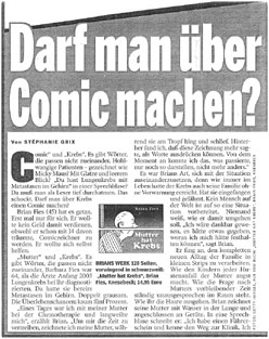
Just before Christmas I did receive a swell package from my German publisher Knesebeck: an envelope packed with German-language articles and reviews of Mom's Cancer (aka Mutter Hat Krebs) dating back to March. There were more than two dozen clips, some from prominent publications such as Zeit Wissen, Bunte, Bild am Sonntag, Suddeutsche Zeitung, and Stuttgarter Zeitung. A cover note from my contact at Knesebeck thanked me and added, "Your book was very well received in Germany," and from what I can understand picking through the reviews armed only with long-forgotten high school German and the Babelfish online translator, I think it was.
I've said before that it's a little unsettling to think of my words and pictures existing out in the world on their own, not knowing what mischief they're up to, only getting an occasional e-mail or postcard to let me know they're alive--moreso when those notes are written in a foreign tongue. I sent two kids to college last fall and, although I take my children's fates much more seriously than my cartoons', it's a similar feeling.
Sometimes I can tell a review has appeared when I see a jump in Web visitors from a particular region or referring URL and follow that trail back to its source. I confess I even Google my title once in a while just to see if anything new turns up. But by and large I have no way of knowing what anyone is saying about my book or if they're saying anything at all. Until I opened the envelope from Knesebeck I was aware of only two or three of these German reviews. Which made it a fine Christmas gift indeed.
I haven't heard anything lately about French or Italian editions that I understand are in the works. I'm assured that everything's fine, it just takes time. When I originally put Mom's Cancer on the Web I of course knew it might be read around the world, and the e-mails I received from Australia, Israel, Brazil, Europe and elsewhere were thrilling. But somehow seeing my work translated into another language, and reading articles and reviews about my work in that language, makes it more real. Mom hoped her story would inform, comfort, and help other people; although Mom's Cancer isn't a high-profile best-seller, and I remain a bit frustrated that so many people who might get something out of it will never see it, this packet of German reviews reminds me how well we've succeeded--really, far beyond any reasonable expectations we could have had.
Which isn't to say we've exceeded any unreasonable expectations. Like Han Solo said when told his reward for saving Princess Leia would be more wealth than he could imagine, "I don't know. I can imagine quite a bit."
Just before Christmas I did receive a swell package from my German publisher Knesebeck: an envelope packed with German-language articles and reviews of Mom's Cancer (aka Mutter Hat Krebs) dating back to March. There were more than two dozen clips, some from prominent publications such as Zeit Wissen, Bunte, Bild am Sonntag, Suddeutsche Zeitung, and Stuttgarter Zeitung. A cover note from my contact at Knesebeck thanked me and added, "Your book was very well received in Germany," and from what I can understand picking through the reviews armed only with long-forgotten high school German and the Babelfish online translator, I think it was.

I've said before that it's a little unsettling to think of my words and pictures existing out in the world on their own, not knowing what mischief they're up to, only getting an occasional e-mail or postcard to let me know they're alive--moreso when those notes are written in a foreign tongue. I sent two kids to college last fall and, although I take my children's fates much more seriously than my cartoons', it's a similar feeling.
Sometimes I can tell a review has appeared when I see a jump in Web visitors from a particular region or referring URL and follow that trail back to its source. I confess I even Google my title once in a while just to see if anything new turns up. But by and large I have no way of knowing what anyone is saying about my book or if they're saying anything at all. Until I opened the envelope from Knesebeck I was aware of only two or three of these German reviews. Which made it a fine Christmas gift indeed.
I haven't heard anything lately about French or Italian editions that I understand are in the works. I'm assured that everything's fine, it just takes time. When I originally put Mom's Cancer on the Web I of course knew it might be read around the world, and the e-mails I received from Australia, Israel, Brazil, Europe and elsewhere were thrilling. But somehow seeing my work translated into another language, and reading articles and reviews about my work in that language, makes it more real. Mom hoped her story would inform, comfort, and help other people; although Mom's Cancer isn't a high-profile best-seller, and I remain a bit frustrated that so many people who might get something out of it will never see it, this packet of German reviews reminds me how well we've succeeded--really, far beyond any reasonable expectations we could have had.
Which isn't to say we've exceeded any unreasonable expectations. Like Han Solo said when told his reward for saving Princess Leia would be more wealth than he could imagine, "I don't know. I can imagine quite a bit."
Tuesday, November 28, 2006
I've Been One Poor Correspondent
Apologies again for not posting more frequently. The Thanksgiving holiday combined with the rush of several end-of-the-year work projects consumes a lot of time. A few odds and ends today:
I just got off the phone with a reporter for the Berlin newspaper Der Tagesspiegel who is doing a story on Mom's Cancer from the healthcare book perspective. I thought it was a very nice interview, with a few thoughtful questions I hadn't been asked before, and the reporter was very knowledgable about comics and graphic novels. In fact, he said he hopes to place a second article about Mom's Cancer with a magazine that would address the graphic novel angle. No idea when either article will appear, but he promised to send me copies.
I just got off the phone with a reporter for the Berlin newspaper Der Tagesspiegel who is doing a story on Mom's Cancer from the healthcare book perspective. I thought it was a very nice interview, with a few thoughtful questions I hadn't been asked before, and the reporter was very knowledgable about comics and graphic novels. In fact, he said he hopes to place a second article about Mom's Cancer with a magazine that would address the graphic novel angle. No idea when either article will appear, but he promised to send me copies.
 What the cool kids are reading in Germany.
I've been looking over a couple of cover designs for the French edition of Mom's Cancer. I'll post them here when I can, but have been asked to keep them under wraps for now. Foreign publishing is an interesting topic in general. Overseas publishers who acquire the rights to print Mom's Cancer in their countries often have their own ideas about looks or formats that will sell best locally. For example, the French cover might look very different. As long as the content of the story remains intact, I'm pretty easy-going about how it's presented.
A lot of authors retain foreign rights but I was frankly happy to let my publisher have them; negotiating contracts in other languages with unfamiliar legal systems sounds like the Tenth Circle of Hell to me. As a consequence, I really have very little to do with my book's fate in non-English-speaking nations, although Editor Charlie and Abrams are extremely considerate and solicitous about keeping me involved and happy (thanks, Jutta!).
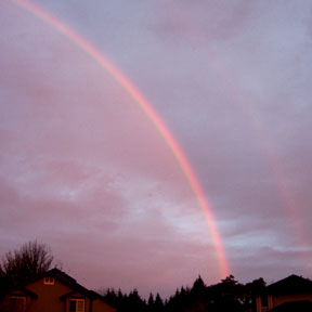
I'll sign off with this photo of a rainbow, which my wife took a couple of days ago. You can just see a wisp of secondary rainbow to the right, with a hint of Alexander's dark band between them. Everyone knows that the sequence of colors in the primary and secondary rainbows are the opposite of each other, right? (Optics was my favorite physics course.)

What I find interesting about this photo is that my wife took it early in the morning, just after sunrise. Since a rainbow forms in the sky opposite the sun--in fact, the shadow of the observer's head always points to the exact center of a rainbow's arc--this is just about as big and high in the sky as a rainbow can be, almost a complete half-circle. (And yes, pedants, I'm aware of circumstances that create full-circle and more exotic rainbows. You know what I mean.)
Where was I? Sleeping, of course.
(We now enter the free-association portion of today's post). It was a rainbow that destroyed any esteem I might have once held for "Painter of Light" Thomas Kinkade. Don't get me wrong, I was never a fan of his syrupy sentimentality, but I could understand the appeal of his work and considered him technically accomplished. That was, until the day I saw one of his typically majestic mountain vistas with a beautiful rainbow suspended in a spot where no rainbow could possibly exist. I think one of the primary functions of art is to tell the truth as the artist sees it; even if I disagree with their vision or dispute their skill, I should be able to count on their integrity. By painting a rainbow that neither he nor anyone who ever walked our planet had ever seen, Kinkade revealed himself to me as a big fat liar. When you call yourself the "Painter of Light," you have a responsibility to get the light right.
Some people become less judgmental with age. I'm trying to become more.
Thursday, November 16, 2006
Kerning
In yesterday's post about digital type, I bemoaned the inability of my custom hand-lettered font to do kerning. That's because I'm a big dummy--but a big dummy who can be taught. Ten minutes ago I figured out that I can do kerning with the Type Tool in Photoshop, and I got so excited I had to share.
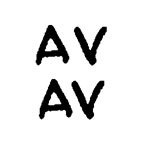
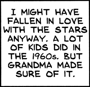
Kerning means making individual letter shapes fit together in ways that are pleasing to the eye. A good example are the letters "A" and "V," whose sides have complimentary slopes. In the top example below, the letters are printed next to each other without kerning, while in the bottom example I used kerning to slightly overlap them (see how the top left of the "V" hangs over the bottom right of the "A") and reduce the empty space between.
Kerning means making individual letter shapes fit together in ways that are pleasing to the eye. A good example are the letters "A" and "V," whose sides have complimentary slopes. In the top example below, the letters are printed next to each other without kerning, while in the bottom example I used kerning to slightly overlap them (see how the top left of the "V" hangs over the bottom right of the "A") and reduce the empty space between.
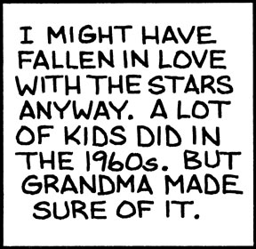
In yesterday's example caption, the words "STARS" AND "LOT" caught my eye, both due to the letter "T." T is a good candidate for kerning since it's got all that empty space at the bottom that many slanted letters could slide into. Here are the two words, without and with kerning around the T's:
 I think the bottom example is easier on the eye. Notice that kerning doesn't mean squishing all the letters together (that's "tracking"), but overlapping the space only between certain letters. If it's absent, words can subconsciously look funny even if you can't figure out why; if you do it right, no one ever notices.
I'm so happy I can kern. And it's still prodigiously faster than lettering by hand.
By the way, this is how I spend my time instead of working.
Wednesday, November 15, 2006
Man of Letters
I did something cool recently that I think turned out pretty well and could save me a lot of time and effort in the future. So why do I feel a bit ambivalent about it?
Fontifier is an online service that for $9 will turn your handwriting (or, really, any characters or squiggles you want) into a True Type font that can be used in Word, Photoshop, and most any other application you'd use on a computer. You download a form, print or paste your upper- and lower-case letters into the appropriate squares, upload the form, pay your $9, and seconds later download your custom font. There are a few things to watch out for, but it's pretty easy. Other people provide the same service and I'm not necessarily endorsing Fontifier, it's just the one I happened to try.
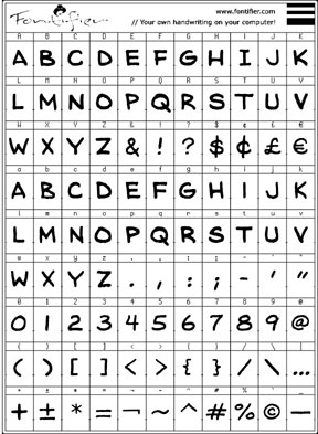
I composed my font digitally, cutting and pasting individual letters from my original Mom's Cancer scans into the Fontifier form using Photoshop. I customized the font to meet my unique needs. Since cartoon lettering is almost always upper-case, I used capital letters for both upper- and lower-case characters, so I have two capital A's, B's, C's, and so forth in case I want to mix things up (handy if you don't want all your letters to look too uniform in a phrase like "No one noshed on one noodle at noon"). I redefined other keys to print characters I thought I'd use more. My form looked like this:
I'll digress to explain that lettering seems to be the part of making comics that cartoonists hate most. It's time-consuming, tedious, and exacting. It's also a real craft in its own right; in the old days, professional letterers made good livings hand-printing words for comic books and strips. Very few cartoonists did their own lettering (Charles Schulz being a notable exception) and it added time and expense to their production.
In contrast to many, I never hated lettering. I always looked at it as a final editing opportunity: a word doesn't count until I put it on the page. Occasionally I could make the letters themselves an interesting graphic element. The act of lettering could also be engrossing. Once you get into a rhythm, time flies enjoyably. Still, there's no denying that it takes a lot of time and leaves little room for error.
So I thought I'd try to digitize.
The first caption box below is my hand lettering as it appears on Page 77 of Mom's Cancer. The box immediately below it is the same caption typed using my custom font.
Fontifier is an online service that for $9 will turn your handwriting (or, really, any characters or squiggles you want) into a True Type font that can be used in Word, Photoshop, and most any other application you'd use on a computer. You download a form, print or paste your upper- and lower-case letters into the appropriate squares, upload the form, pay your $9, and seconds later download your custom font. There are a few things to watch out for, but it's pretty easy. Other people provide the same service and I'm not necessarily endorsing Fontifier, it's just the one I happened to try.
I composed my font digitally, cutting and pasting individual letters from my original Mom's Cancer scans into the Fontifier form using Photoshop. I customized the font to meet my unique needs. Since cartoon lettering is almost always upper-case, I used capital letters for both upper- and lower-case characters, so I have two capital A's, B's, C's, and so forth in case I want to mix things up (handy if you don't want all your letters to look too uniform in a phrase like "No one noshed on one noodle at noon"). I redefined other keys to print characters I thought I'd use more. My form looked like this:

I'll digress to explain that lettering seems to be the part of making comics that cartoonists hate most. It's time-consuming, tedious, and exacting. It's also a real craft in its own right; in the old days, professional letterers made good livings hand-printing words for comic books and strips. Very few cartoonists did their own lettering (Charles Schulz being a notable exception) and it added time and expense to their production.
In contrast to many, I never hated lettering. I always looked at it as a final editing opportunity: a word doesn't count until I put it on the page. Occasionally I could make the letters themselves an interesting graphic element. The act of lettering could also be engrossing. Once you get into a rhythm, time flies enjoyably. Still, there's no denying that it takes a lot of time and leaves little room for error.
So I thought I'd try to digitize.
The first caption box below is my hand lettering as it appears on Page 77 of Mom's Cancer. The box immediately below it is the same caption typed using my custom font.

The top box has an undeniable rough-hewn hand-crafted quality... some might even say a naive charm. It says something about me, and that something is: "I am not a professional letterer." I think the bottom box is better. Characters are uniform (duh), lines are straight and evenly spaced, everything's centered. Any lost personality is more than offset by improved quality. And it is still my handwriting.
It also took about one-fiftieth the time.
I want to point out one fine detail about the art of lettering that a lot of people miss. I made two versions of the letter "I," one with serifs (the little horizontal lines at top and bottom) and one without. The serif "I" should be used when it stands alone, as at the start of the first sentence. The sans-serif "I" should be used everywhere else. It's just a spacing/style thing that the old pros knew and a lot of punk kids don't.
So whence my ambivalence? In general, I value hand-crafted artwork and stand like an ink-stained dinosaur against the irresistible forces of computerization and digitization. More and more artists and cartoonists are working entirely on the computer and, although some are very skilled, I think it's a terrible trend. I think the computer imposes a uniformity of style and technique that artists aren't even aware of. Unless you're really good, everything drawn on a Wacom tablet and colored in Photoshop looks the same to me. "When your only tool is a hammer, every problem looks like a nail."
I think we're in danger of losing entire media of artistic expression--charcoal, ink wash, pastel, watercolor--simply because they're not easy to duplicate or manipulate on a computer. I've seen discussions in which cartoonists describe elaborate multi-layer Photoshop processes aimed at producing the same effect they could achieve in 10 seconds with a brush and drop of paint. I want to scream at the them, "Just DRAW the darn thing!"
In my opinion, computerization homogenizes while removing flavor. And, entirely personally, it drains most of the fun, as well. I enjoy putting ink and paint onto paper in a way I've never once enjoyed clicking a computer mouse.
Anyway, it's already an old argument among cartoonists and I'm pretty sure I've taken my stand on the losing side. But if someone told me I had to stop using paper and ink in favor of the computer, I think I'd probably rather quit altogether. It just wouldn't be something I'd want to do anymore.
Is digital lettering my first step down the slippery slope? I doubt it, but I admit I'm worried. I also think my friend Patricia Storms, who has stood on the side of the dinosaurs with me, might be disappointed in me. Fontifier isn't a terribly sophisticated font generator (my kingdom for kerning), and for future professional work I might try something more advanced (and expensive). But I think once you've lettered digitally, there's no going back.
Friday, August 25, 2006
Color Experiment 1
In anticipation of my next project, I've been experimenting with different ways of handling color. Coloring black-and-white line art is a challenge in digital media. Cartoonists spend a lot of time debating and sharing the best ways to achieve the look they want and have it appear in print as intended.
Of course, one approach is to simply color the original with inks, watercolors, markers, etc., then scan it as a single work of art the same way you would a photograph. The main drawback is that you only get one shot at that; mess up the coloring and you're starting over from scratch. A more subtle drawback is that printed blacks come out much cleaner and blacker if they can be printed by themselves. It's good to keep blacks and colors separate if possible.
Another approach is to scan the line art and then color it digitally with Photoshop or similar software. That's what I did on Mom's Cancer. Once you learn to do that right, it works pretty well. Some artists (not me) are Photoshop masters who can use different techniques and effects to create beautiful work. But unless you're really good (again, not me), I think Photoshopped work has a sterile quality I dislike.
A similar approach is to do the entire project digitally, line art included. Increasing numbers of artists work entirely on the computer, start to finish. Without igniting a heated "Digital/Paper" debate, I'll just say I don't have the equipment to do that and wouldn't want to if I did.
In fact, I feel pretty strongly that I'd like to go the other direction, making my work as hand-crafted as possible. It's more fun and shows more life and personality. Today's experiment was aimed at finding a new way of doing a black-and-white drawing on one piece of paper, watercolor on another piece of paper, and combining them in Photoshop.
Here's my line art:
This is india ink on bristol board, about 5.5 x 8.5 inches, done with a brush. To start, I scanned this at a very high resolution (1200 dpi) in bitmap mode to capture nothing but pure black and white--no grays.
In Photoshop, I flopped (reversed right-to-left) the image. I then printed this reversed version onto an 8.5 x 11 inch sheet of watercolor paper. This became the back of the surface I painted; I used a lightbox to see the drawing through the paper and painted on the other side. The result looked like this:
Remember, the flopped line art is printed on the other side and I could see it while I painted. I could have simply put a piece of watercolor paper over the original drawing and, with light shining through both sheets, painted it that way. But everytime I try that I can never keep the two sheets lined up, even with registration marks and tape. By printing the line art on the back of the actual watercolor paper, I made sure it didn't go anywhere. Also, I want the option of doing the line art and coloring at two very different scales. For example, with this technique I could draw my line art huge, shrink it down, and color it with tiny of splashes of paint to create a particular look. In this case, the painted image is just a little smaller than the corresponding line art.
Then I scanned the watercolor, selected the black line art from the original, pasted it on top of the color, matched them up, and cropped. Only the blue sky is colored digitally. The composite picture looks like this:
Not my neatest paint job ever, and if I were doing this for real I'd probably do quite a bit of supplemental touch-up and color detailing in Photoshop. But this is basically the look I was going for and I got a few ideas to try next time. All-in-all, a pretty successful experiment.
Of course, one approach is to simply color the original with inks, watercolors, markers, etc., then scan it as a single work of art the same way you would a photograph. The main drawback is that you only get one shot at that; mess up the coloring and you're starting over from scratch. A more subtle drawback is that printed blacks come out much cleaner and blacker if they can be printed by themselves. It's good to keep blacks and colors separate if possible.
Another approach is to scan the line art and then color it digitally with Photoshop or similar software. That's what I did on Mom's Cancer. Once you learn to do that right, it works pretty well. Some artists (not me) are Photoshop masters who can use different techniques and effects to create beautiful work. But unless you're really good (again, not me), I think Photoshopped work has a sterile quality I dislike.
A similar approach is to do the entire project digitally, line art included. Increasing numbers of artists work entirely on the computer, start to finish. Without igniting a heated "Digital/Paper" debate, I'll just say I don't have the equipment to do that and wouldn't want to if I did.
In fact, I feel pretty strongly that I'd like to go the other direction, making my work as hand-crafted as possible. It's more fun and shows more life and personality. Today's experiment was aimed at finding a new way of doing a black-and-white drawing on one piece of paper, watercolor on another piece of paper, and combining them in Photoshop.
Here's my line art:

This is india ink on bristol board, about 5.5 x 8.5 inches, done with a brush. To start, I scanned this at a very high resolution (1200 dpi) in bitmap mode to capture nothing but pure black and white--no grays.
In Photoshop, I flopped (reversed right-to-left) the image. I then printed this reversed version onto an 8.5 x 11 inch sheet of watercolor paper. This became the back of the surface I painted; I used a lightbox to see the drawing through the paper and painted on the other side. The result looked like this:

Remember, the flopped line art is printed on the other side and I could see it while I painted. I could have simply put a piece of watercolor paper over the original drawing and, with light shining through both sheets, painted it that way. But everytime I try that I can never keep the two sheets lined up, even with registration marks and tape. By printing the line art on the back of the actual watercolor paper, I made sure it didn't go anywhere. Also, I want the option of doing the line art and coloring at two very different scales. For example, with this technique I could draw my line art huge, shrink it down, and color it with tiny of splashes of paint to create a particular look. In this case, the painted image is just a little smaller than the corresponding line art.
Then I scanned the watercolor, selected the black line art from the original, pasted it on top of the color, matched them up, and cropped. Only the blue sky is colored digitally. The composite picture looks like this:

Not my neatest paint job ever, and if I were doing this for real I'd probably do quite a bit of supplemental touch-up and color detailing in Photoshop. But this is basically the look I was going for and I got a few ideas to try next time. All-in-all, a pretty successful experiment.
Wednesday, August 16, 2006
Extended Coverage
Comics expert, historian and Web buddy D.D. Degg commented on yesterday's post that he tried to click on my cover montage to view individual thumbnails up-close. No dice, I'm afraid. But below are the two to which I think he referred:

This was the cover concept I proposed at first, with my "Mom in the Chemo Chair" art flopped. The colors are pretty arbitrary, but I wanted to use strong primary red-blue-yellows to communicate "Comics!" while at the same time use muted browns and grays to communicate "But not funny!" I think the result was a fairly unattractive palette that would have surely changed if we'd gone this direction. If I recall correctly, some on the cover committee found this image too clinical, distressing, and depressing.
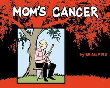
This cover evolved a bit later in the process, when I somehow got it in my head that "oak tree" would evoke a contemplative, sunrise-sunset, circle-of-life theme. I dunno what I was thinking. But I spent the better part of a morning driving around taking photos of real oak trees, intending to find one standing by itself in an open field that I could Photoshop into a silhouette, under which I could insert a drawing of Mom. It wasn't until I'd shot a couple dozen pictures (it turns out to be unexpectedly hard to find an elegantly proportioned oak standing by itself in an open field) and brought them home that I realized the scale was all wrong: Mom would be completely dwarfed by these giant trees. So in the end I just drew a little one instead. The drawing of Mom sitting on the bench was a real quick sketch I did with a brush-pen, a new tool I was trying out. If we'd gone this direction I would have redrawn it, although I really like the spontaneity and quality of line I achieved here. The panel separating Mom from the background is supposed to communicate "Comics!" and also symbolize...I don't know what. Being trapped in her own world, seeing life from a limited perspective, having her world close in on her? You decide.
In his comment, D.D. also complimented the cover typography. I heartily agree. All the type in my samples was intended as placeholders only. I think Abrams designer Brady McNamara came up with the font we used--though art director Mark LaRiviere may have had a hand in it too, I just don't remember--but I thought it was terrific. Big, fat, Deco-evocative sans serif letters that managed to say "comics" and "classy" at the same time.
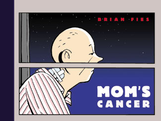
No one remembers who came up with the bit for the back cover involving the six panels of Mom with the words stripped out (probably Brady again). It wasn't me but I loved it. Charlie surprised me by adding my drawing of the Eisner Award, which I'd sent him as a lark, to my bio.
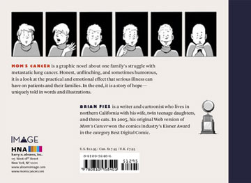
George Lucas once said that the only aspect of the original "Star Wars" movie that exceeded his hopes and expectations was John Williams' score; I felt that way when I saw the my book's cover coming together. It's not at all what I pictured when I was writing and drawing Mom's Cancer, but once it was done I couldn't imagine it being anything else.
Tuesday, August 15, 2006
Exhaustive Coverage
It's been longer than I'd've liked since my last post. Sorry. My book life is kind of slow right now, while my real life is not.
Part of my Comic-Con Spotlight Panel slide show described how Abrams and I designed the cover for Mom's Cancer. One thing I learned about the publishing business was that, unlike almost every other book-related decision that involved only Editor Charlie and me, picking a cover involves everyone. Marketing, sales, management: covers (at least at Abrams) are chosen by a committee of people whose expertise and interests don't always overlap.
Here's Charlie's very first rough of how he thought the cover should look. He just printed a copy of one of my story's pages, blacked out the captions, added the title, and indicated how the colors might look. Charlie liked the "iconography" of this image--the sense the panels simultaneously communicated that this was a comic and at the same time suggested looking into Mom's life through a window. It really spoke to him.
 I wasn't immediately sold. I understood why he liked it, but I wanted to build the cover around my drawing of Mom sitting in the chemo chair. That was the very first picture I sketched when I conceived the idea of telling our family's story as a comic and it meant a lot to me. If I recall correctly, members of the cover committee found it too bleak and busy. I reluctantly moved on.
Over the next several weeks, Charlie and I batted dozens of ideas back and forth--generally beginning with an overarching concept and then playing with color, font, layout, etc. to get different takes on the idea. One time it was "cartoon panels," another time "trees." These were all my brainstorms that Charlie was genuinely happy to consider and pass on if he liked them. The image below summarizes just a few of the variations we went through.
No one liked any of my alternatives as much as Charlie's concept; in the end, neither did I. The last one in the lower right corner was my last-ditch attempt to find a cover guaranteed to please my editor, who'd spent 12 years at DC Comics working with talent like Alex Ross, Roger Stern, Chip Kidd, etc. I don't recall Charlie sounding as amused as I'd hoped when I called him to discuss it, but the Comic-Con audience loved it: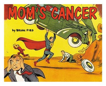 Anyway, after weeks of sketching, drawing, coloring and e-mailing, we at last arrived at the cover we did. I was happy, my editor was happy, the committee was happy. Most of all, my most important and potentially harshest critic, Mom, was happy. And Charlie called it pretty much from the start. Also note that on his mock-up, Charlie inserted a little caption box reading "Eisner Award Winner" when at the time I had not yet won it. Right again. This was not my last opportunity to learn to trust his judgment.
Wednesday, August 02, 2006
Sell Sheet
Today, Editor Charlie sent me a new "sell sheet" Abrams has put together to further promote Mom's Cancer to booksellers. I think it's intended as a reminder and update: "You saw this book back in March, but look at all the great reviews and press it's gotten. Maybe you'd like to order a few copies?" Kind of building on what we've accomplished so far--which, when you see it all listed in one place like this, is pretty remarkable I think.
 Click on the image above to open
a larger PDF of the Sell Sheet
 Click on the image above to open
a larger PDF of the Sell Sheet
Keeping in mind that Abrams is a smallish publisher with fewer resources than, say, a giant like Random House, I've been pretty satisfied with their promotional efforts for my book. They can't afford to fly me around the country, but then I'd rather not do that anyway. When opportunities such as my recent Tucson speaking engagement come up, Abrams helps make them happen. I know Mom's Cancer is getting more support than many (most?) of their other books, and Charlie assures me that even though the fall season of shiny exciting new releases is just around the corner, they'll keep doing all they can for mine. Sounds more than fair to me.
Wednesday, June 14, 2006
Mutter Hat Krebs
After a bit of a wait, Editor Charlie was finally able to get me a few copies of the German edition of Mom's Cancer, titled Mutter Hat Krebs. It's pretty cool.
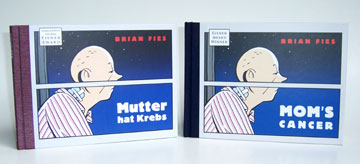
I was very happy to see that the book's production and print quality look every bit as good as they did in the English-language edition. The German publisher, Knesebeck, made an odd choice to use a reddish-brown cloth on the spine instead of the original blue-black. I can live with that. The fun part is picking through the pages with my high-school German and seeing the choices they made in translating my colloquial American. Some are pretty interesting.
Did you know that American snoring goes "Zzzz" while German snoring goes "Chrrr"? Me neither.
Anyway, my compliments to whoever was in charge of quality control (it wasn't me) because I think the German version turned out great. My foreign language collection has begun.
Subscribe to:
Posts (Atom)

