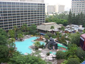
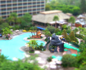
For the Disneyland Hotel picture, I cropped the original to focus on the pool area and eliminate the background, then applied the gradient blurring as described in the tutorial I linked to earlier. In this case, I didn't mask any features to keep them in focus, although it probably would've looked good if I'd masked that one palm tree that juts into the beige roof. Notice how the tree is sharp at the bottom and blurry at the top; it would've been better all sharp (since the top of the tree is theoretically in the same focal plane as the bottom). But that's nit-picking.


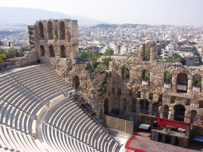
For the ampitheater, I kept the entire stone wall in focus while gradient blurring the rest of the top and bottom of the picture. Then I cut out the arched windows to let the now-blurry background show through. I could've done more with the red-rimmed stage at lower right; in the tilt-shift image, it's hard to tell what and where it's supposed to be.


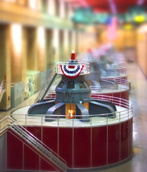
As I also mentioned in the first post, one trick that helps the illusion is increasing the image's saturation to brighten colors and make the surfaces look more plastic and shiny. That worked really well in the next pair:


Not too boring, I hope. I'm sure I'll play with this more later. What I find really intriguing is thinking about how we perceive what we see, the cues we use to judge relationships and distance, and how those cues can be manipulated to fool us. It's pretty subtle and almost always completely unconscious. The eye-brain connection is an amazing thing.

No comments:
Post a Comment