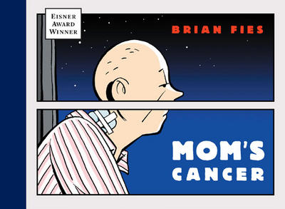
Designing the cover was an interesting process. My editor gravitated to this image (which is a close-up of a page in the book) right away: the horizontally split panel instantly communicated "graphic novel" to him, and there's some (deliberate) symbolism in the mind-body separation. Some have worried that the cover may be too bleak. We tried even more depressing images, uplifting images, abstract images, images with the whole family. We kept coming back to this as the most direct, honest summation of what the story is about. Mom's Cancer isn't a gloomy tale of torment nor a hap-hap-happy romp about a family dancing into the sunset. It's a true story about slogging through.
The thing about covers is they're at least as much about marketing as they are editorial. A book cover is a billboard. We need a strong image to catch the reader's eye and sell the book, and Abrams has a committee whose job is to figure out how to do that. An interesting insight I've had while working on the cover is that decisions like this rarely come down to Good Choice A vs. Bad Choice B. Much more often, we're trying to decide from among Good Choices A, B, C, D, E, F and G. That's a tougher challenge.


No comments:
Post a Comment