Wednesday, August 31, 2005

Trapping

"Trapping" is an obscure but interesting part of the pre-press process. When a color picture is printed using four colors of ink (cyan, magenta, yellow and black, or CMYK), each color is put down on the paper via a separate pass through the press. If the paper lines up perfectly with each pass, all the colors align and you get perfect registration. Very often, though, if you look at four-color printing closely enough, you can see that the inks are just a bit off. You'll see a colored halo on one side, or colors slopping out of their black boundaries, or a gap where colors don't meet up.


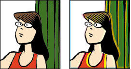
Good registration (left) and bad (right)

Trapping helps minimize registration problems by spreading out the non-black colors a few pixels so that, even if registration is a little bit off, they still have some "wiggle room" to fit and overlap as intended. With Photoshop, trapping is as easy as pushing a button (I can't imagine how anyone did it pre-digitally, or whether they bothered at all). Coincidentally, a private cartoonists' board I frequent just had a long discussion about trapping.

That discussion came in handy when I got word late last week that the printer wasn't happy with my color registration. It wasn't coming out right. Not lining up. Within half a second I realized the problem: no trapping. When I submitted my final image files to Abrams they were trapless. Trap-free. Bereft of trap. My trapping had shuffled off this mortal coil, run down the curtain, and joined the choir invisible. The subject never came up and I never thought to ask. My bad.

So I spent a few hours this morning speedily trapping the 26 color pages scattered throughout Mom's Cancer. I envisioned the overseas printer tapping his toe, glancing nervously at his watch, paying overtime while the presses waited in idle silence for my upload.

Assuming my trapping worked, I should have first proofs to review in a few days. Next book, I'm hiring a high school kid to take care of this.

Thursday, August 11, 2005

The Back Cover

Abrams has turned in our final digital files to the printer, with the first real printer's proofs expected back in a couple of weeks. Below is the back cover and spine of the book. I'm very, very happy with it. Whoever thought of putting those wordless panels of Mom across the top was inspired. (Yeah, I drew the pictures for the book, but I didn't think of laying them out like that for the cover. It was either my editor or Abrams' art director, and they don't remember who deserves the credit.) I also drew the little Eisner Award at lower right just for the heck of it; my editor surprised me by finding a place for it here.


By the way, the price shown here is what it will be: $12.95 ($17.95 in Canada), which I think is an exceedingly reasonable price for a hardcover. We want Mom's Cancer to be an affordable "gift book." If folks want to buy two or three of them, I'd be all right with that, too.

Friday, August 05, 2005

Vote of Confidence

I got some exciting news from Abrams this morning. My editor just presented Mom's Cancer at an internal sales meeting that went so well Abrams decided to greatly increase my first print run. I'm not sure I'm free to report the numbers, but it's a big jump that I take as a big vote of confidence. They expect the book to do well. I reminded my editor that if they all end up sitting unsold in a warehouse it's his fault, not mine.

Thursday, August 04, 2005

Strategery

I've just approved a promotional "Sell Sheet" that Abrams will send out to book buyers. It's a nice piece; if I can get permission to post it on my website I will. I see that they're not just trying to promote the story, but the story behind the story: how Mom's Cancer began as an anonymous webcomic on the Internet, the long odds against it being noticed and becoming a book, the Eisner win. We're not just selling pictures printed on paper--we're selling me and my family. I get that.

It'll be interesting to see what bookstores make of Mom's Cancer. I really hope they've learned from previous graphic novels that they don't all belong on the comic strip shelf (not that there's anything wrong with that...). I think the fact that my book will be hardcover and smaller than most graphic novel/cartoon books will help it stand out and could be the best, smartest decision my editor made.

Wednesday, August 03, 2005

The Front Cover

Yes, that's the book cover design below: the culmination of many weeks of work. We went through dozens of potential cover sketches before arriving at this. I like it, Mom likes it. I'm especially thrilled with the title font found by Abrams' art director.


Designing the cover was an interesting process. My editor gravitated to this image (which is a close-up of a page in the book) right away: the horizontally split panel instantly communicated "graphic novel" to him, and there's some (deliberate) symbolism in the mind-body separation. Some have worried that the cover may be too bleak. We tried even more depressing images, uplifting images, abstract images, images with the whole family. We kept coming back to this as the most direct, honest summation of what the story is about. Mom's Cancer isn't a gloomy tale of torment nor a hap-hap-happy romp about a family dancing into the sunset. It's a true story about slogging through.

The thing about covers is they're at least as much about marketing as they are editorial. A book cover is a billboard. We need a strong image to catch the reader's eye and sell the book, and Abrams has a committee whose job is to figure out how to do that. An interesting insight I've had while working on the cover is that decisions like this rarely come down to Good Choice A vs. Bad Choice B. Much more often, we're trying to decide from among Good Choices A, B, C, D, E, F and G. That's a tougher challenge.