Fontifier is an online service that for $9 will turn your handwriting (or, really, any characters or squiggles you want) into a True Type font that can be used in Word, Photoshop, and most any other application you'd use on a computer. You download a form, print or paste your upper- and lower-case letters into the appropriate squares, upload the form, pay your $9, and seconds later download your custom font. There are a few things to watch out for, but it's pretty easy. Other people provide the same service and I'm not necessarily endorsing Fontifier, it's just the one I happened to try.
I composed my font digitally, cutting and pasting individual letters from my original Mom's Cancer scans into the Fontifier form using Photoshop. I customized the font to meet my unique needs. Since cartoon lettering is almost always upper-case, I used capital letters for both upper- and lower-case characters, so I have two capital A's, B's, C's, and so forth in case I want to mix things up (handy if you don't want all your letters to look too uniform in a phrase like "No one noshed on one noodle at noon"). I redefined other keys to print characters I thought I'd use more. My form looked like this:

I'll digress to explain that lettering seems to be the part of making comics that cartoonists hate most. It's time-consuming, tedious, and exacting. It's also a real craft in its own right; in the old days, professional letterers made good livings hand-printing words for comic books and strips. Very few cartoonists did their own lettering (Charles Schulz being a notable exception) and it added time and expense to their production.
In contrast to many, I never hated lettering. I always looked at it as a final editing opportunity: a word doesn't count until I put it on the page. Occasionally I could make the letters themselves an interesting graphic element. The act of lettering could also be engrossing. Once you get into a rhythm, time flies enjoyably. Still, there's no denying that it takes a lot of time and leaves little room for error.
So I thought I'd try to digitize.
The first caption box below is my hand lettering as it appears on Page 77 of Mom's Cancer. The box immediately below it is the same caption typed using my custom font.
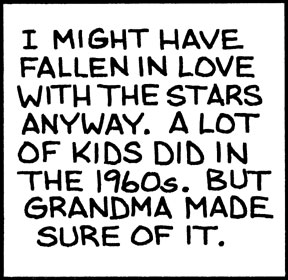
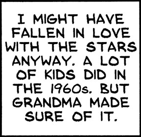
The top box has an undeniable rough-hewn hand-crafted quality... some might even say a naive charm. It says something about me, and that something is: "I am not a professional letterer." I think the bottom box is better. Characters are uniform (duh), lines are straight and evenly spaced, everything's centered. Any lost personality is more than offset by improved quality. And it is still my handwriting.
It also took about one-fiftieth the time.
I want to point out one fine detail about the art of lettering that a lot of people miss. I made two versions of the letter "I," one with serifs (the little horizontal lines at top and bottom) and one without. The serif "I" should be used when it stands alone, as at the start of the first sentence. The sans-serif "I" should be used everywhere else. It's just a spacing/style thing that the old pros knew and a lot of punk kids don't.
So whence my ambivalence? In general, I value hand-crafted artwork and stand like an ink-stained dinosaur against the irresistible forces of computerization and digitization. More and more artists and cartoonists are working entirely on the computer and, although some are very skilled, I think it's a terrible trend. I think the computer imposes a uniformity of style and technique that artists aren't even aware of. Unless you're really good, everything drawn on a Wacom tablet and colored in Photoshop looks the same to me. "When your only tool is a hammer, every problem looks like a nail."
I think we're in danger of losing entire media of artistic expression--charcoal, ink wash, pastel, watercolor--simply because they're not easy to duplicate or manipulate on a computer. I've seen discussions in which cartoonists describe elaborate multi-layer Photoshop processes aimed at producing the same effect they could achieve in 10 seconds with a brush and drop of paint. I want to scream at the them, "Just DRAW the darn thing!"
In my opinion, computerization homogenizes while removing flavor. And, entirely personally, it drains most of the fun, as well. I enjoy putting ink and paint onto paper in a way I've never once enjoyed clicking a computer mouse.
Anyway, it's already an old argument among cartoonists and I'm pretty sure I've taken my stand on the losing side. But if someone told me I had to stop using paper and ink in favor of the computer, I think I'd probably rather quit altogether. It just wouldn't be something I'd want to do anymore.
Is digital lettering my first step down the slippery slope? I doubt it, but I admit I'm worried. I also think my friend Patricia Storms, who has stood on the side of the dinosaurs with me, might be disappointed in me. Fontifier isn't a terribly sophisticated font generator (my kingdom for kerning), and for future professional work I might try something more advanced (and expensive). But I think once you've lettered digitally, there's no going back.


4 comments:
"More and more artists and cartoonists are working entirely on the computer and, although some are very skilled, I think it's a terrible trend. I think the computer imposes a uniformity of style and technique that artists aren't even aware of."
It isn't worth worrying about. Change will come as it always does. Each new generation will choose the styles, methods and tools that it likes best and rarely will they have the whole hearted approval of the generation that came before.
That the creative impulse itself remains alive and vibrant, is all that really matters.
I feel guilty when I do lettering on the computer, but sometimes it works, on gag cartoons the publication will usually set the caption up in type, so it looks natural on the art. It's in balloons that the guilt really sets in, and I frequently reach for a dip pen. That's unfortunate, I'm a lousy letterer.
I don't have anything against technology, but I'm obsessive about old ways, I've sheets of papyrus, reed pens, around 250 different pen nibs, etc. but I'd hate to give up the computer. I think the more tools and techniques we're familar with the better.
How could I ever be disappointed in you, my dear? You are so talented, and such a wonderful person.
It's true, I'm a bit of a luddite when it comes to create comic strips all by hand, but I'm also a bit of a hypocrite, because I myself use the computer to colour most of my work, as well as fix any mistakes I made while inking by hand. So who am I to judge?
I will be honest with you, though, and say that I prefer the hand-drawn sample over the computerized one. It's almost difficult to put into words the difference between the two. In the end, all I can say is that the hand-drawn is "more you" whatever flaws may exist in its creation. That is what I am afraid will disapear with the use of computers over time...that unique organic, deeply personal touch which is such an integral part of creating comic strips.
That being said, I'm not the one who has to do a crapload of lettering in my work, and I certainly understand how time-consuming that part of the job is.
So do what works for you! You have my blessing (for what it's worth...heh).
Drive-By, I agree that the creative impulse remaining alive is important, but not sure I agree that's all that matters. I think the creative impulse can be nurtured or retarded by the tools available to express it, and the wider the variety of tools the better. What if Mozart had never seen a piano? I worry a bit for the future of art in general and cartooning in particular if computers become the overwhelming tool of choice, like a symphony composed entirely of cellos.
Arnold, I love the feel of pen scritching over paper but I'm feeling less guilty every day. As I mentioned, I actually like my hand-lettering, but have always hated my balloons. They come out lopsided and uneven. Still, I think your dedication to "the old ways" is important, and artists must at least know what they can do before they give them up.
Patricia, I understand the importance of the organic in art and value it. Your blessing is worth...well, at least a little. Thanks for replying.
Post a Comment