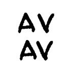
Kerning means making individual letter shapes fit together in ways that are pleasing to the eye. A good example are the letters "A" and "V," whose sides have complimentary slopes. In the top example below, the letters are printed next to each other without kerning, while in the bottom example I used kerning to slightly overlap them (see how the top left of the "V" hangs over the bottom right of the "A") and reduce the empty space between.
In yesterday's example caption, the words "STARS" AND "LOT" caught my eye, both due to the letter "T." T is a good candidate for kerning since it's got all that empty space at the bottom that many slanted letters could slide into. Here are the two words, without and with kerning around the T's:
 I think the bottom example is easier on the eye. Notice that kerning doesn't mean squishing all the letters together (that's "tracking"), but overlapping the space only between certain letters. If it's absent, words can subconsciously look funny even if you can't figure out why; if you do it right, no one ever notices.
I'm so happy I can kern. And it's still prodigiously faster than lettering by hand.
By the way, this is how I spend my time instead of working.


2 comments:
I knew it...you don't really work, do you? :)
Totally understand.
Post a Comment