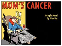
This was the cover concept I proposed at first, with my "Mom in the Chemo Chair" art flopped. The colors are pretty arbitrary, but I wanted to use strong primary red-blue-yellows to communicate "Comics!" while at the same time use muted browns and grays to communicate "But not funny!" I think the result was a fairly unattractive palette that would have surely changed if we'd gone this direction. If I recall correctly, some on the cover committee found this image too clinical, distressing, and depressing.
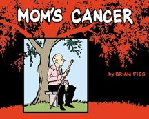
This cover evolved a bit later in the process, when I somehow got it in my head that "oak tree" would evoke a contemplative, sunrise-sunset, circle-of-life theme. I dunno what I was thinking. But I spent the better part of a morning driving around taking photos of real oak trees, intending to find one standing by itself in an open field that I could Photoshop into a silhouette, under which I could insert a drawing of Mom. It wasn't until I'd shot a couple dozen pictures (it turns out to be unexpectedly hard to find an elegantly proportioned oak standing by itself in an open field) and brought them home that I realized the scale was all wrong: Mom would be completely dwarfed by these giant trees. So in the end I just drew a little one instead. The drawing of Mom sitting on the bench was a real quick sketch I did with a brush-pen, a new tool I was trying out. If we'd gone this direction I would have redrawn it, although I really like the spontaneity and quality of line I achieved here. The panel separating Mom from the background is supposed to communicate "Comics!" and also symbolize...I don't know what. Being trapped in her own world, seeing life from a limited perspective, having her world close in on her? You decide.
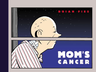
In his comment, D.D. also complimented the cover typography. I heartily agree. All the type in my samples was intended as placeholders only. I think Abrams designer Brady McNamara came up with the font we used--though art director Mark LaRiviere may have had a hand in it too, I just don't remember--but I thought it was terrific. Big, fat, Deco-evocative sans serif letters that managed to say "comics" and "classy" at the same time.
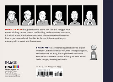
No one remembers who came up with the bit for the back cover involving the six panels of Mom with the words stripped out (probably Brady again). It wasn't me but I loved it. Charlie surprised me by adding my drawing of the Eisner Award, which I'd sent him as a lark, to my bio.
George Lucas once said that the only aspect of the original "Star Wars" movie that exceeded his hopes and expectations was John Williams' score; I felt that way when I saw the my book's cover coming together. It's not at all what I pictured when I was writing and drawing Mom's Cancer, but once it was done I couldn't imagine it being anything else.


3 comments:
Thanks Brian for blowing up the cover roughs, though they don't look too rough to me.
Yes the cover that was published is the cover on all our shelves and is a darn fine cover and the only cover;
but I still like that red oak tree.
Mom had an oak tree on the hill that we could see out our family room that she focused on in some of her paintings. The tree was far enough away that the perspective was just all wrong when we finally me the tree "in person." I was incredibly depressed when I was last in town to find that not only was the tree gone but the entire hill was covered with houses and condos.
I'm looking forward to getting my own copy of your book.
Thanks, guys. Milinda, thank you for telling me the story about the tree. There are a lot of old trees, hills, and fields getting paved over around here. Some things just shouldn't change.
Post a Comment