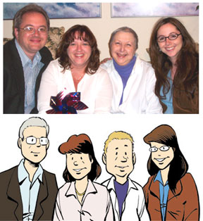
As I prepared to do Mom's Cancer, I put a lot of thought into what the characters would look like. Making them exact likenesses of my family was not my top priority, which is one reason Editor Charlie and I decided not to publish a photo in the book: as cartoon characters, we're abstract stand-ins for the reader rather than concrete, specific people. Also, we didn't want to pull readers out of the story by giving them a reason to flip back and forth comparing the drawings with reality. But for today's purposes, here's a side-by-side:
Mom’s Cancer took more than a year to draw and I wanted my characters to be recognizable and consistent from the beginning of the story to the end. I sat down beforehand to make sure I understood the fundamental shapes underlying my characters, could move them around in space and make them work from every angle, etc. I didn't spend a lot of time on it and wasn’t trying to accomplish anything more profound than come up with characters who could do everything I wanted and express every emotion I needed, and that I could stand to draw over and over again.
Mostly, I tried to apply some basic cartooning principles to help the reader subconsciously know my characters before they opened their mouths. In Mom’s Cancer, the characters of Nurse Sis and I are in our forties while Kid Sis is about thirty. Nurse Sis and I therefore have stockier necks, rounder faces, thicker body shapes, and more often than not a bag under an eye. Nurse Sis is a take-charge person who leans forward and leads. My character is more passive and reflective, leaning back. In contrast, Kid Sis is more angular and attractive, with a thinner neck, smaller nose, bigger smile, and better posture.
Of all my characters, Mom is the one that looks least like her real-world counterpart. The Mom character is in her sixties, sick, and tired. Both her head and body are pear-shaped, her posture is poor. Gravity is dragging her down. She has no neck, her eyes are baggy. When she had hair, I drew it with a lot of waves and points that would contrast with her smooth bald head later. Her striped shirt gave me something graphically interesting to play with that stood out against both white and black backgrounds, while her black pants were a negative space I knew I could use effectively once in a while. I was much less interested in creating a character who looked like my mother than one who could help me tell the story.
Despite my initial groundwork, I found that the look of my characters gradually evolved over the course of drawing them dozens of times over several months. That's pretty common for comics characters: Snoopy changed a lot between 1955 and 1995. I actually had to go back and redraw Mom in particular as she became quite unrecognizable. The “Moms” in about the first 20 pages of my book are all paste-up corrections inserted much later because the way I drew her character changed as I grew more comfortable with it and demanded more of it.

Mom's evolution, pre- and post-paste-up.
I consider that design evolution an interesting failure on my part. If I had put a little more thought into what I expected of the character at the start, I might have been able to design her to hold up better in the long run.
And though I wasn't necessarily aiming for photorealistic accuracy, at least I was honest about my gray hair.


7 comments:
Great post. I love when artists and writers talk about process.
I keep telling my girlfriend I'm going to do more of that on my own blog. I guess I should get on that.
-Otis
Thanks for yet another fascinating look into your creative process, Brian. As someone who can't draw stick figures that are recognizable as sticks, I'm not about to criticize the way talented people can put so much expressiveness into a few simple strokes. So I hope you took my remarks for the tongue-in-cheek spirit in which they were intended.
You were right on target in your decision not to print the picture in the book; flipping back and forth for comparison is exactly what I did the first time I saw that photo of your family, and it would have been very distracting in the book.
I think the main difference that caught my eye, and resulted in the "your comic strip self looks younger" comment, is that the very nature of a cartoon drawing gives you (and the others in the picture) a smoother complexion.
Anyway, if you were really on the ball you would have drawn your cartoon self older while you stay the same age in the real world :-)
Peter B. Steiger
Cheyenne, WY
Hey there Mr. F.,
thanks for more insight into your creative process.
I really DO think you have created one flawless gn. You aren't as objective as I am -- I read hundreds per year, select them for public libraries. Your book is in my all-time top ten!
Dori Seda, hugely different topics and style from you, had a funny bit in one of her strips about being criticized for drawing herself too pretty... Whoa, that lady basically died of smoking too much too!
I think you are all much prettier in your photo, but especially Kid Sis. She is gorgeous. Gonna go 'fess up on her blog, you guys nudged me over into YET another but this time hopefully permanent Quitting Smoking ordeal.
One thing I did observe in your book (and your sweet mama's blog and writings): YOU have never personally writhed around with that evil demon, tobacco. Damn hard to quit even if harder to explain or rationalize.
Uh, I don't write well and tend to run on. But sorry, heartfelt thanks, you touched my soul and perhaps will help keep me alive.
> Note: I know the images below
> are "lossy" (poor quality).
> The originals looked good but
> something got lost in the upload.
Brian, the images are fine, it's just that you're not displaying them at their original dimensions. They're either being stretched, (the first one), or compressed. (The second.)
Right-click on the images and choose "View Image." (Or something similar depending on your browser.) You'll see them in their original size, looking fine.
Dave
P.S. I don't think anyone would have really noticed anyway. ;)
Otis, thanks for looking in. You should give us some behind-the-scenes insights into your work. I'd like that. Are you going to Comic-Con this year?
Laundress, thanks again for visiting. My sisters and I never smoked and I had a lot of sympathy for what Mom went through when she tried to quit. Mom was a defiant smoker who always said she wasn't hurting anyone but herself. When she got sick, she said the one thing she never realized was how much her illness would hurt the people she loved the most. Maybe it'll strengthen your resolve to think in terms of what quitting might spare your family, not just you.
PBS, I detected your tongue in your cheek; no offense taken. If I knew how to do a Dorian Gray, I would, but then I would necessarily turn evil. Well, more evil. I'm also eyeing the Lady Clairol aisle.
Dave, thanks for the advice. I have learned that you're always right. In this case, the sizing mismatch seems to be due to a glitch on Blogger's end (judging by a ton of sudden complaints on their Help Board) and nothing I've been able to fix. But I'll keep playing with it.
Always appreciated everyone, thanks.
I got the image quality fixed, so deleted my reference to it in the post. Thanks again, Dave.
That was amazing..thank you for sharing it. It is fascinating to see the process.
Post a Comment