Thursday, November 30, 2006

Put Up or Shut Up

I think its kind of presumptuous for you to assume you know what Kinkade sees and experiences. Maybe in a certain place he saw exactly the rainbow he painted! Unless you followed him around his whole life I don't think you can know.

Anonymous Reply to Previous Post

That’s a fair enough objection, I think. At the risk of getting too textbooky, I’ll explain myself and then add a few thoughts about exactly how obligated to truth I believe an artist can or should be. It’s not my job to tell anyone what art to like or not like (hi, Nurse Sis!). But I can defend my rationale.

First, a little rainbow physics. Your standard rainbow appears when sunlight behind you hits raindrops in front of you. Each individual spherical raindrop becomes a prism that refracts white sunlight into its component colors and reflects it back to your eye. It’s important to remember that a rainbow isn’t a “real thing out there,” but an optical phenomenon that the observer is a part of. Everybody sees a slightly different one.

(This suggests an interesting analog to the old koan, “If a tree falls in a forest and there’s no one there to hear it, does it make a sound?” I never understood why that was considered a profound puzzle: the answer is obviously Yes. However, if sunlight hits a raindrop and there’s no one there to see it, does it make a rainbow? Maybe not.)

A rainbow’s arc is always a portion of a circle, and the angle sunlight makes going in and out of each raindrop is always the same: 42 degrees. This has some interesting corollaries: the angle described by the center of the rainbow’s arc, the observer, and the rainbow is likewise always 42 degrees.

Furthermore, all rainbows are the same size—you just see more or less of them depending on how high the sun is in the sky. When the sun’s low, you see more of the circle; when it’s high, you see less. That’s what impressed me about the rainbow my wife photographed: with the sun about as low as it could be, the rainbow was about as big as it could get.

The Crime of Kinkade

I tried to find the objectionable Thomas Kinkade painting online but couldn’t. I only saw it once a few years ago, but as I best recall (and I apologize if I recall incorrectly) the critical elements looked like this:

You can make rainbows many different ways, but the one indispensable element is light. A bright light source has to be either directly behind the observer opposite the rainbow, or at the exact center of the rainbow behind it (for example, you can sometimes see a night rainbow circling the Moon formed by ice crystals in the sky).

Where’s the light source in this painting? The sun isn’t directly behind the observer nor directly behind the rainbow. It’s off to one side. There’s no enormous spotlight shining onto or out of the waterfall. The only way this rainbow works is if it’s on a planet with two suns, like Luke Skywalker’s home of Tatooine, and one of those suns is shining behind us. But even then, the rainbow is so far up the mountain that the second sun behind us would have to be impossibly below the horizon. If Kinkade added a Jawa or Sand Creature to this painting I’d be more satisfied, because this rainbow couldn't happen on Earth.

There’s a more subtle problem with the rainbow as well. As mentioned, the angle between a rainbow’s center, an observer, and the rainbow’s arc is always 42 degrees. That means that an entire rainbow, side to side, takes up 84 degrees of the observer’s world view. Think of it like this: if you slowly turned in a 360-degree circle and saw rainbow after rainbow lined up side by side along the horizon like McDonald's Golden Arches, there’d be just over four of them before you circled back to where you started.

The problem with Kinkade’s rainbow, then, is not just that it’s in the wrong place but that it's far too small. You could have fit several rainbows side by side in the painting I remember without going all the way around. Kinkade was clearly thinking of a rainbow as a physical “real thing out there” that should follow the rules of perspective and look smaller when it’s farther away. But that’s not how rainbows work.

Is There in Truth No Beauty?

So what?

A lot of artists draw and paint a lot of things that aren’t necessarily technically accurate. Have I never heard of artistic license? Never made a mistake myself? Am I trying to suck the fun out of everything?

That kind of depends on what you think art is about. I’m not a soulless drudge. I’d never criticize a child for drawing the sun beside a rainbow or getting the colors mixed up. And abstract artists can do whatever they want. Still....

When I was in college, a friend who wanted to sell his racing bicycle asked me to do a drawing of it that he could post with a flyer (this was in the Dark Ages, kids, when we couldn’t just upload a digital photo and print it in full color. Although we did have photocopiers, which saved me the trouble of chiseling the bike’s image in marble).

So with my friend’s bike as a model I drew it as best I could. When I proudly unveiled my creation to him, he scoffed, “That looks like my grandmother’s Schwinn!” Then he took me by the hand and patiently explained to me all the features that made a racing bike different from grandma’s Schwinn. I was struck by how wrong I’d gotten it. The proportions, the angles of the posts, the wheels... Even though it was sitting right in front of me, I hadn’t drawn his bike at all. I had drawn a completely different bike that existed in my head.

I think a fundamental responsibility of artists is to view the world as accurately and convey it as honestly as they can. To really see what they’re looking at and then communicate it. That's very hard to do! A big part of that responsibility is knowing what you don’t know and being willing to find out. I didn’t know anything about racing bikes but didn’t know I didn’t know. I learned.

If I set out to draw a horse, I’d surround myself with horse references. If I tried to draw a World War II tank, I’d google up as many tank pictures as I could find. I’d probably still botch the job: there are things about horses only a horse person knows and I’m sure there’s a tank guy out there who’d get mad because I put a 1944 model in a story set in 1943. And doctors and nurses laugh at medical shows (you ought to hear Nurse Sis gripe about “E.R.”), cops laugh at cop shows, lawyers laugh at law shows, and cartoonists laugh at cartooning shows (“Caroline in the City” anyone?). You could get paranoid and paralyzed pretty quickly, afraid to move a muscle. Nobody knows everything! What’re you supposed to do?

Cartoonist Mort Walker wrote about how when he started “Beetle Bailey” he took great pains to be sure the rifles, tanks, and other equipment were drawn accurately. He soon realized that didn’t work. In his comic strip world, his generalized abstractions of rifles and tanks worked better than truer representations. The symbols were more effective than the objects they symbolized. That’s probably true for a lot of cartooning and non-representational art but a problem for an artist like Kinkade, who is clearly portraying places that, though idealized, are meant to look like they could exist.

Another story: One of my favorite panels in Mom’s Cancer is the one of my mother strapped down in Frankenstein’s lab.
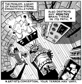
The metaphor conveys her perspective of the terrifying experience, but my original intent was to draw a realistic picture of her lying on the actual machine used to treat her. I scoured the Internet looking for a picture of the machine, all through the hospital’s and manufacturer’s websites, and couldn’t find one. That wasn’t a detail I wanted to risk getting wrong so I evaded it as creatively as I could. It worked great, better than my original idea, but it was essentially a cheat to cover my ignorance of stereotactic radiosurgery (sorry, I must have missed that day of class). There are a lot of ways to solve the problem.

I make mistakes and take shortcuts (I'm painfully aware of mine, no need to point them out), everyone does. All I’m looking for is a good-faith effort. An artist who makes his living as a “painter of horses” should know horses. A “painter of tanks” should know tanks. And a “painter of light”....

Tuesday, November 28, 2006

I've Been One Poor Correspondent

Apologies again for not posting more frequently. The Thanksgiving holiday combined with the rush of several end-of-the-year work projects consumes a lot of time. A few odds and ends today:

I just got off the phone with a reporter for the Berlin newspaper Der Tagesspiegel who is doing a story on Mom's Cancer from the healthcare book perspective. I thought it was a very nice interview, with a few thoughtful questions I hadn't been asked before, and the reporter was very knowledgable about comics and graphic novels. In fact, he said he hopes to place a second article about Mom's Cancer with a magazine that would address the graphic novel angle. No idea when either article will appear, but he promised to send me copies.

What the cool kids are reading in Germany.

I've been looking over a couple of cover designs for the French edition of Mom's Cancer. I'll post them here when I can, but have been asked to keep them under wraps for now. Foreign publishing is an interesting topic in general. Overseas publishers who acquire the rights to print Mom's Cancer in their countries often have their own ideas about looks or formats that will sell best locally. For example, the French cover might look very different. As long as the content of the story remains intact, I'm pretty easy-going about how it's presented.

A lot of authors retain foreign rights but I was frankly happy to let my publisher have them; negotiating contracts in other languages with unfamiliar legal systems sounds like the Tenth Circle of Hell to me. As a consequence, I really have very little to do with my book's fate in non-English-speaking nations, although Editor Charlie and Abrams are extremely considerate and solicitous about keeping me involved and happy (thanks, Jutta!).

I'll sign off with this photo of a rainbow, which my wife took a couple of days ago. You can just see a wisp of secondary rainbow to the right, with a hint of Alexander's dark band between them. Everyone knows that the sequence of colors in the primary and secondary rainbows are the opposite of each other, right? (Optics was my favorite physics course.)


What I find interesting about this photo is that my wife took it early in the morning, just after sunrise. Since a rainbow forms in the sky opposite the sun--in fact, the shadow of the observer's head always points to the exact center of a rainbow's arc--this is just about as big and high in the sky as a rainbow can be, almost a complete half-circle. (And yes, pedants, I'm aware of circumstances that create full-circle and more exotic rainbows. You know what I mean.)

Where was I? Sleeping, of course.

(We now enter the free-association portion of today's post). It was a rainbow that destroyed any esteem I might have once held for "Painter of Light" Thomas Kinkade. Don't get me wrong, I was never a fan of his syrupy sentimentality, but I could understand the appeal of his work and considered him technically accomplished. That was, until the day I saw one of his typically majestic mountain vistas with a beautiful rainbow suspended in a spot where no rainbow could possibly exist. I think one of the primary functions of art is to tell the truth as the artist sees it; even if I disagree with their vision or dispute their skill, I should be able to count on their integrity. By painting a rainbow that neither he nor anyone who ever walked our planet had ever seen, Kinkade revealed himself to me as a big fat liar. When you call yourself the "Painter of Light," you have a responsibility to get the light right.

Some people become less judgmental with age. I'm trying to become more.

Tuesday, November 21, 2006

Nice People

I rent a P.O. box for business purposes that I check once or twice a week. The post office is a one-room cinder-block building in a tiny town nearby, and is usually staffed by two workers who keep a candy bowl on the counter.

A few months ago while I waited in line to mail a package, one of the clerks caught me rooting around in the bowl for my favorite, those little green sour apple Jolly Ranchers. We chatted about candy for a few seconds, I mailed my package and left.

Several days later I returned to check my mail, opened my box, and found sitting atop the junk adverts three green sour apple Jolly Ranchers. That particular clerk wasn't working that day so I couldn't thank her for making my week. Next time I went in: another couple of Jolly Ranchers. She was working that day, so I went to the counter to thank her for, again, making my week. She explained that she was attuned to the candy preferences of several regulars and, when she refilled the counter candy bowl, did her best to accommodate them. I just returned from the post office a few minutes ago and she did it again.

What a tiny, attentive, wonderful thing to do. How easy it is to brighten someone's day. Monuments, museums, technology and conquest are well and good but, as far as I'm concerned, getting candy in my mailbox is what Civilization is all about.

Three-Point Perspective

Another way I spend my time instead of working:


Original is non-photo blue pencil, about 14 x 17 inches. Maybe I'll think of something useful to do with it... Hmm....

Friday, November 17, 2006

Miriam Engelberg Memorial

I'm planning to attend a public memorial service for Miriam Engelberg in San Francisco this Sunday, November 19 at 1 p.m. Details and directions are available on her website at www.miriamengelberg.com.

UPDATE: It was nice.

Thursday, November 16, 2006

Kerning

In yesterday's post about digital type, I bemoaned the inability of my custom hand-lettered font to do kerning. That's because I'm a big dummy--but a big dummy who can be taught. Ten minutes ago I figured out that I can do kerning with the Type Tool in Photoshop, and I got so excited I had to share.

Kerning means making individual letter shapes fit together in ways that are pleasing to the eye. A good example are the letters "A" and "V," whose sides have complimentary slopes. In the top example below, the letters are printed next to each other without kerning, while in the bottom example I used kerning to slightly overlap them (see how the top left of the "V" hangs over the bottom right of the "A") and reduce the empty space between.


In yesterday's example caption, the words "STARS" AND "LOT" caught my eye, both due to the letter "T." T is a good candidate for kerning since it's got all that empty space at the bottom that many slanted letters could slide into. Here are the two words, without and with kerning around the T's:

I think the bottom example is easier on the eye. Notice that kerning doesn't mean squishing all the letters together (that's "tracking"), but overlapping the space only between certain letters. If it's absent, words can subconsciously look funny even if you can't figure out why; if you do it right, no one ever notices.
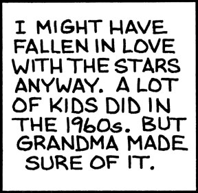
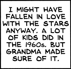
I'm so happy I can kern. And it's still prodigiously faster than lettering by hand.

By the way, this is how I spend my time instead of working.

Wednesday, November 15, 2006

Man of Letters

I did something cool recently that I think turned out pretty well and could save me a lot of time and effort in the future. So why do I feel a bit ambivalent about it?

Fontifier is an online service that for $9 will turn your handwriting (or, really, any characters or squiggles you want) into a True Type font that can be used in Word, Photoshop, and most any other application you'd use on a computer. You download a form, print or paste your upper- and lower-case letters into the appropriate squares, upload the form, pay your $9, and seconds later download your custom font. There are a few things to watch out for, but it's pretty easy. Other people provide the same service and I'm not necessarily endorsing Fontifier, it's just the one I happened to try.

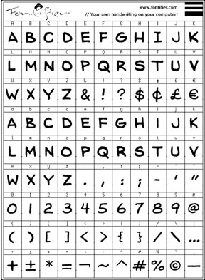
I composed my font digitally, cutting and pasting individual letters from my original Mom's Cancer scans into the Fontifier form using Photoshop. I customized the font to meet my unique needs. Since cartoon lettering is almost always upper-case, I used capital letters for both upper- and lower-case characters, so I have two capital A's, B's, C's, and so forth in case I want to mix things up (handy if you don't want all your letters to look too uniform in a phrase like "No one noshed on one noodle at noon"). I redefined other keys to print characters I thought I'd use more. My form looked like this:


I'll digress to explain that lettering seems to be the part of making comics that cartoonists hate most. It's time-consuming, tedious, and exacting. It's also a real craft in its own right; in the old days, professional letterers made good livings hand-printing words for comic books and strips. Very few cartoonists did their own lettering (Charles Schulz being a notable exception) and it added time and expense to their production.

In contrast to many, I never hated lettering. I always looked at it as a final editing opportunity: a word doesn't count until I put it on the page. Occasionally I could make the letters themselves an interesting graphic element. The act of lettering could also be engrossing. Once you get into a rhythm, time flies enjoyably. Still, there's no denying that it takes a lot of time and leaves little room for error.

So I thought I'd try to digitize.

The first caption box below is my hand lettering as it appears on Page 77 of Mom's Cancer. The box immediately below it is the same caption typed using my custom font.


The top box has an undeniable rough-hewn hand-crafted quality... some might even say a naive charm. It says something about me, and that something is: "I am not a professional letterer." I think the bottom box is better. Characters are uniform (duh), lines are straight and evenly spaced, everything's centered. Any lost personality is more than offset by improved quality. And it is still my handwriting.

It also took about one-fiftieth the time.

I want to point out one fine detail about the art of lettering that a lot of people miss. I made two versions of the letter "I," one with serifs (the little horizontal lines at top and bottom) and one without. The serif "I" should be used when it stands alone, as at the start of the first sentence. The sans-serif "I" should be used everywhere else. It's just a spacing/style thing that the old pros knew and a lot of punk kids don't.

So whence my ambivalence? In general, I value hand-crafted artwork and stand like an ink-stained dinosaur against the irresistible forces of computerization and digitization. More and more artists and cartoonists are working entirely on the computer and, although some are very skilled, I think it's a terrible trend. I think the computer imposes a uniformity of style and technique that artists aren't even aware of. Unless you're really good, everything drawn on a Wacom tablet and colored in Photoshop looks the same to me. "When your only tool is a hammer, every problem looks like a nail."

I think we're in danger of losing entire media of artistic expression--charcoal, ink wash, pastel, watercolor--simply because they're not easy to duplicate or manipulate on a computer. I've seen discussions in which cartoonists describe elaborate multi-layer Photoshop processes aimed at producing the same effect they could achieve in 10 seconds with a brush and drop of paint. I want to scream at the them, "Just DRAW the darn thing!"

In my opinion, computerization homogenizes while removing flavor. And, entirely personally, it drains most of the fun, as well. I enjoy putting ink and paint onto paper in a way I've never once enjoyed clicking a computer mouse.

Anyway, it's already an old argument among cartoonists and I'm pretty sure I've taken my stand on the losing side. But if someone told me I had to stop using paper and ink in favor of the computer, I think I'd probably rather quit altogether. It just wouldn't be something I'd want to do anymore.

Is digital lettering my first step down the slippery slope? I doubt it, but I admit I'm worried. I also think my friend Patricia Storms, who has stood on the side of the dinosaurs with me, might be disappointed in me. Fontifier isn't a terribly sophisticated font generator (my kingdom for kerning), and for future professional work I might try something more advanced (and expensive). But I think once you've lettered digitally, there's no going back.

Tuesday, November 14, 2006

Thursday, November 09, 2006

Top O' My Book Heap

I'm working hard on a bunch of stuff, some of it fun, but leaving little time for blogging. But I didn't want to leave my six regular readers hanging.

Books I've read lately:

"Fun Home," Alison Bechdel. Finally got around to it, and it's certainly a tour de force graphic novel by any standard. I'm not sure how I feel about it; I need to reflect on it a bit and may have a fuller review later. Let's say that although I'm tremendously impressed on many levels, my reaction was not the unequivocal rave it's gotten from everyone else.

"Moondust," Andrew Smith. I picked up this paperback at an airport bookstore and enjoyed it very much. Smith, who is about my age, interviewed the surviving nine Apollo astronauts who landed on the Moon (three are deceased) in an attempt to figure out what it all meant. The author injected himself into the story more than I thought necessary and I don't entirely agree with his conclusion, but as a fellow Apollo buff born at the beginning of the Space Age I found it fascinating.

"Boswell's London Journal," James Boswell. I find myself rereading Boswell's first-hand account of life in 18th century London every few years. To be honest, I don't read it straight through cover to cover, but enjoy dipping in and out for several pages at a time. It's cliche to say a work "brings history to life," but this is the only book I can remember that meets that standard.


"Brunelleschi's Dome," Ross King. Frankly kind of a slog to get through, but an ultimately rewarding look at the construction of Florence's Il Duomo cathedral at the height of the Renaissance. Begrudgingly recommended.

"On Writing," Stephen King. A lot of writers say this is one of the best books about being a writer they've ever read. I agree with them.

"The Elements of Style," Strunk and White. One of my daughters' good friends was the editor of their high school newspaper who hopes to pursue writing at university and in the service of various progressive causes she champions (ah, youth). I bought her a copy of this classic style guide because no writer should be without it. Then, realizing I didn't actually own a copy myself, I bought a second one for me and read it in one sitting. E.B. White is one of my favorite writers anyway, and this book--while too dry a reference work for the casual reader--is packed with gems of wisdom it's good to be reminded of from time to time... of which it is good to be reminded... that which of be reminded... never mind.

Monday, November 06, 2006

E-mail Woes, You Bet'cha

I just learned this morning that, for at least the second time in the past few months, e-mails sent to me at brian[AT]momscancer.com aren't reaching me (substitute "@" for "[AT]"...I'm trying to fool the spammers' evil robots). Of course the scary thing is that these are the two situations I'm aware of; for all I know, the darn thing has only worked 15 minutes a day for the past year.

Part of the problem is surely my cut-rate site host, but part may be the intricate daisy-chain of forwarding instructions that send mail from that address to another address where I actually read it. From now on I'm skipping the middle man. If you want to reach me, I'm at:

brianfies[AT]comcast.net

I've never had a reliability problem with Comcast and trust that'll work. I've changed all the contact information on this blog and my www.momcancer.com website accordingly. Of course I'll keep the old address active, but use it at your own risk.

I hate not knowing what I might've missed. If you sent me an e-mail I should have responded to but didn't, I wasn't intentionally rude. I answer everything I get, generally within a day or two. If I get it. Feel free to try me again.

You Ain't From Around Here, Is'ya?
I found this fun quiz on Raina Telgemeier's blog. Answer some questions about how you pronounce various words and it'll tell you what kind of accent you have. Here's mine:

What American accent do you have?
Your Result: North Central

"North Central" is what professional linguists call the Minnesota accent. If you saw "Fargo" you probably didn't think the characters sounded very out of the ordinary. Outsiders probably mistake you for a Canadian a lot.

The Midland
The West
Boston
The Inland North
Philadelphia
The South
The Northeast
What American accent do you have?
Take More Quizzes

Although I enjoyed the quiz, it got me wrong. I'm pretty sure my accent is "The West," a neutral newscasters' accent that the quiz calls "the lowest common denominator of American speech," and if I answer just a few questions differently I can tweak my result to come out that way. I suspect part of what the quiz picked up on is that, as a writer, I try to be careful and precise about what I say and how I say it. I exert a little effort to differentiate "stock" from "stalk" and "pin" from "pen."

On the other hand, although I've lived in the accentless West for more than 30 years, I did spend my speech-forming childhood in South Dakota. When I'm lazy I say "crick" for "creek" and I know what a davenport is. So I have to wonder if the quiz was clever and subtle enough to uncover my buried Midwestern roots. Or if it just got lucky.

Along those lines, check out the "Pop vs. Soda" website, where researchers have documented where in the U.S. people refer to a carbonated soft drink as "pop," "soda," "coke," or something else. I grew up a "pop" kid in South Dakota, as the map shows, and clearly remember feeling like a yokel when I first used the word in California.

I love regional accents and dialects. The fear that they'll go extinct as we all consume the same mass media doesn't seem to be coming to pass, as I understand it. What babies hear in their homes still seems to overwhelm whatever homogenization encroaches from outside. I hope that's true and remains so for a long time.

UPDATE: I just retook the accent quiz fresh (i.e., forgot what I answered the first time) and got "The West." Guess I'm a borderline case.

Friday, November 03, 2006

ALA BBYA! (BYOB.)

A nice, unexpected honor arrived with yesterday's announcement of the American Library Association's 2007 nominees for Best Books for Young Adults (BBYA). Out of uncounted thousands of books eligible for the honor, the ALA nominated Mom's Cancer and 231 other titles, a list that (I gather) a blue-ribbon committee will trim by more than half in January. Those that make the cut will be official 2007 BBYAs, with a Top Ten list highlighting the best of the best. This is a potentially big deal, as librarians throughout the country look to the ALA's guidance when deciding how to spend their meager book-buying funds.

As I say, the nomination was unexpected, partly because I had no idea my work was being considered but mostly because I never thought of Mom's Cancer as a young adult book. I can certainly see how that could work, though, and in fact young adult literature includes some of the best writing and most challenging concepts around. I have a ton of respect for the field; I just didn't realize I was in it. I also think there are many readers whose first instinct when seeing comics in a book is to think "kids' stuff." I noticed that Jessica Abel's La Perdida, R. Kikuo Johnson's Night Fisher, and The 9/11 Report: A Graphic Adaptation also made the first cut, and I don't think of them as particularly young adult titles, either. Maybe I need to expand my concept of "young adult."

The other curiosity is that Mom's Cancer got listed as fiction. Trust me, it's as non-fictional as I could make it. I wonder if the ALA was thrown off by some of my metaphorical choices, like the superheroes. I'm reminded of a story about Art Spiegelman's Maus, when the New York Times was trying to decide if it should be listed as fiction or non-fiction. As I recall the tale (no doubt inaccurately), an exasperated editor finally said, "Go knock on Spiegelman's door. If a giant mouse answers, it's non-fiction."

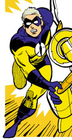
If anyone knocks on my door, I'll be sure to have my yellow superhero tights on.

Thursday, November 02, 2006

What Did You Find in Your Shower?


These are two original Charles Schulz sketches I found in the shower around 1976-77. Explaining how I got them requires me to write a sentence I am extremely reluctant to type: When I was a teenager, my family belonged to the same raquet club as Mr. Schulz.

I expect that admission to conjure a completely inaccurate image of my family, our finances, and our position in the social strata. We didn't talk like Thurston Howell III while dashing off to the polo pitch in our tennis whites (nor did Mr. Schulz, come to think of it). We were just a solidly middle-class family who found a nice place to play tennis and swim. Why Mr. Schulz spent time there was beyond me, although I suspect it was simply for the friendship and competition. As I recall, he regularly appeared atop the tournament leader boards. He certainly didn't need the facilities, what with having his own indoor and outdoor tennis courts back at his studio.

In any case, I was playing tennis one day with my best friend, hacking away. We weren't rowdy or disruptive but we weren't very good, either, and our balls kept dribbling into the adjoining court whose players gamely returned them to us. When our neighbors left, my friend said, "That was Charles Schulz!" I'd played beside the man--and no doubt annoyed him--for an hour and never noticed.

When we finished I went into the clubhouse locker room and found these slips of paper lying on the floor, crumpled and completely soaked with water that'd run over from the shower. They were literally circling the drain. Obviously Mr. Schulz had drawn them for a friend or fan who promptly lost them. I took them home, gently uncrumpled them, pressed them flat between paper towels until they were completely dry, and used a soft kneaded eraser to pick up as much dirt as I could without touching the pencil. They couldn't have been more lovingly restored if they'd been sent to the Louvre.

And so they've sat in a scrapbook for thirty years until today, when I decided to matte them properly and add them to my slowly growing collection of original cartoon art. My Winsor McCay, Irwin Hasen, Raina Telgemeier, Ted Slampyak, and Otis Frampton are now joined by my two Charles Schulzes... which, no disrespect to those other talents (some of whom I consider friends), classes up the joint considerably.

Wednesday, November 01, 2006

Dia de los Muertos, Part Two

As I suspected, all attempts to photograph the rest of my Halloween yard decorations in operation failed. You'll just have to take my word that everything worked perfectly, a fine time was had by all, and trick-or-treaters seemed more numerous than in most years.

My favorite was a boy who came with his father and admitted he'd been too scared to approach the door on past Halloweens but had finally mustered the courage now. The stout-hearted lad was very happy and proud of himself, while I was simultaneously horrified and gratified. I never meant my wee ghosties to be scary in the slightest but, at the same time, it was kinda cool to hear that. Ringing my doorbell was a rite of passage for him. I'll take that.

Y'all'll just have to come over next year. Everyone's invited.