Part of my Comic-Con Spotlight Panel slide show described how Abrams and I designed the cover for Mom's Cancer. One thing I learned about the publishing business was that, unlike almost every other book-related decision that involved only Editor Charlie and me, picking a cover involves everyone. Marketing, sales, management: covers (at least at Abrams) are chosen by a committee of people whose expertise and interests don't always overlap.
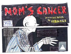
Here's Charlie's very first rough of how he thought the cover should look. He just printed a copy of one of my story's pages, blacked out the captions, added the title, and indicated how the colors might look. Charlie liked the "iconography" of this image--the sense the panels simultaneously communicated that this was a comic and at the same time suggested looking into Mom's life through a window. It really spoke to him.
 I wasn't immediately sold. I understood why he liked it, but I wanted to build the cover around my drawing of Mom sitting in the chemo chair. That was the very first picture I sketched when I conceived the idea of telling our family's story as a comic and it meant a lot to me. If I recall correctly, members of the cover committee found it too bleak and busy. I reluctantly moved on.
Over the next several weeks, Charlie and I batted dozens of ideas back and forth--generally beginning with an overarching concept and then playing with color, font, layout, etc. to get different takes on the idea. One time it was "cartoon panels," another time "trees." These were all my brainstorms that Charlie was genuinely happy to consider and pass on if he liked them. The image below summarizes just a few of the variations we went through.
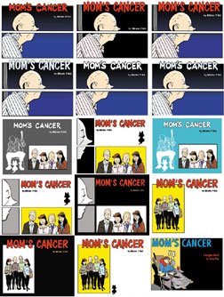
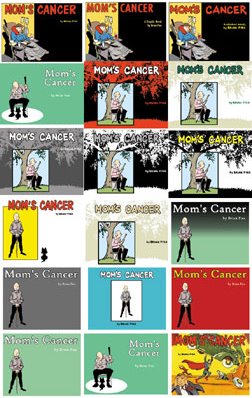
No one liked any of my alternatives as much as Charlie's concept; in the end, neither did I. The last one in the lower right corner was my last-ditch attempt to find a cover guaranteed to please my editor, who'd spent 12 years at DC Comics working with talent like Alex Ross, Roger Stern, Chip Kidd, etc. I don't recall Charlie sounding as amused as I'd hoped when I called him to discuss it, but the Comic-Con audience loved it: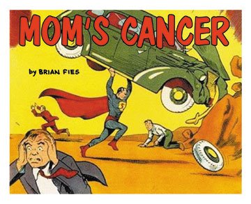 Anyway, after weeks of sketching, drawing, coloring and e-mailing, we at last arrived at the cover we did. I was happy, my editor was happy, the committee was happy. Most of all, my most important and potentially harshest critic, Mom, was happy. And Charlie called it pretty much from the start. Also note that on his mock-up, Charlie inserted a little caption box reading "Eisner Award Winner" when at the time I had not yet won it. Right again. This was not my last opportunity to learn to trust his judgment.


4 comments:
I kept trying to click on the covers hoping to get an enlarged version of them, no dice.
From what I can see of them I think I like the tree version with background red. For some reason it makes me kind of sad though, maybe that's why I like it. Right above it is another one I like, but with the red title; the blue doesn't seem to work with the blue wardrobe.
I am glad you all went with the title typography you did, the others somewhy don't seem right.
Like the comic-con fans I got a laugh out of the Action cover.
I wanted to see the covers larger as well. Thanks for this very interesting peek at Abrams.
After reading this, I want Charlie for -my- editor!
I always thought the cover spoke to how Mom's mind and body were not quite on the same wavelength about what was happening. There was a fragmented nature to her existence during her time with cancer, and the panel/comic book iconography spoke to that.
Great cover, no matter how you interpret it.
-Otis
D.D. and Mike, thanks. Mike, Charlie is mine but I'll let you borrow him on weekends.
Otis, I really appreciate you coming by. You're entirely right about the mind-body separation represented in that image. I did that on purpose and I think it's one of the things Charlie picked up on. Mom's brain and body were on two different wavelengths. It also has a little additional meaning in that she was fighting tumors in both her brain and lungs: two different battlefronts to focus on. I'm glad you caught that.
Post a Comment